
type
status
date
slug
summary
tags
category
icon
password
📚 🎨 Design Studio
本页汇总了 🎨 Design Studio 相关的常见问题(共 87 个)
▶ Image placeholders with multiple Color options
You can add multiple color options to image placeholders so customers can
colorize their uploaded images and choose from a range of colors while
personalizing. You can assign multiple colors in two ways:
- by using a color library (which is the easiest way)
Tip
If you want customers to choose any image color freely you can configure
it by using the color picker option. There is no need to set multiple color options.
To add multiple color options to a user-uploaded image manually
- Select the image placeholder
- Expand the Image Behavior toolbox
- Change the Image Type to Single Color
- Click the color swatch or the color picker to assign a color, and remember to hit save to save the selection !image-color-1.gif
- Use the arrows next to the option number to change to option 2
- Click the color swatch or the color picker to assign a new color
- Use the arrows to change to the next option and repeat as many times as you want.
To add multiple color options to a user-uploaded image using libraries
- First, you have to create a color library. You can learn how to create a color library here.
- Select the image placeholder
- Expand the Image Behavior toolbox
- Change the Image Type to Single Color
- Click Pick Library
- Choose the color library you'd like to use
Tip
To see all the color options an image placeholder has saved, just click the
arrows next to the option number to browse through all options. You can also
type a specific number if you want to jump faster to a certain color option.
▶ Using dynamic images or dynamic vectors as masks
Dynamic images or vectors are a great way to use masks on your products. You
can use them as an alternative to masks for user-uploaded images, to give maps and star
maps a nice shape, or to give texture and effects to your designs or mockups.
The best thing about using dynamic images or vectors as masks is that you can
not only give shape to the design (for example to the user-uploaded image or the map) but you can also add artwork on top of it, such as frames, icons,
decorations, crop marks, and more.
To add a dynamic image or vector as a mask
- Add the element that you want to mask. This could be a map, or an image placeholder (if it's an image placeholder, don't add a mask to it)
- Add a dynamic image or dynamic vector
- While on option 1, click upload and select the file you want to use as the mask
- Resize and reposition the mask so it is placed correctly on top of the element added on (1)
Keep in mind
If you are using a dynamic image, make sure you upload a PNG file, with the
area that you want to use as a mask transparent. If you are using a dynamic
vector, upload an EPS with the area that you want to use as a mask empty. Here
are the masks used for the examples above:
▶ Understanding the design studio
The Design Studio is what you use to build and edit your designs, product
bases, and templates. It is full of features to help you create all your
different products' personalization.
It has two main areas, the workspace where you have the canvas to work on, and
the tool panel from where you can add design elements to your canvas, and
format them.
The different design elements available are:
You can learn more about each element by clicking on them.
Workspace
On your left, you have the workspace. Here you'll see your canvas with all the
personalized elements and graphics of your designs.
On the top, you'll find the undo and redo buttons, and the option to resize
your canvas.
On the bottom right corner, you'll be able to control your workspace zoom. You
can also use your mouse or trackpad to zoom in and out.
To edit an element on the workspace, simply click it. When an element is
selected a light blue line will indicate it.
Tip
You can shift + click several elements on the workspace to edit them at
the same time. Another option is to click + drag your mouse over the
elements you want to select on the workspace.
Tool panel
On your right, you have the tool panel, from where you can add different
elements to your canvas, and format them.
On the top of the tool panel, you'll see your layers. This lists all the
layers on your canvas. You can select elements by clicking them on the layer
panel. And same as when selecting multiple elements from the workspace, you
can shift+click multiple layers from the layer panel.
Once you select an element, whether, from the workspace or the layer panel,
the information for that element will be displayed on the tool panel. With a
series of settings organized in toolboxes, you'll be able to format the
element as you want.
With the toolboxes, you'll be able to format elements, from their size
position and rotation to more specific things like fonts available, character
size and spacing for text elements, or image filters for image elements. The
toolboxes you'll see will depend on each element. They are:
- Transform: Where you can resize, reposition, and rotate.
- Character: Where you can assign font options, character size, spacing, and more. Only available for text elements
- Color: Where you can assign font color options. Only available for text elements
- Image behavior: Where you can assign image filters. Only available for image placeholders
- Vector behavior: Where you can assign vector filters and color options. Only available for vector placeholders
- Map and star map behavior: Where you can format the maps, assign map styles, and initial location. Only available for map and star map elements.
Important
The design studio works best on Chrome browser on a desktop device.
▶ Working with Layouts
When your designs offer multiple variations, you can easily select and
organize your elements in different layouts directly from the Layer Panel.
For example, if you offer the same design, but for 1 dog, 2 dogs, and 3 dogs,
you can organize your design on 3 layouts, so you will only show one design at
a time, depending on what your customer chooses.
Organizing your designs in layouts will then create the option for the
customer to choose between layouts when personalizing. This means it will
allow your customer to easily change from one layout to the other and only see
the options corresponding to each one of them.
Keep in mind
Working with layouts can be a bit advanced, so make sure you fully understand
how to create simpler designs (without so many variations) before diving into
it!
To create a new layout
- Select the elements on the Layer panel
- Click on the Create Layout button
Tip
Easily rename the layouts by clicking them twice. The name of the layout is
what is used later on as a label for the option your customer will interact
with. So naming the layout like you would call the option will save you a lot
of work.
To create more layouts
You can create new more layouts from scratch, by applying the same method
described above. Or you can clone the existing layout and work with it to
create a new one.
- Select the layout you want to copy
- Click the clone button  or Ctrl+D to clone the layout
- Edit the new layout as you want
Tip
When creating products that offer different "Number of..." options (for example, "Choose the number of dogs") it is very helpful to start with the
layout that has more elements. Then you can clone the entire layout, and
remove the elements you don't want in it to create the layouts with fewer
options.
It is important that you clone the element (not copy/paste!) so each
element is the same across layouts. To understand the difference between
cloning a layout and copy/pasting it, you can check out this video.
▶ Text with multiple Color options
You can add multiple color options to a text element so customers can choose
from a range of colors while personalizing. You can assign color options for
the text fill, it's stroke, or both. You can assign multiple colors in two
ways:
- by using a color library (which is the easiest way)
- by manually assigning all the color options you'd like to have
Tip
If you want customers to choose any text color freely you can configure it
by using the color picker option. There is no need to set multiple color options.
To add multiple color options to a text using libraries
- First, you have to create a color library. You can learn how to create a color library here.
- Select the text element
- Expand the Color toolbox
- Click Pick Library
- Choose the color library you'd like to use
You will see all the color options the text has displayed in the color
toolbox. To see how they look, just click through them.
Tip
If you want to change the order of the color options, you can do so by editing
the library. Learn how to edit a library here.
To add multiple color options to a text manually
- Select the text element
- Expand the Color toolbox
- Click the color swatch to assign a color
- Click Apply
- Click **\+ Add Color Option
**
- Pick a color and click Apply
- Repeat 5 and 6 to add as many color options as you'd like
You will see all the color options the text has displayed in the color
toolbox. To see how they look, just click through them.
To delete a color option , click the

next to the color value.
To edit the color option , click the
 next to
the color value, and pick a new color.
Tip
You can change the color options order by clicking the dots to the left of the
font option. Simply click and drag to rearrange them.
▶ Adding a Dynamic Image only to the Preview
Sometimes, you want to enhance the visual look of your product preview —
without changing anything in your actual print file. That’s exactly what
**dynamic images** in the Preview (Step 2) are for.
These elements can include product variations (like different colors),
decorative items (like props or backgrounds), or anything else that helps your
shopper visualize what they’re buying.
When to Use a Dynamic Image on your Preview
Use this feature when you want to:
- Show multiple product colors in one design
- Add props or decorative elements that don’t need to be printed
- Create mix-and-match setups (like bundles, or products with different fabrics or decorations)
Keep in mind
These images will be only visible on the storefront preview. They **do not
appear**in the print files. If you want to add variations that will need
to be printed, then you should add regular dynamic images on the Print File settings (Step 1).
To add a Dynamic image to the Preview
- Open your template in the Design Studio
- Go to Step 2 – Preview
- Click **\+ Add Dynamic Image
**
- A dynamic image element will be added, click + Add Image Option to start uploading your images or Pick Library to use an image library if you already have one created.
- Resize and position it however you want in the mockup
▶ Vectors with multiple Color options
You can add multiple color options to vectors so shoppers can choose from a
range of colors while personalizing. You can assign color options for dynamic
vectors or shopper uploaded vectors (vector placeholders). Colors applied to a
dynamic vector will be applied to all the vector options uploaded into it,
this is a great way to provide customers with not only a set of vectors to
choose from but also, to be able to choose from a selection of colors. Colors
applied to a vector placeholder, will be applied to whatever vector the
shopper uploads.
You can assign multiple colors in two ways:
- by using a color library (which is the easiest way)
Tip
If you want customers to choose any vector color freely you can configure
it by using the color picker option. There is no need to set multiple color options.
To add multiple color options using libraries
- First, you have to create a color library. You can learn how to create a color library here.
- Select the vector element
- Expand the Vector Mode toolbox
- Select Single color as the vector type
- Choose the color library you'd like to use
You will see all the color options the text has displayed in the toolbox. To
see how they look, just click through them.
Tip
If you want to change the order of the color options, you can do so by editing
the library. Learn how to edit a library here.
To add multiple color options to a vector manually
- Select the vector element
- Expand the Vector Mode toolbox
- Select Single color as the vector type
- Click the color swatch to assign a color
- Click Apply
- Click **\+ Add Color Option
**
- Pick a color and click Apply
- Repeat 5 and 6 to add as many color options as you'd like
You will see all the color options the text has displayed in the toolbox. To
see how they look, just click through them.
To delete a color option , click the
next to the color value.
To edit the color option , click the
 next to
the color value, and pick a new color.
Tip
You can change the color options order by clicking the dots to the left of the
font option. Simply click and drag to rearrange them.
▶ Adjusting dynamic vectors in previews
Adjust dynamic vectors on step 2 to make them more realistic on previews.
By default, dynamic vectors will remain the same on step 2, however, if needed
you can replace them exclusively on step 2 to make the preview more realistic.
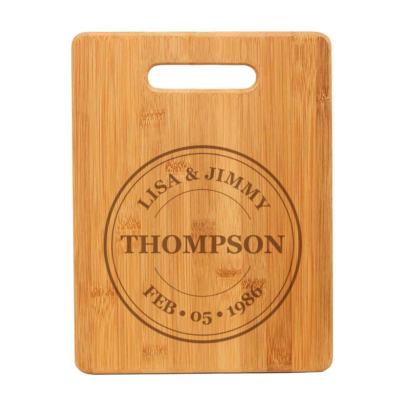
Let's see an example. This is the default way a dynamic vector will appear in
step 2:
Dynamic vectors are loaded exactly as they were on step 1. In this case, we
have a black vector since it is intended for engraving. While this works on
the production file, it doesn't look good on the preview.
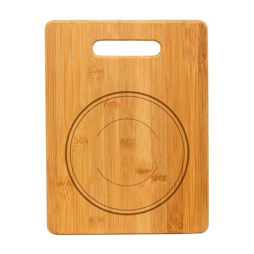
This is why we can use replace with an image to replace the vector with a
much more realistic representation of that art.
Here, we replaced the vector with a PNG of the wreath, in a wooden color so it
would look more realistic. We then applied skew to it to make an even better
preview.
Changing the overlay will transform the dynamic vector into a dynamic image,
exclusively on step 2. You can learn more about how dynamic images work here.
How to replace vectors with images
- Make sure you are on step 2
- Make sure you are on option 1 and click the replace with image button. This will transform the dynamic vector element into a dynamic image, so you can upload pictures on each option. 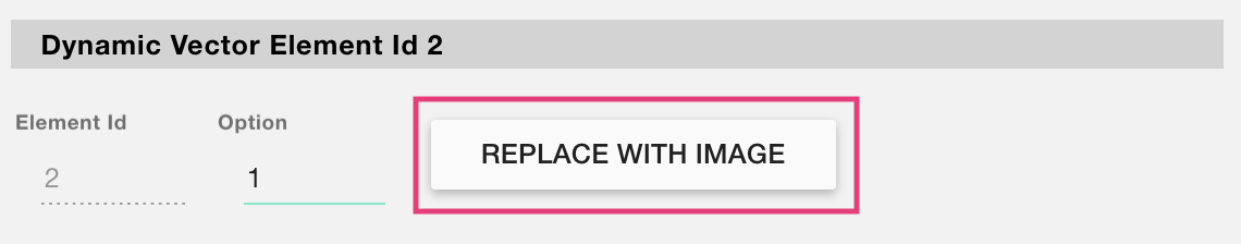
- Browse the picture you want to use for option 1.
- Click the arrows to change option
- Click upload an image again to choose the picture for option 2
- Repeat steps 4 and 5 to replace all options of the vector.
Important:
It is important to replace all the dynamic vector options with an image. So if
the vector has 5 options, when replacing it with an image you will need to
upload pictures into 5 options.
Also, the options need to match exactly. For example, if the dynamic vector
has in option 1 an EPS of a star and on option 2 an EPS of a heart, when
replacing with an image you should add a picture of a start on option 1 and on
option 2 a picture of a heart.
▶ Replacing the background image in your Template Preview
The background image (or color) in Step 2 of the Design Studio helps shoppers
visualize the final product. You can change it at any time without affecting
your personalization setup.
What Happens When You Replace the Background?
- Only the background image or color is updated
- Your personalization elements stay exactly as they are
- Any dynamic images, layout changes, or positioning on the preview remain untouched
This is the best option when you want to change the background without
resetting your entire preview layout.
To replace the background image
- Open your template in the Design Studio
- Go to Step 2 – Preview
- Click Replace Background
- If you're background was an image, then upload a new image. If you're background was a color, you'll be able to pick a different color.
Pay attention to image size
We recommend using a background image with a similar size to the original. If
the new file is significantly smaller, some personalization elements may fall
outside the canvas. You can find your current background size in the warning
message.
- Your elements will remain exactly where they were. Of course you can always reposition or resize them to fit the new image if needed.
▶ Step 2: Preview settings
The preview is the part of the template that customers will see online on your
store. It will contain all the personalized elements created on the production
file, such as text and images, placed on the product picture and adjusted to
look as real as possible. You can also add other product variations that are
important for showcasing the preview but don't affect the production file,
like product colors, materials, etc.
1. Setting the preview background image
The first thing you need to do when setting the preview is to choose the image
you want to use as background. This is the picture where all the
personalizable elements will be placed.
The background image can be a PNG or JPG file. It should not have any
personalization on it since that is added dynamically with Customily
What should I include on my background image?
To learn more about the preview background image, and how you should set them
2. Adjusting the personalizable elements to match the preview
Once the background is uploaded, it will appear on the workspace together with
all the elements created in step 1. These elements will appear as they
were created in step 1, so it's probable that they won't match the background
picture. This is why you can adjust them and rearrange them to match your
background picture perfectly. To edit an element just click on it on the
workspace to select it.
The different adjustments you can apply to the personalizable elements are:
- Change position
- Change size: This will scale the elements, always maintaining the proportions to make sure it matches correctly with the production file.
- Change rotation
- Add Skew: Use this to apply a perspective effect to the different elements.
- Color: You can change the colors of text elements and image placeholder elements (if they are grading or single color type) to match the real-life color perfectly. Colors on the preview are independent of the production file, meaning changes here won't affect the colors set on step 1.
- Texture: You can add texture to the text to make the preview more realistic
- Image opacity: Give image placeholders opacity to make them look more realistic
Important:
All adjustments done on the preview won't affect the production file. So feel
free to adjust elements as you'd like.
💡 Tip:
To adjust several elements together you can Shift + click all of them, and
then resize or move them all together.
3. Adding extra personalizable elements on the preview
When you want to let customers choose from different product options that
don't affect the production file, you can add dynamic images. These
options could be, materials, background colors, background patterns, fabrics,
etc.
Dynamic images have multiple positions, so you can add different pictures on
each position. These positions are the different options customers will be
able to choose.
Learn more about how to use dynamic images
here.
💡 Tip:
You can add as many dynamic images as you'd like. They are great to create mix
and match products, where customers can choose different materials or colors
for different parts of the products.
▶ What is a base file?
When adding a new template, you can work with your own design files, by
selecting to upload a base file.
What exactly is a base file?
It's the file you'll work with to create your personalization template. This
file should contain all the information you need on your production file. For
example:
- Size: It should have the measurements you'll need on your export files, including margins, bleed, etc.
- Base Designs: All design elements from the product that are not personalizable should be there. For example, if your design has some static decorations, they should be part of the base EPS file.
- Cut lines, annotations and more: Make sure you add any extra stuff you need to have on your production files.
You can choose to upload a base EPS file or a base PNG file. Depending
on your design, what will work better for you. Usually, if you'll be exporting
in vector format, we recommend using the base EPS file. If you'll be exporting
in image format then it is safe to go with base PNG file.
How to save EPS files in Adobe Illustrator
- Open your design file on Illustrator and remove all the personalized elements (text, pictures, etc.)
- Go to File > Save As
- On the dialog choose Illustrator EPS (eps) as Format
- Check Use Artboards to make sure the EPS is exported with the correct page size
Important:
Remember to remove all personalizable elements from the base file. These
elements will be added with Customily, this is why they shouldn't be on the
base file. This includes all the text elements where customers can type and
all the picture elements where customers can upload their own photos.
Examples of different base files
Let's see some product designs and how the base file looks like for that
design:
- Engraved Chopping Board
This is the base EPS file we'll use for this chopping board. Since it's for
engraving we'll be using EPS as we need the export to be in vectors.
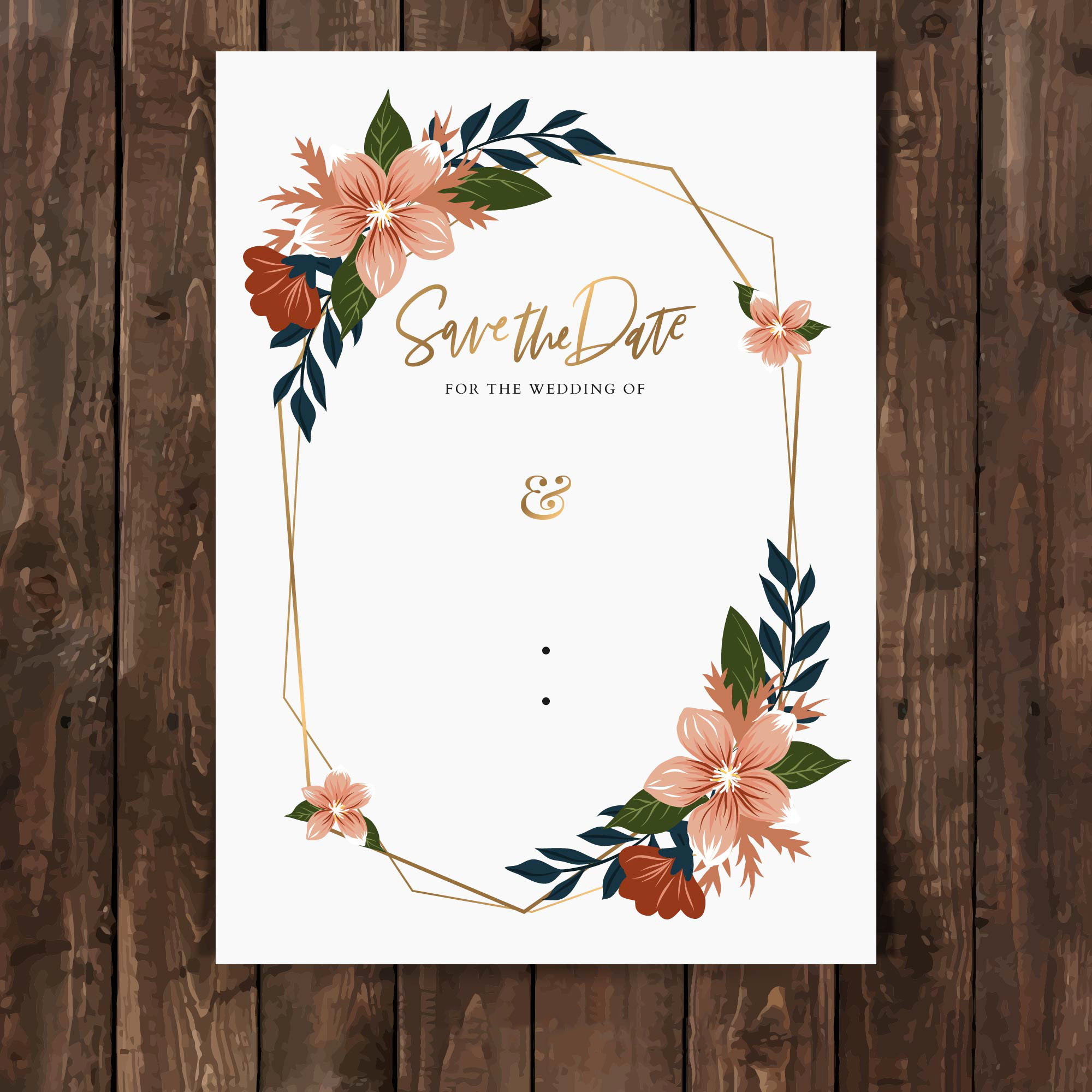
- Wedding invitation
This is the base PNG file we'll use for this invitation. Since it's for
regular printing and we'll be exporting in image format, we can use a base PNG
file.
▶ Adding fonts into Customily
By default, Customily comes with a small font collection. The idea is for you
to add your own fonts so you can make your own designs. You can add as many
fonts as you wish, and all you need to have is the .ttf or .otf font file.
Important
- All the fonts you upload will be exclusive to your user, and only you will have access to them
- Make sure that you have the rights to use the fonts you upload
- Make sure the font file you use has no strange characters on its name such as ¤ , ¶ , § , © , ®
- You can upload fonts in TTF or OTF formats
To upload a new font
- Select any text element
- Expand the Character toolbox
- Click on the upload button next to the Select a font list
- Choose any TTF or OTF font file from your drive
- The font will be automatically added to your font list for you to choose it
Tip
If you upload a font but when you use it, it doesn't show in the text, it
could be that the upload was unsuccessful.
To troubleshoot the issue convert the original font file to another file type
(from TTF to OTF or the other way round), change its name, and re-upload it.
You can find an online converter here. If the
font still doesn't work contact our support team.
To delete a font
You will be able to delete fonts **only if they are not being used in any text
element**. If a font is being used (even if it's on a different design or template) a dialog will let you know where it's being used so you can change
them, and then try to delete the font again.
- Select any text element
- Expand the Character toolbox
- Click to expand the Select a font list
- Click  next to the font name
- Click Ok on the confirmation dialog
▶ Adding a design element
When opening the Design Studio, on your tool panel you'll see the different
elements you can add to your canvas to create personalized designs.
The different design elements available are:
Click on each one to learn more about what the element can do.
To add a design element
Simply click the button for that element. Once you click it, the element will
be added to your canvas. Every time you click those buttons, a new element
will be added.
▶ What is the preview background image?
When setting the preview of a template you need to first define the
background image that the preview will use.
What exactly is the background image?
It's the picture you'll work with to create your preview template. Important
things to consider for the background picture are:
- It should have a clear view of the product to be able to showcase the personalization at its best.
- It should not have any personalization on it. If your product picture already has some personalization, it is very important you delete it before uploading it.
Important:
Remember to remove all personalizable elements from the background image.
These elements will be added with Customily, this is why they shouldn't be on
the background image. This includes all the text elements where customers can
type and all the picture elements where customers can upload their own photos.
Examples of different background images
Let's see some product designs and how the base background images look like
for that design:
- Engraved Chopping Board
This is the background image we'll use for this chopping board
- Wedding invitation
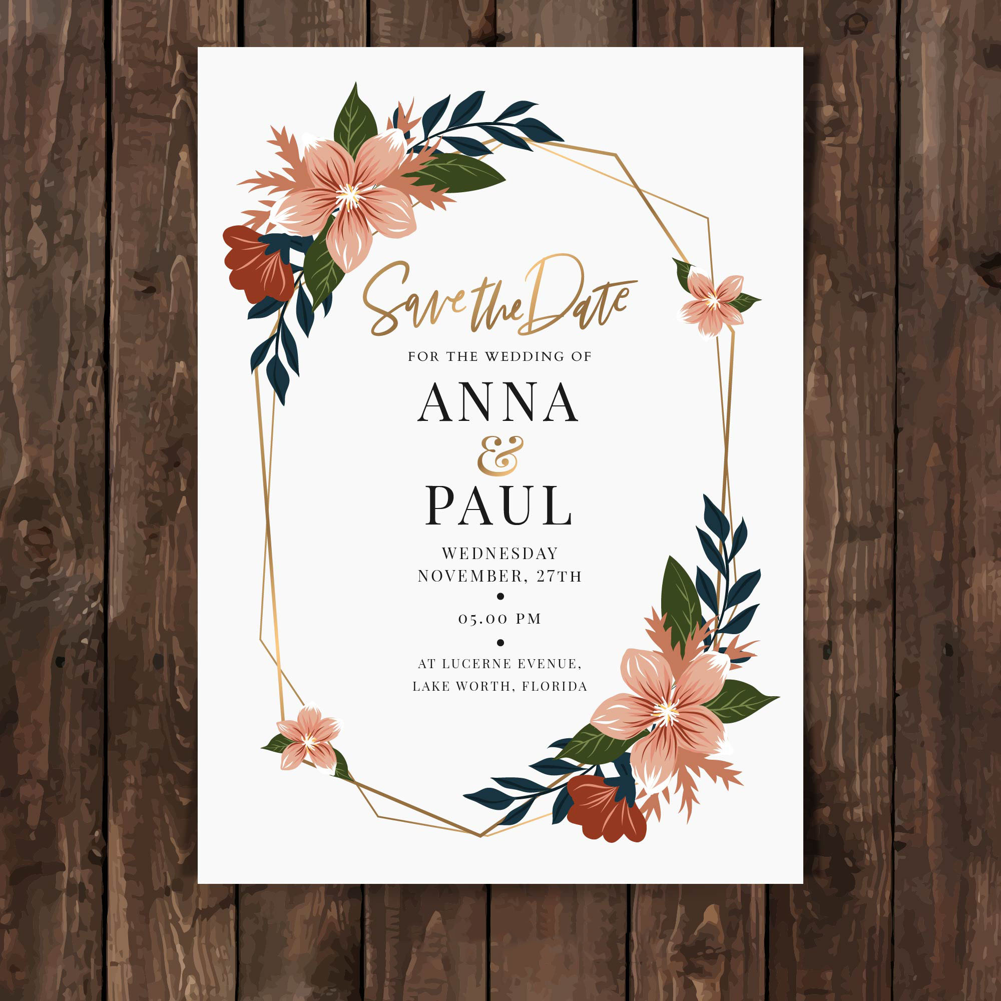
This is the base background image we'll use for this invitation
▶ Copying or Cloning an element
You can either Copy and Paste an element or Clone an element on the Design
Studio. Each of them has different behaviors.
Copying an element
When copying and pasting an element, the copied element will have a
different id. Elements will look the same but they are independent from one
another.
- Select the element or elements on the Workspace or Layer Panel
- Press Ctrl/Cmd + C to copy
- Press Ctrl/Cmd + V to paste, or Ctrl/Cmd + B to paste in place

Cloning an element
When cloning an element, the cloned element will have the same exact ID as
the original element. When elements have the same ID they work coordinated.
For example, 2 text elements with the same ID will change at the same time
when a customer types on them.
- Select the element or elements on the Workspace or Layer Panel
- Click the clone button

Tip
Use cloning whenever you want to create designs with patterns or multiple
elements that change together. For example, texts or images that repeat
multiple times across a product. !wrapping paper 2.png!wrapping paper.png
▶ Deleting an element
You can delete one or multiple elements with a click of a button, or with your
keyboard.
To delete an element with the delete button
- Select the element on the workspace or in the Layer Panel.
- Hit the delete button on the left bottom corner of the tool panel.
To delete an element with the keyboard
- Select the element on the workspace or in the Layer Panel.
- Press delete on your keyboard on Windows / Cmd + delete on your Mac.
Tip
If you accidentally delete an element, you can recover it using the undo
button, or pressing Ctrl/Cmd + Z
To delete multiple elements
- Select multiple elements on the workspace or in the Layer Panel using shift.
- Hit the delete button , or press delete on your keyboard on Windows / Cmd + delete on your Mac.
▶ Text with multiple Font options
You can add multiple font options to a text element so customers can choose
from a range of fonts while personalizing. You can assign multiple fonts in
two ways:
- by using a font library (which is the easiest way)
- by manually assigning all the font options you'd like to have
To add multiple font options to a text using libraries
- First, you have to create a font library. You can learn how to create a font library here.
- Select the text element
- Expand the Character toolbox
- Click Pick Library
- Choose the font library you'd like to use
You will see all the font options the text has displayed in the character
toolbox. To see how they look, just click through them.
Tip
If you want to change the order of the fonts, you can do so by editing the
library. Learn how to edit a library here.
To add multiple font options to a text manually
- Select the text element
- Expand the Character toolbox
- Click to expand the Select a Font list
- Pick a font from the list
- Click \+ Add Font Option
- Click to expand the Select a Font list
- Pick a font from the list
- Repeat 5, 6, and 7 to add as many font options as you'd like
You will see all the font options the text has displayed in the character
toolbox. To see how they look, just click through them.
To delete a font option , click the
next to the font name.
To edit the font option , click the
 next to
the font name, and pick a new font from the list.
Tip
You can change the font options order by clicking the dots to the left of the
font option. Simply click and drag to rearrange them.
▶ Step 3: Final Review
The final review lets you check the production file, and the preview, with all
their personalized elements and compare their behavior.
On the left side of the screen, you'll see the production file you created in
step 1, and on the right side, you'll see the preview created in step 2.
1. Checking how the personalized elements work
In order to try how the different personalized elements behave on both parts
of the template you can:
- Double click text elements or curved text elements (on any side) and type to see how the texts will look on both sides
- Click the image placeholders (on any side) and upload a test image, to see how the image placeholder will behave. Double click the image placeholder until the boundaries are turned red to move and scale the uploaded image within the placeholder boundaries.
2. Saving the template
Once the elements have been checked, click Save to finish the template
creation.
This will prompt a message with the Unique Template ID and take you back
to the homepage.
▶ What size should my background image have?
We recommend keeping background images light, so they load as fast as possible
on any browser and device.
Since background images are only visible on screens on the preview on your
store (we never use them for printing) you can keep them light easily without
compromising quality.
The recommended dimensions for background images are:
- 1000 x 1000 px / 72 dpi
This is a suggestion, any value around that will work well.
Keep in mind that preview images don't need to be square, but it's usually
what works better with stores' layouts and product galleries.
▶ Adjusting the personalizable elements to match the preview
Once the background is uploaded, it will appear on the workspace together with
all the elements created in step 1.
These elements will appear as they were created in step 1, so it's probable
that they won't match the background picture. This is why you can adjust them
and rearrange them to match your background picture perfectly. To edit an
element just click on it on the workspace to select it.
💡 Tip:
To adjust several elements together you can Shift + click all of them, and
then resize or move them all together.
The different adjustments you can apply to the personalizable elements are:
- Change position
- Change size: This will scale the elements, always maintaining the proportions to make sure it matches correctly with the production file.
- Change rotation
- Add Skew: Use this to apply a perspective effect to the different elements.
- Color: You can change the colors of text elements and image placeholder elements (if they are grading or single color type) to match the real-life color perfectly. Colors on the preview are independent of the production file, meaning changes here won't affect the colors set on step 1.
- Texture: You can add texture to the text to make the preview more realistic
- Opacity: Give image placeholders opacity to make them look more realistic
💡 Tip:
For text elements, try typing some text to see how it will look on the
preview, this will give you a better idea of how you need to adjust them.
For image placeholder or vector placeholder elements, try uploading a picture
to see how it will look on the preview, this will give you a better idea of
how to you need to adjust them.
Important:
All adjustments done on the preview won't affect the production file. So feel
free to adjust elements as you'd like.
▶ Changing zoom on your Workspace
Change the zoom on your Workspace to see every detail of your designs up
close.
To change zoom with preset values
Click on the zoom button that's located on the right bottom side of your
Workspace (the one with a magnifying glass) and choose the option that best
fits your needs.
Tip
A zoom of 100% will show you the actual size of your print file!
To change zoom freely
Make sure your cursor is on the Workspace and then:
- On Windows: Press Ctrl while moving the mouse scroll wheel.
- On Mac: Pinch the trackpad to zoom in or out (as if you were zooming on a mobile phone) or double-tap on your mouse
▶ Dynamic Vector
Dynamic Vectors are places where you can add pre-set vectors to your designs.
It can be a single vector or a collection of vectors for customers to choose
from, that is why they are dynamic!
They are a very versatile element, that can be used in many ways on your
designs. For example:
- if you want to add a fixed graphic to your design (like a nice quote, or a frame) you can add it as a dynamic vector
- if you want to give customers clipart options to choose from (like choosing quotes, or logos) you can upload all those options into a dynamic vector
- if you want to add a mask to your designs (to give it a cool shape) you can upload it into a dynamic vector
A dynamic vector is represented on the canvas by a dashed line, showing the
vector you uploaded onto it inside. If you have uploaded multiple vectors into
it, you will only see one of them at a time.
How It Works
When you add a Dynamic Vector to your design:
- Shoppers see a pre-set vector or a list of vector options to choose from.
- If you’ve uploaded multiple vectors, shoppers can switch between them by selecting from a product option (like dropdowns or swatches). Only one vector will show at a time—whichever one matches their selection.
- You define the position, size, and behavior of the vector; shoppers don’t upload or modify the artwork.
- If multiple color options are added , shoppers will see options to pick from them.
- If Movable Vector is enabled, shoppers can also reposition or resize the image within the area you define.
- * *
In this article:
- How to add a dynamic vector
- Uploading vector/s into the dynamic vector
- Transform the dynamic vector
- How to add color options to the dynamic vector
- Allow shoppers to move the dynamic vector
Dynamic vectors can have one or multiple vectors in them. The file type
supported by dynamic vectors is EPS. Make sure the EPS files you upload
into the dynamic vector are composed of vector elements. If your EPS file
has image elements inside (like PNGs or JPGs) or text elements (with font information) we recommend transforming everything to curves before uploading
to Customily.
If you are unsure whether to use dynamic images or dynamic vectors, we
recommend using images, as they load faster on previews. If you want to add
images to your design check dynamic images.
To add a dynamic vector
You can add dynamic vectors on Designs a Templates by clicking the **Dynamic
Vector button**.
Each dynamic vector you add will have a Name that you can edit, and a Unique Id for you to
easily identify it.
Adding vector/s options into the dynamic vector
After creating the element you will need to add the vector/s that will go in
it. You can add vectors in two ways:
- by using a vector library (which is the easiest way)
- by manually uploading all the vector options you'd like to have
Important
Vectors uploaded into the dynamic vector will be set to fit the dynamic vector
area. So we always recommend uploading vectors with the same or very similar
sizes, to avoid unwanted changes in size when switching between vector
options.
To add vector/s into the dynamic vector using libraries
- First, you have to create a vector library. You can learn how to create a vector library here.
- Select the dynamic vector
- Click Pick Library
- Choose the vector library you'd like to use
You will see all the vector options displayed in a list. To see how they look,
just click through them.
Tip
If you want to change the order of the vectors, you can do so by editing the
library. Learn how to edit a library here.
To add vector/s into the dynamic vector manually
- Select the dynamic vector
- Click the \+ Add Vector Option button
- Select the vector or vectors (using shift) you want to upload
- Repeat 2 and 3 to add as many vector options as you want.
You will see all the vector options displayed in a list. To see how they look,
just click through them.
To delete a vector option , click the
to the right of the vector icon.
To edit a vector option , click the
 to the
right of the vector icon, and upload a new vector.
Tip
You can change the vector options order by clicking the dots to the left of
the option. Simply click and drag to rearrange them.
Transform the dynamic vector
Directly on the canvas or by expanding the Transform toolbox, you can
transform the
dynamic vector:
Keep in mind
Transforming the dynamic vector will transform all the vectors it contains
inside. So if for example, you rotate the dynamic vector element, all vectors
inside it will be rotated. If you want to transform one vector option only,
you should edit the vector before uploading it into the dynamic vector
element.
To add color options to the dynamic vector
By changing the dynamic vector Mode, you can apply coloring effects to the
vectors. The vector types available are:
Full Color
Vectors in full-color mode will remain exactly as you uploaded them. This is
the standard mode for vectors. !full color vector.png
▶ Setting the preview background image
The first thing you need to do when setting the preview is to choose the image
you want to use as background. This is the picture where all the
personalizable elements will be placed.
The background image can be a PNG or JPG file. It should not have any
personalization on it since that is added dynamically with Customily
To set the background image
- Click set background image 
- Browse and select the file you want to use as the background image. You can choose any JPG or PNG files.
What should I include on my background image?
Learn more about background images and how you should set them up
▶ Keyboard shortcuts
Use keyboard shortcuts in the Design Studio, to make simple operations faster.
You can use them both on Windows and Mac.
Shortcut (Windows/Mac) | Command
---|---
Ctrl/Cmd + C | Copy
Ctrl/Cmd + V | Paste
Ctrl/Cmd + B | Paste in place
Ctrl/Cmd + Z | Undo
Ctrl/Cmd + Shift + Z | Redo
Shift + click | Select multiple elements
Shift + click and drag (while resizing) | Resize from center
▶ How to reset the Preview in a template.
If you’ve made changes to the preview mockup that you want to undo, or just
want to start fresh, you can reset your preview.
This will:
- Remove any changes made in the preview (Step 2) - this includes any extra items you've added on the preview like dynamic images
- Reload the template elements exactly as they were in Step 1 (Print Settings)
When to Reset the Preview
You might want to reset your preview if:
- You’ve moved or resized elements on the preview and want to undo everything
- The mockup doesn’t look aligned or clean anymore
- You changed your product’s print settings (added new elements, or moved things around) and need to reflect those changes in the preview
- You just want to start over with a new background or a cleaner layout
Resetting gives you a clean slate without touching your print settings or
design logic.
To reset the preview
- Open your template in the Design Studio
- Go to Step 2 – Preview
- Click **Reset Preview
**
- Choose whether to use an image or a solid color as your new background
- Upload your image (it can be the same one you were using before) or pick a new color. Your elements will reload fresh, with the same position and sizing they have on step 1!
- Select your elements and adjust them to fit the new preview as needed
Keep in mind
Resetting the preview will clear all changes made to the mockup ,
including:
- Resizing or repositioning elements
- Any dynamic images added just for the preview
- Custom tweaks specific to the visual layout of Step 2
If you want to change just the background **without resetting the entire
preview** , use Replace Background instead.
▶ How to prepare your cliparts before uploading them to Customily
If you have a product with options that offer different color options or
styles like hair, clothing, animals, etc. In this tutorial, you'll learn how
to resize all your clip-arts so when you upload them into Customily they will
all have the perfect size and position for your design.
▶ Working with the Layer Panel
Expanding the Layer Panel allows you to easily select and organize the
different elements of your designs, products, and templates. directly from the
Layer Panel.
Whenever you want to see the layer Panel, just click to expand it.
There you will be able to:
Click each operation to learn more about it.
▶ Selecting multiple elements
You can select multiple elements, from the workspace or the Layer panel, to
move them or scale them together.
To select multiple elements in the Layer Panel
- Shift + select two layers to select all the ones in between.
Tip
If you are using Windows you can use Ctrl + select to select specific (not consecutive) layers from the layer panel.
- Use the Select Unlocked / Select All buttons to select all unlocked layers, and eventually all layers (no matter if they are locked !select- unlocked.gif ## To select multiple elements in the workspace * Shift + click the elements you want to select on the workspace. !shift-select- canvas.gif * Click + drag the mouse over the elements you want to select !select- drag.gif ## To unselect elements Simply click anywhere on the workspace (outside of the elements you have selected). The easiest way is to click the grey area around your canvas!
▶ Arranging elements order
You can change an element's order easily by using the Layer Panel or the
Transform Toolbox.
##
Change element position using the Layer panel
- Expand the Layer Panel
- Select the element
- Drag it until you reach the desired position
- Drop your element
Tip
This is the easiest and fastest method to arrange your layers.
Change an element's position using the Transform Toolbox
- Select the element on the workspace
- Toggle the Transform Toolbox
- Click move forward or move backward buttons
- Elements are moved one position at a time forward or backward. If you want to send an element to the back click the button as many times as necessary to move the element several positions.
Keep in mind
If you are using a base image or a base EPS for your template or design,
elements will never go behind them.
▶ What's a template ID?
Each new template you create on Customily has an ID. This is the way we can
identify the different templates.
Each template gets assigned an ID automatically, and it can't be changed.
##
How to know the ID of a template.
Template IDs are very easy to identify. They are displayed below the template
name in purple.
▶ The Template Homepage
On the template homepage, you'll see a list of all the templates on your
account. There you can:
By default, the homepage will show "all templates" and they will appear
ordered by date of creation, from oldest to newest. You can rearrange the
order to see your newest templates first or rearrange them by last modified by
clicking on the sorting titles.
Create a new template
- click the Create Template button on the top left corner of the homepage
Search
- Type on the search bar in the top left corner
You can search templates by their name, or their ID.
Rename
- Click on the Template's name or on the  next to it
- This will activate the name so you can type in the new one
To exit renaming mode, press Enter/Return or click anywhere outside the name.
Edit
- Stand on top of the template so it is highlighted
- Click anywhere to open it and edit it. You can also click the edit button on the left
Clone
- Stand on top of the template so it is highlighted
- Click the clone button on the left
Cloned templates are added at the end of the list. You will identify it since
"cloned" is added at the end of its name.
Delete
- Stand on top of the template so it is highlighted
- Click the trash button on the left
- A confirmation to delete will be shown, click yes to delete
Deleted templates go to the recently deleted folder, and will be kept there
for 90 days in case you need to recover them.
Recover recently deleted templates
- Select Deleted from the template filters on the top right of the homepage (by default it shows all templates) to see the recently deleted templates
- Stand on top of the template so it is highlighted
- Click the restore button
can access your recently deleted folder to recover templates that have been
deleted. After 90 days, templates will be deleted permanently, and you won't
be able to recover them.
▶ What's the elements ID?
Each new element you add while working in the Design Studio has an ID. This is
the way we can identify elements.
Think of layers in Photoshop, where each layer has a name so you can identify
it. Well, in Customily, apart from the name we also use IDs to identify
layers.
Each element gets assigned a Unique ID automatically starting at 1. This means
the first element you create on your designs (doesn't matter if it's a text element, an image placeholder, or any other) will have Unique ID 1, the second
element Unique ID 2, and so on.
How to know the ID of an element
To know what's the unique ID of a certain element all you need to do is take a
look to the right of the Layers Panel. When you select an element on the
workspace, it will be highlighted so you can easily see its name and ID.
Can you change the ID of an element?
Yes, you can change the ID of any element. This is useful when you want
elements to change together since having the same ID will tie their behavior.
For example, let's say that you have multiple text boxes that you want to
change at the same time with the same text the customer types. This is easy to
achieve if all the text elements have the same ID.
Another example is if you are using clipart and because of how your art is
made, you have separate cliparts for the face and the arms, so you use
separate dynamic images to add them. Of course you want the skin color to
change coordinated between face an arms. This can be done by giving the
dynamic images the same ID.
To change the ID of an element
- Select the element
- Type the ID you want to use under Element ID
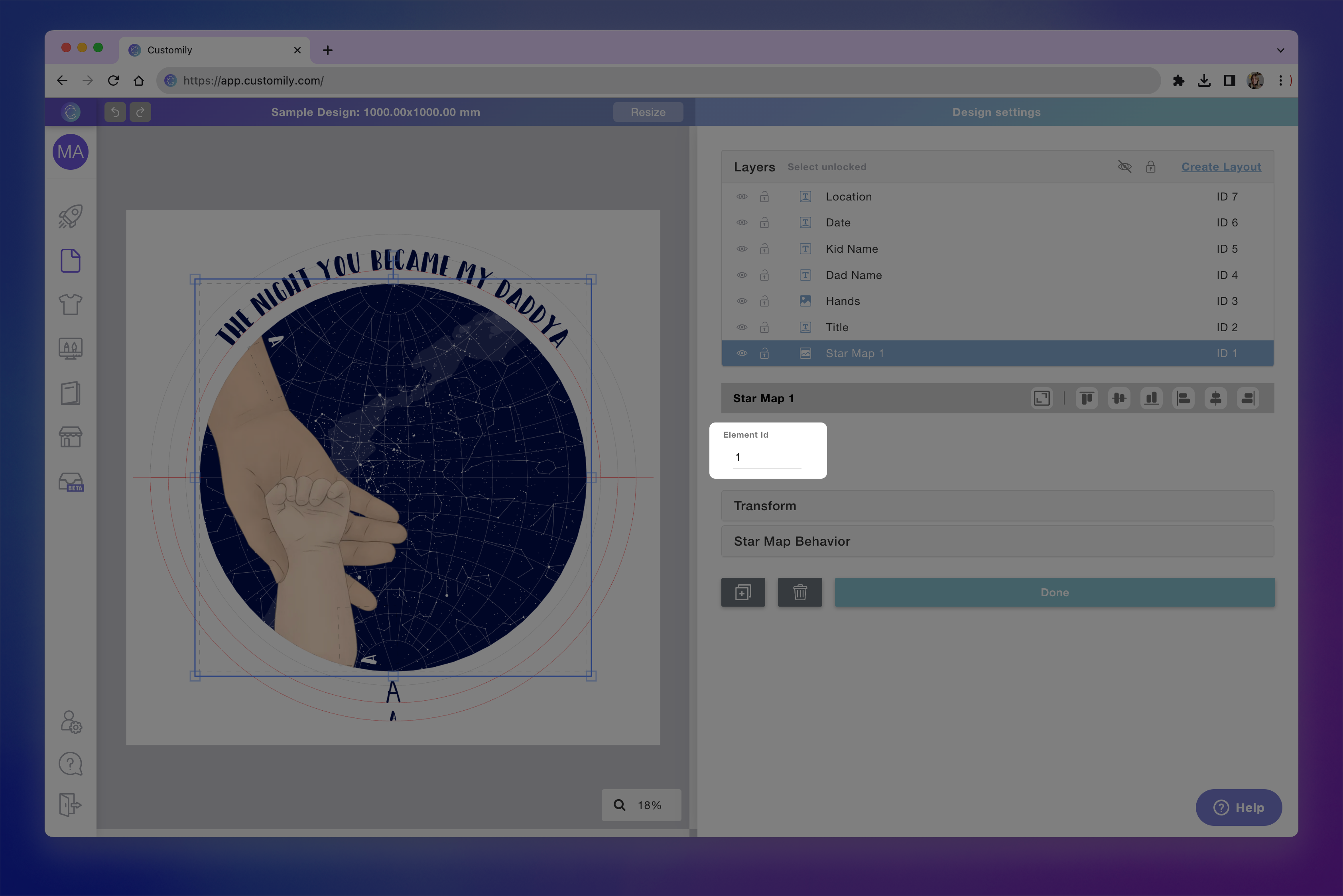change element id.png**
Important
Unless you want to use it for a specific reason, as the ones described above,
it is better to avoid changing the ID of the element to avoid any kind of
confusion.
▶ Clipart protection
Customily previews automatically convert all images uploaded to the templates
to lower-quality WEBP files. That way we can guarantee a great resolution for
digital display while protecting your artwork from being downloaded and
stolen.
Note
All files uploaded to the template will maintain their original resolution for
production files. The clipart protection measure applies to store previews
only.
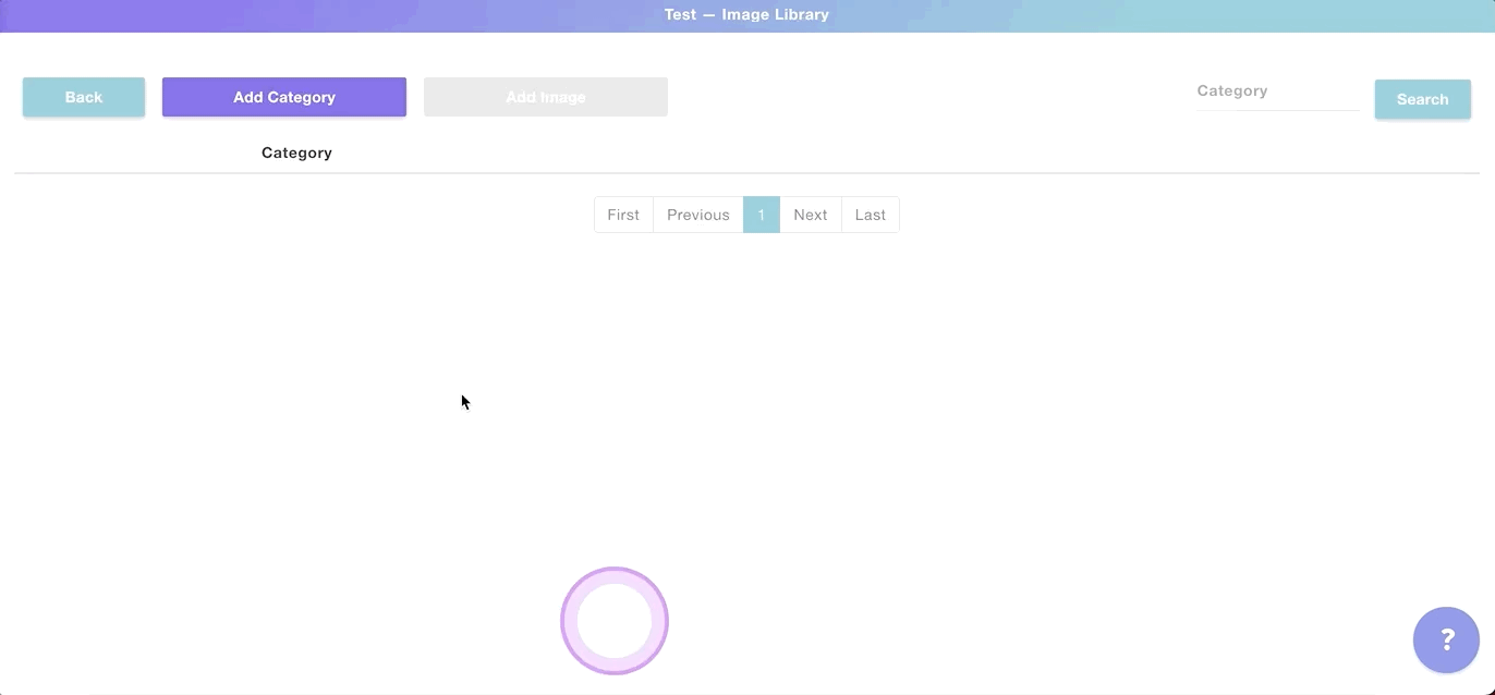
▶ Categories
The Categories feature lets you organize elements from libraries into
different groups. Categories can be applied to:
- Dynamic Image Libraries
To create a Category
- Open an Image Library or create a new one as shown
here.
- Click Add Category to create a new category
- Name your category and add a**category thumbnail
**
💡 Tip:
The category thumbnail is used to easily recognized what category you're in,
so make sure you are using an image that accurately represents that group of
images.
**If you are using Shopify, then the thumbnail will be used to create the
swatch for that category option.**
To add image options to your category
- Click Edit to see the category and add, delete or modify image options
in it
- To add a new image option click **Add Image
**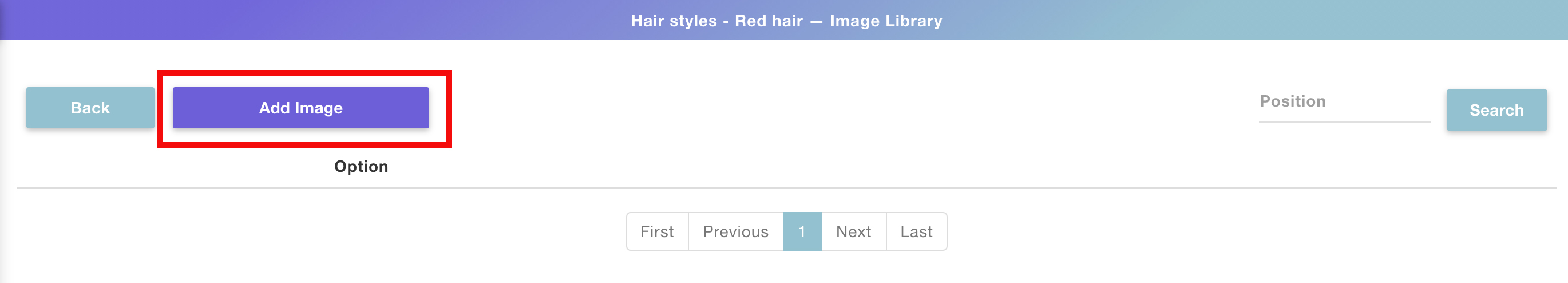
- Choose the image option you are going to add. If this is the first image
you are adding to the category, then it will be option 1
💡 Tip:
If you want to assign an image to a different option, you can either type the
option number or click the arrows next to it to change options.
- Click Upload Image(s) to select the image you want to add to that
option.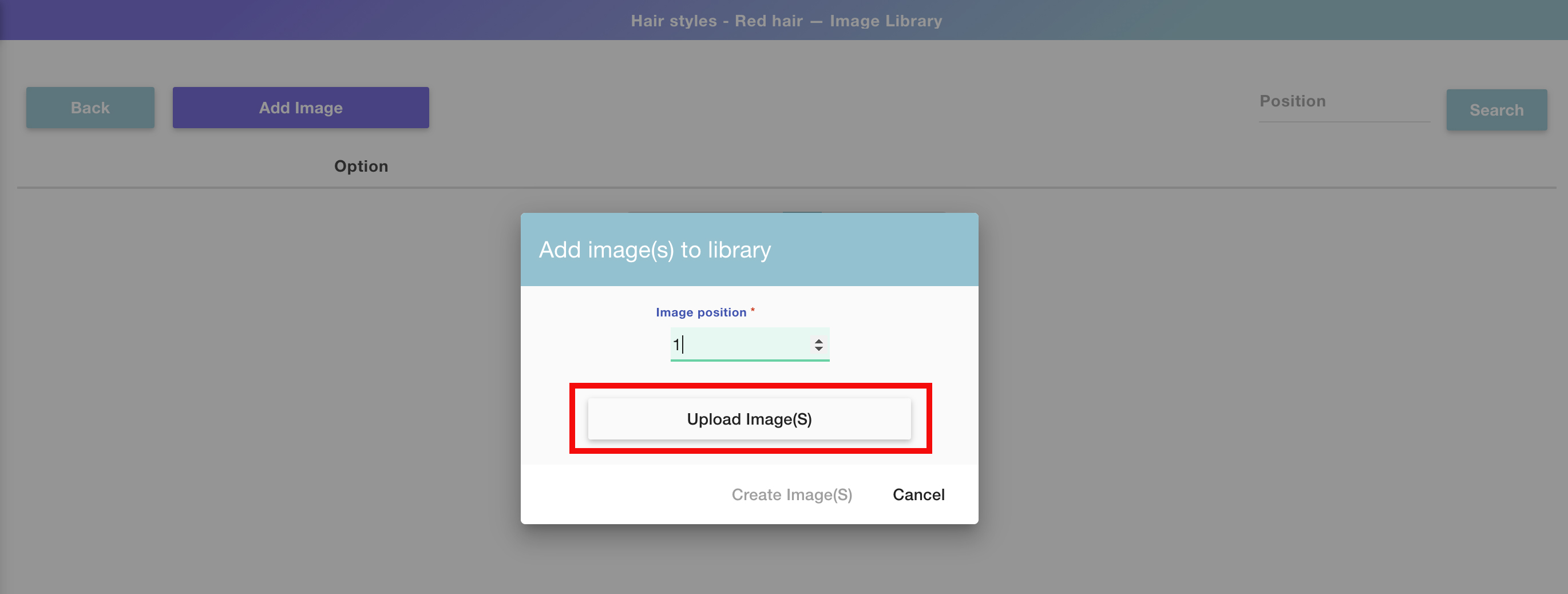
Pro tip!!
You can upload multiple images in consecutive positions by selecting them
altogether from the upload dialog. The images will be uploaded in the same
order as the files appear on your folder.
- Once the image, or multiple images, are uploaded click Create Image(s)
- You'll now see the first image was saved into the first option, and so on.
Repeat this as many times as images you want to add to the library. At the end
of the process, you'll have something like this:
💡 Tip:
Every extra image you add will be automatically added to the following option.
For example, if you already have 4 options, the next image you'll add will be
added by default in image option 5, unless you change that manually of course.
Keep in mind that as you create different categories, the options will be
created in order. So if on the first category you have up to 4 image options,
then on the second category the image options will start uploading on option
5.
To edit an image category
- Select any category you want to edit from your category list and click the
Edit button
- Once inside the category, you can either add new images , **edit
existing images , and delete existing images.**
Do you have a Shopify store?
If you have a Shopify store, when creating categories you can create an option
set automatically with the conditions already set! Learn how to do this
▶ Color Libraries
Color Libraries let you organize color options to use on multiple templates at
the same time. Color Libraries can be applied to different personalizable
elements from Customily, such as:
- Text Color for production files
- Text Color for previews
- Vector color (when they are in single color mode)
Once you assign a library to a Customily element, every change you make on the
library will be reflected in that element.
For example, let's say you want to offer 5 new color options for your
embroidered products. If you edit the library that has all the embroidery
colors and add 5 new colors to it, all the texts that use this library will be
updated across all templates!
To create a color library
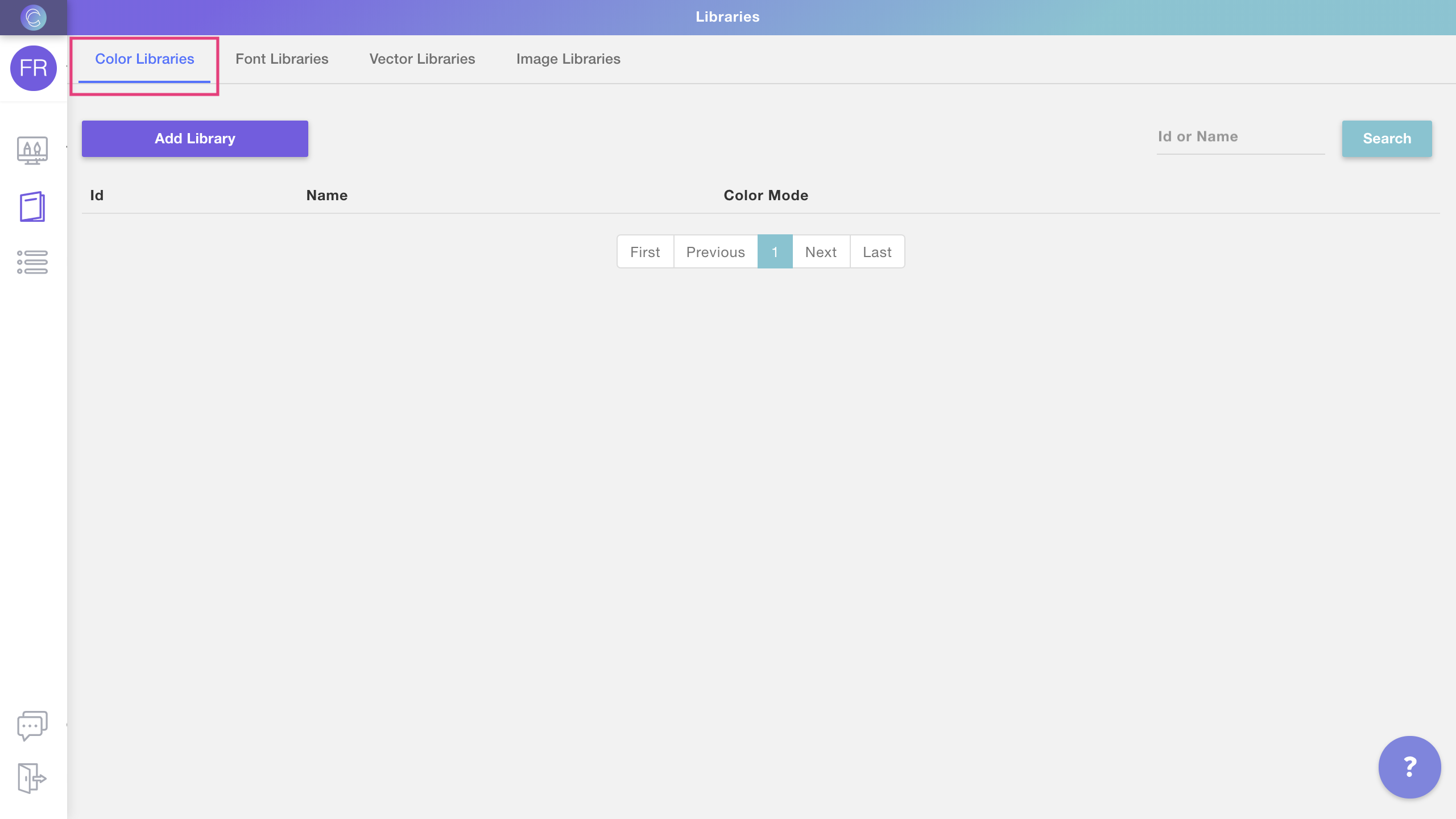
- Open the libraries menu as shown
- Select **Color Libraries Tab
**
- Click Add Library to create a new library
- Name your library, choose a color mode and click create to start
choosing the colors for the library
- Once the library is created you will see it on your library list. Click
Edit to see the library and start adding colors to it
To add color options to your library
- Click Edit to see the library and add, delete or modify color options
in it
- To add a new color option click **Add color
**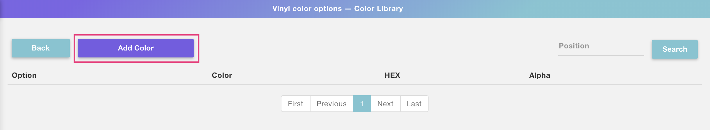
- Choose the color option you are going to add. If this is the first color
you are adding to the library, then it will be option 1
💡 Tip:
If you want to assign a color to a different option, you can either type the
option number, or click the arrows next to it to change options.
- Select the color from the color toolbar and click Create Color to save
the color into that
option.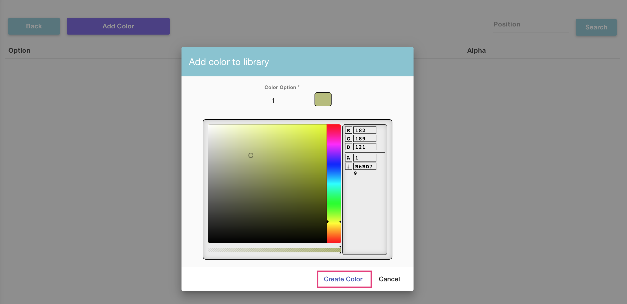
- You'll now see the color was saved into option number 1. Repeat this as
many times as colors you want to add to the library. At the end of the
process, you'll have something like this:
💡 Tip:
Every extra color you add will be automatically added to the following option.
For example, if you already have 4 options set, the next color you add will by
default be added in color option 5, unless you change that manually of course.
To edit a color library
- Select any library you want to edit from your libraries list and click the
Edit button
- Once inside the library, you can either add new colors , **edit
existing colors , and delete existing colors.**
To clone a color library
- Select any library you want to edit from your libraries list and click the
Clone button
- The cloned library will appear at the end of the list, with the text
"cloned" added to its name. To edit that library's name just click the name to
make it active, type any new name you want and hit enter.
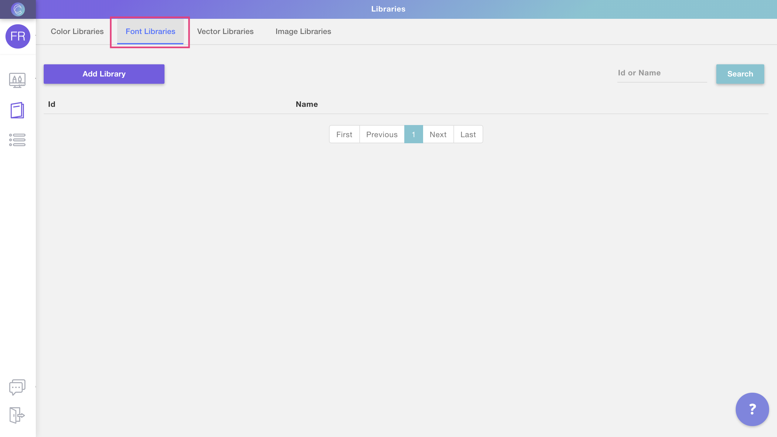
▶ What is a Library?
A Customily Library is a collection of design assets to be used on your
templates. Several types of design assets can be used to create libraries,
this includes: color libraries, font libraries, vector libraries, and image
libraries.
Libraries let you organize your design assets and keep multiple templates up
to date with them. For example, if you edit a library to add a new color
option, all your templates that are using that color library will be updated
to include the new color.
This way you can reuse assets and properties across multiple templates,
without having to load the options over and over again in each template. It's
especially useful if your products have similar personalizations since you can
use libraries to apply these personalization options across all of them at
once.
Libraries available are:
Learn how to access your libraries' configuration
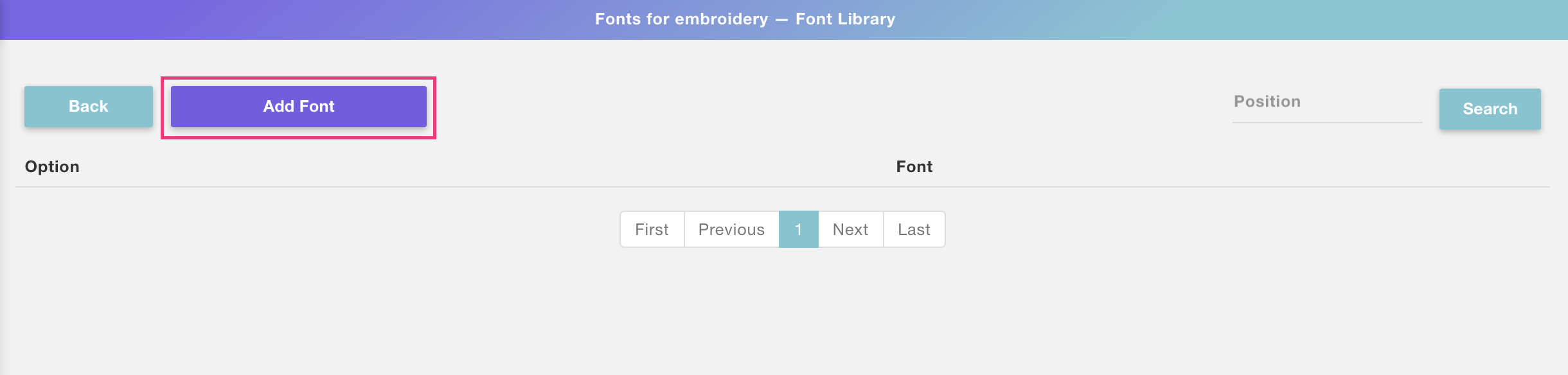
▶ Font Libraries
Font Libraries let you organize font options to use on multiple templates at
the same time. Font Libraries can be applied to:
- Text Elements
Once you assign a library to a Customily element, every change you make on the
library will be reflected in that element.
For example, let's say you want to offer 5 new font options for your
embroidered products. If you edit the library that has all the embroidery
fonts and add 5 new fonts to it, all the texts that use this library will be
updated across all templates!
To create a font library
- Open the libraries menu as shown
- Select **Font Libraries Tab
**
- Click Add Library to create a new library
- Name your library and click create to start choosing the fonts for the
library
- Once the library is created you will see it on your library list. Click
Edit to see the library and start adding fonts to it
To add font options to your library
- Click Edit to see the library and add, delete or modify font options
in it
- To add a new font option click **Add font
**
- Choose the font option you are going to add. If this is the first font you
are adding to the library, then it will be option 1
💡 Tip:
If you want to assign a font to a different option, you can either type the
option number or click the arrows next to it to change options.
- Select the font from the dropdown and click Create Font to save the
font into that
option.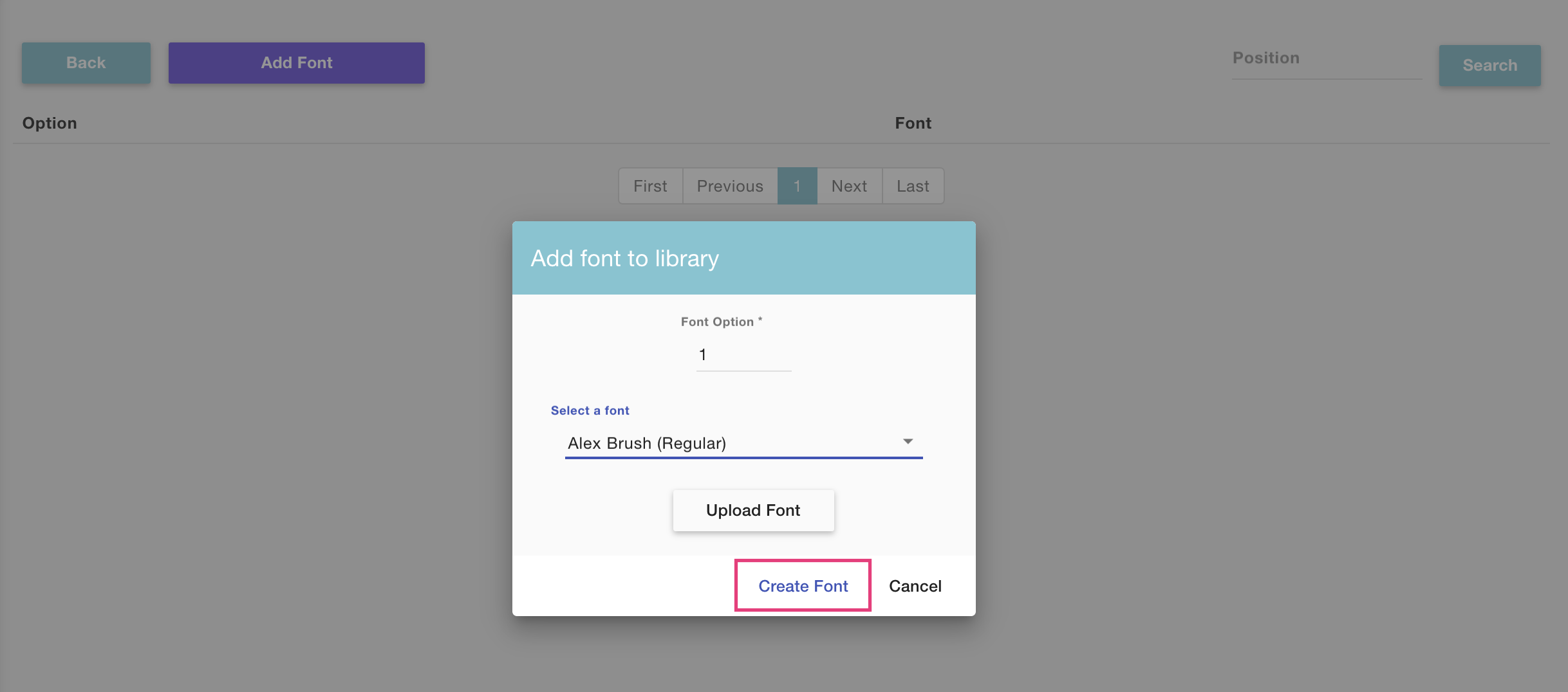
To upload a new font:
If the font you want to choose is not available on the list, then you will
need to upload it into Customily. To upload a new font just click **Upload
Font and select the .ttf or .otf** file for the font you'd like to
use.
Once uploaded it will immediately appear on the font list for you to choose
it.
- You'll now see the font was saved into option number 1. Repeat this as
many times as fonts you want to add to the library. At the end of the process,
you'll have something like this:
💡 Tip:
Every extra font you add will be automatically added to the following option.
For example, if you already have 3 options set, the next font you add will by
default be added in font option 4, unless you change that manually of course.
To edit a font library
- Select any library you want to edit from your libraries list and click the
Edit button
- Once inside the library, you can either add new fonts , **edit
existing fonts , and delete existing fonts.**
To clone a font library
- Select any library you want to edit from your libraries list and click the
Clone button
- The cloned library will appear at the end of the list, with the text
"cloned" added to its name. To edit that library's name just click the name to
make it active, type any new name you want and hit enter.
▶ How to bulk download your production files
We offer the possibility to bulk download your production files from
ourAmazon S3 bucket using
Cyberduck. In this guide we'll show you how you could
do this:
- Download and install Cyberduck from https://cyberduck.io/
- Open Cyberduck and go to Bookmark -> New Bookmark
- A new window will open, this is here you should enter your connection settings:
Connection Settings
Make sure to select "Amazon S3" as the connection type.
Contact our support team so they can
provide you with your "Access Key ID", "Secret Access Key" and "Path" settings
for your account.
- Close the window (everything will be saved, there's no save button)
- Now go to your Bookmarks view, right-click your bookmark and select "Connect to server":
Once you are connercted, you'll see a list of all your production files to
download.
Please be patient, if you have a lot of production files, it will take a
couple of minutes to load them
File names
By default, all the production files will have a random
GUID as a file
name. If you have a Shopify store and are subscribed to one of our unlimited plans, you can have these files
automatically renamed after your order number, client's name, etc.
▶ Vector Libraries
Vector Libraries let you organize dynamic vector options to use on multiple
templates at the same time. Vector Libraries can be applied to:
- Dynamic Vectors
Once you assign a library to a Customily element, every change you make on the
library will be reflected in that element.
For example, let's say you want to offer 5 new vector options for your printed
products. If you edit the library that has all the vectors used for those
prints and add 5 new EPS to it, all the dynamic vectors that use this library
will be updated across all templates!
To create a vector library
- Open the libraries menu as shown
- Select **Vector Libraries Tab
**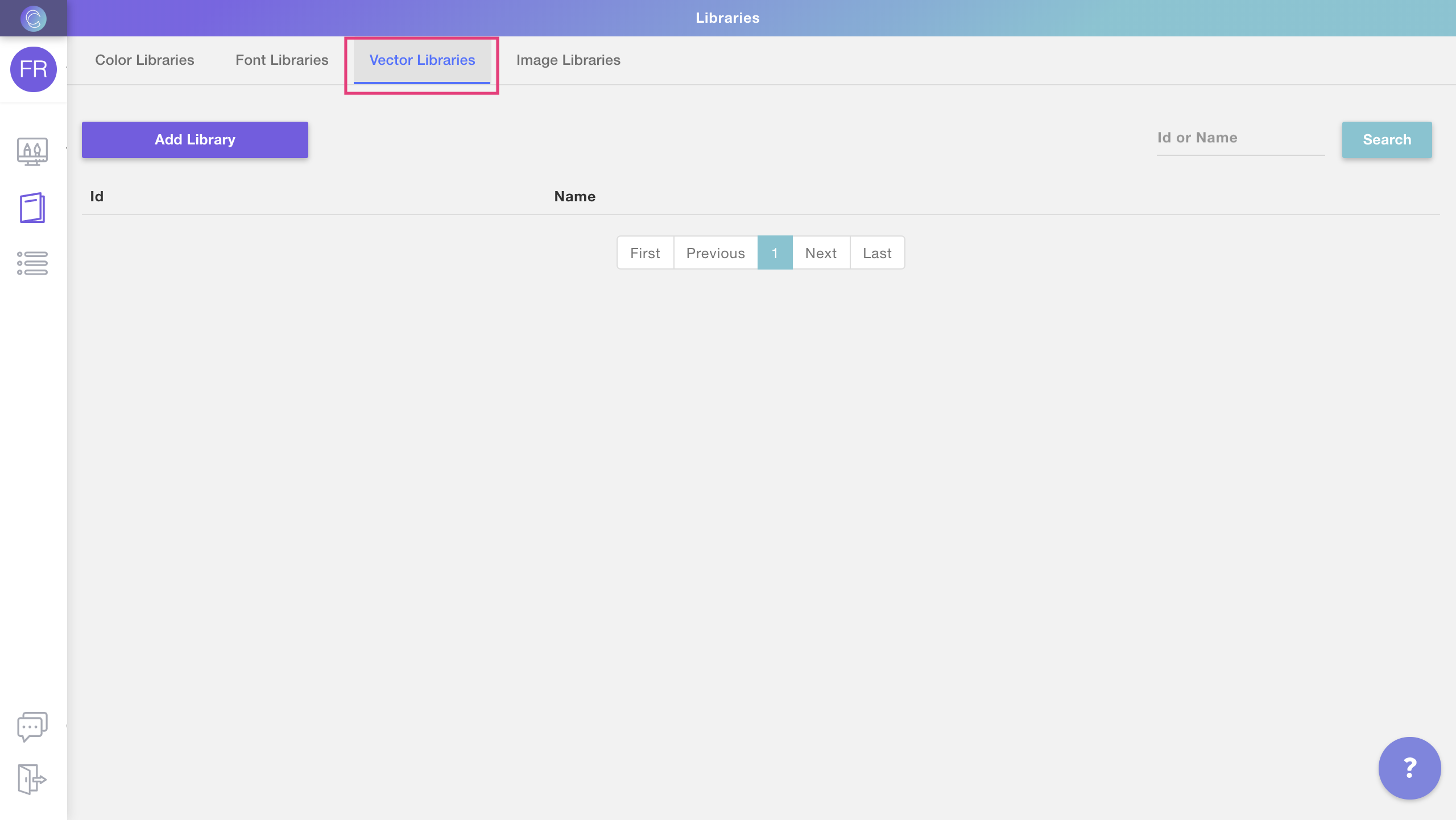
- Click Add Library to create a new library
- Name your library and click create to start choosing the vectors for
the library
- Once the library is created you will see it on your library list. Click
Edit to see the library and start adding vectors to it
To add vector options to your library
- Click Edit to see the library and add, delete or modify vector options
in it
- To add a new vector option click **Add Vector
**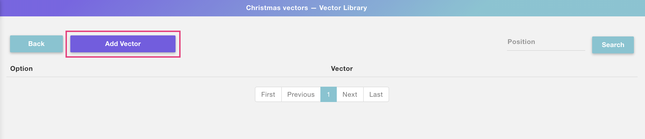
- Choose the vector option you are going to add. If this is the first vector
you are adding to the library, then it will be option 1
💡 Tip:
If you want to assign a vector to a different option, you can either type the
option number or click the arrows next to it to change options.
- Click Upload Eps(s) to select the vector you want to add to that
option.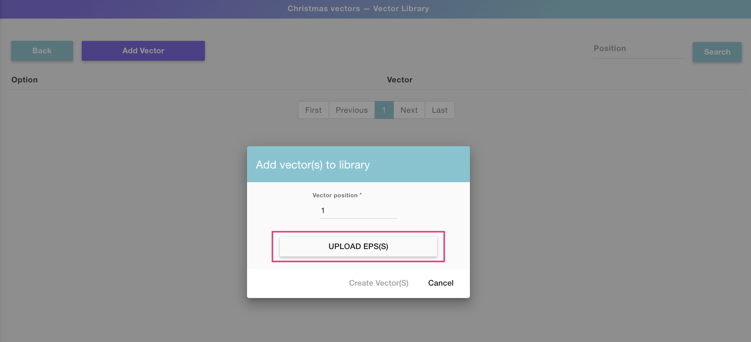
Pro tip!!
You can upload multiple vectors in consecutive positions by selecting them all
together from the upload dialog. The vectors will be uploaded in the same
order as the files appear on your folder.
- Once the EPS (or multiple EPS!) is uploaded, click Create Vector(s)
- You'll now see the vector was saved into option number 1. Repeat this as
many times as vectors you want to add to the library. At the end of the
process, you'll have something like this:
💡 Tip:
Every extra vector you add will be automatically added to the following
option. For example, if you already have 3 options set, the next vector you
add will by default be added in vector option 4, unless you change that
manually of course.
To edit a vector library
- Select any library you want to edit from your libraries list and click the
Edit button
- Once inside the library, you can either add new vectors , **edit
existing vectors , and delete existing vectors.**
To clone a vector library
- Select any library you want to clone from your libraries list and click
the Clone button
- The cloned library will appear at the end of the list, with the text
"cloned" added to its name. To edit that library's name just click the name to
make it active, type any new name you want and hit enter.
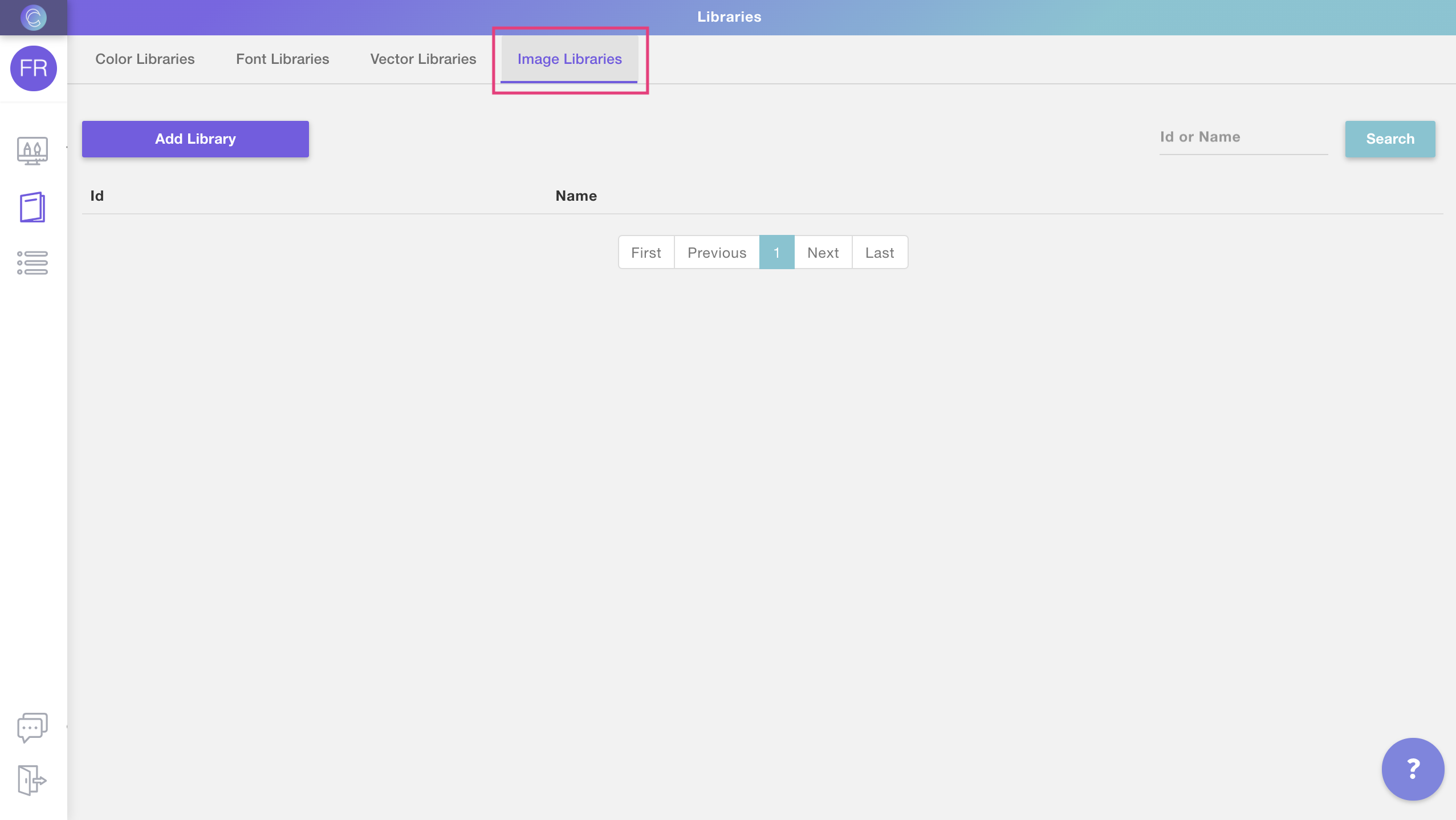
▶ How to access Libraries
To access your Customily Libraries's configuration:
- Open the sidebar menu
- Click libraries
📝 Note:
If you don't have libraries available on your menu, please contact
support@customily.com and ask our team to enable this feature for you!
▶ Image Libraries
Image Libraries let you organize dynamic image options to use on multiple
templates at the same time. Image Libraries can be applied to:
- Dynamic Images
Once you assign a library to a Customily element, every change you make on the
library will be reflected in that element.
For example, let's say you want to offer 5 new image options for your printed
products. If you edit the library that has all the images used for those
prints and add 5 new PNGs to it, all the dynamic images that use this library
will be updated across all templates!
To create an image library
- Open the libraries menu as shown
- Select **Image Libraries Tab
**
- Click Add Library to create a new library
- Name your library and click create to start choosing the images for
the library
- Once the library is created you will see it on your library list. Click
Edit to see the library and start adding images to it
To add image options to your library
- Click Edit to see the library and add, delete or modify image options
in it
- To add a new image option click **Add Image
**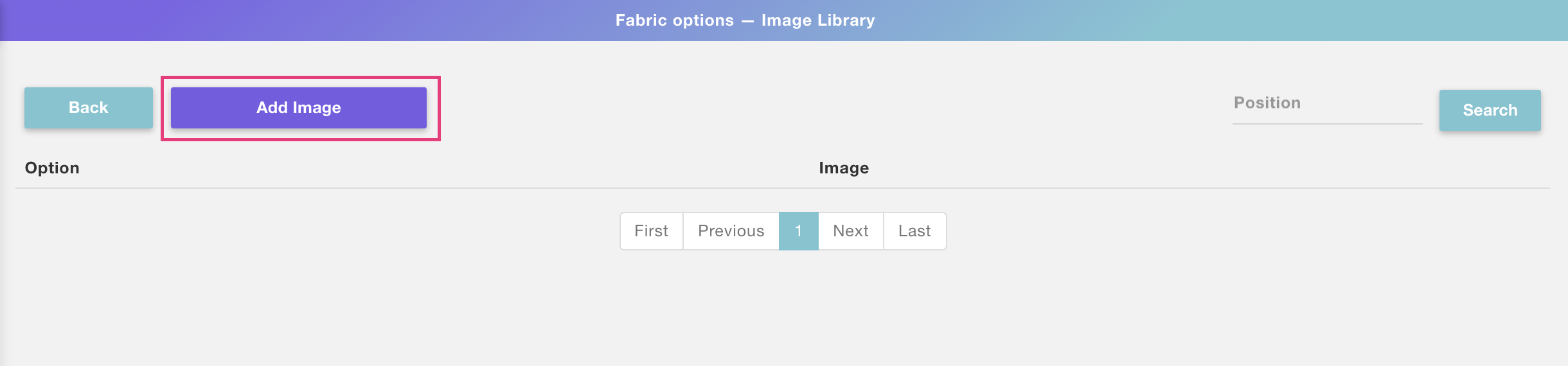
- Choose the image option you are going to add. If this is the first image
you are adding to the library, then it will be option 1
💡 Tip:
If you want to assign an image to a different option, you can either type the
option number or click the arrows next to it to change options.
- Click Upload Image(s) to select the image you want to add to that
option.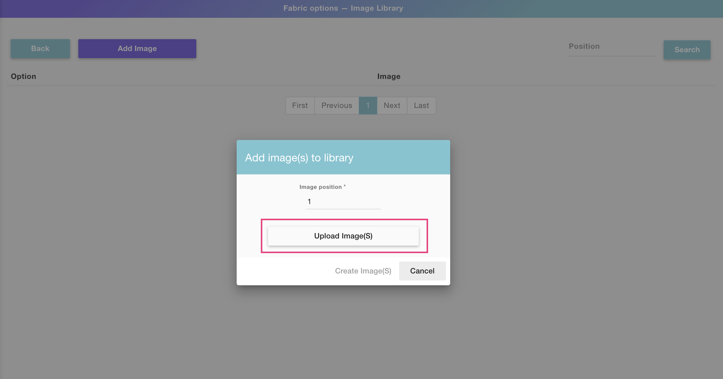
Pro tip!!
You can upload multiple images in consecutive positions by selecting them all
together from the upload dialog. The images will be uploaded in the same order
as the files appear on your folder.
- Once the image (or multiple images!) is uploaded, click **Create
Image(s)**
- You'll now see the image was saved into option number 1. Repeat this as
many times as images you want to add to the library. At the end of the
process, you'll have something like this:
💡 Tip:
Every extra image you add will be automatically added to the following option.
For example, if you already have 3 options set, the next image you add will by
default be added in image option 4, unless you change that manually of course.
To edit an image library
- Select any library you want to edit from your libraries list and click the
Edit button
- Once inside the library, you can either add new images , **edit
existing images , and delete existing images.**
To clone an image library
- Select any library you want to clone from your libraries list and click
the Clone button
- The cloned library will appear at the end of the list, with the text
"cloned" added to its name. To edit that library's name just click the name to
make it active, type any new name you want, and hit enter.
▶ Dynamic Image
Dynamic Images are places where you can add pre-set images to your designs. It
can be a single image or a collection of images for customers to choose from,
that is why they are dynamic!
They are a very versatile element, that can be used in many ways on your
designs. For example:
- if you want to add a fixed graphic to your design (like a nice quote, or a frame) you can add it as a dynamic image
- if you want to give customers clipart options to choose from (like choosing their own pet, or their hairstyle) you can upload all those options into a dynamic image
- if you want to add a mask to your designs (to give a texture or distressed effect to your design, or a cool shape) you can upload it into a dynamic image
A dynamic image is represented on the canvas by a dashed line, showing the
image you uploaded onto it inside. If you have uploaded multiple images into
it, you will only see one of them at a time.
How It Works
When you add a Dynamic Image to your design:
- Shoppers see a pre-set image or a list of image options to choose from.
- If you’ve uploaded multiple images, shoppers can switch between them by selecting from a product option (like dropdowns or swatches). Only one image will show at a time—whichever one matches their selection.
- You define the position, size, and behavior of the image; shoppers don’t upload or modify the artwork.
- If Movable Image is enabled, shoppers can also reposition or resize the image within the area you define.
- * *
In this article:
- How to add a dynamic image
- Uploading image/s into the dynamic image
- Transform the dynamic image
- Allow shoppers to move the dynamic image
Dynamic images can have one or multiple images in them. The file types
supported by dynamic images are JPG and PNG. If you want to add
vectors to your design check dynamic vectors.
To add a dynamic image
You can add dynamic images on Designs, Templates, and Product bases by
clicking the Dynamic Image button.
Each dynamic image you add will have a Name that you can edit, and a Unique Id for you to
easily identify it.
Adding image/s options into the dynamic image
After creating the element you will need to add the image/s that will go in
it. You can add images in two ways:
- by manually uploading all the image options you'd like to have
- by using an image library (which is the easiest way)
By default, the first image is added in option 1, and the following images are
added in the consecutive options (2, 3, etc.).
To add image/s into the dynamic image manually
- Select the dynamic image
- Click the Upload Image button
- Select the image or images (using shift) you want to upload
Tip
The first image will be added in option 1. If you've selected multiple images
using shift, the following images will be added in the consecutive options (2, 3, etc.). You can also add one image at a time by browsing through the options
using the arrows, or if you want to add an image in a specific option, you can
type that specific option number and upload the image there.
To add image/s into the dynamic image using libraries
- First, you have to create an image library. You can learn how to create an image library here.
- Select the dynamic image
- Click Pick Library
- Choose the image library you'd like to use
Tip
To see all the image options a dynamic image has, just click the arrows next
to the option number to browse through all options. You can also type a
specific number if you want to jump faster to a certain image option.
Important
Images uploaded into the dynamic images will be set to fit the dynamic image
area. So we always recommend uploading images with the same sizes, to avoid
unwanted changes in size when switching between image options (this is a classic thing that happens when using hair clipart, because of the size difference between long and short hair). Here you can learn how to prepare your images before adding them to a dynamic image (or an image library) to make sure they are all the perfect size.
Transform the dynamic image
Directly on the canvas or by expanding the Transform toolbox, you can
transform the
dynamic image:
Keep in mind
Transforming the dynamic image will transform all the images it contains
inside. So if for example, you rotate the dynamic image element, all images
inside it will be rotated. If you want to transform one image option only, you
should edit the image before uploading it into the dynamic image element.
Allow Movable Dynamic image
Enabling this option allows customers to move and resize the dynamic image
inside the defined area. This is useful when you want to give shoppers more
freedom in adjusting the layout—like repositioning an icon within a frame or
shifting an artwork around a photo.
To allow Movable Dynamic image
- Select the dynamic image element
- Expand the Image Behavior toolbox
- Check Allow moving image inside bounding box
Tip
When this option is enabled, the image placeholder bounding box will become
the area of movement. Customers will be able to click and drag the image to
change its position and resize it within that area. If you want to make the
area bigger, just resize the image placeholder on the canvas or with the tool
box.
If disabled, the image will stay locked in the position you define.
▶ Curved Text
Curved Texts are places where customers can type their own custom text along a
curve. The curved text sets the path and boundaries where text can be typed,
and is represented on the canvas by a circle or ellipse with the text on it.
You can format curved texts in many ways to give customers further options.
How It Works
When you add a Curved text to your design:
- Shoppers will see a text input to type custom text algo a defined arc.
- As they type, their custom text appears live in the design preview.
- You control the curve, font, size, color, alignment, and styling.
- If multiple font or color options are added , shoppers will see options to pick from them.
- * *
In this article:
- Add curved text to your design
- Move, resize, and transform the text
- Style and format the text
- Apply color and outlines
- Use advanced settings (prefix, suffix, etc.)
- Test how it works for shoppers
To add a curved text
You can add curved texts on Designs and on Templates, by clicking the **Curved
Text button
**
Each curved text that you add will have a Name that you can edit, and a Unique
Id for you to easily identify it.
How to move, resize, and transform the text
Directly on the canvas or by expanding the Transform toolbox, you can
transform the
text box:
How to style and format the text
After selecting the element, expand the Character toolbox to format the curved
text. Click on each item to learn more:
- Font Option
- Font size
- Alignment
- Tracking
- Text String length
- Text Side
- All Caps
Font Option
You can apply one or multiple fonts to a curved text element.
- Select the curved text
- Expand the Character toolbox
- Click to expand the Select a Font list
- Pick a font from the list
New accounts will just have a couple fonts available. You can easily add as
many fonts as you want to your font list.
Tip
You can add multiple font options to a curved text. To add more than one font
option you can either use a font library or assign multiple font options by clicking **\+
Add font option** and choosing a new font.
Font Size
The font size is independent of the curved text path dimensions (which can be edited in the transform toolbox). Curved texts have a font size range ,
meaning you can set a minimum and a maximum font size. This is to allow text
to resize when customers type something super long (making the text smaller to fit more characters).
We recommend using the Max Size as the size that you want. The Min Size will
be the limit of the resizing, to ensure that small texts still look good and
are printable, leaving the value that comes by default is a great choice. If
you don't want the text to be able to resize at all, you should use the same
value on both.
- Select the curved text element
- Expand the Character toolbox
- Type in the Max (and Min if desired) font size in points (pts)
Alignment
You can align a text inside the path string:
\- Left, Center, Right, Justified
- Select the curved text element
- Expand the Character toolbox
- Select from the dropdown the Alignment
Tracking
You can adjust the tracking (character spacing) of your text by inputting the
values. Tracking is expressed in %.
- Select the text element
- Expand the Character toolbox
- Type in a value you want for Tracking
Text String length
The text string is the portion of the path where the text can be written. It
marks the beginning and the end of the text. You can adjust both the start and
end of the string to limit the path where the text can be written.
- Select the curved text element
- Expand the Character toolbox
- Type in a value for the String Start and String End. You can also adjust the text string by using the string handles on the workspace.
Text Side
The text side will determine where the text is positioned along the path if
it's on its concave or convex side.
▶ Map
With custom maps, you can let customers immortalize a special place. By
choosing a location the map will show the area so customers can pick their
favorite spot. You can format maps in different ways to offer customers
further personalization options.
How It Works
When you add a Map element to your design:
- Shoppers will type an address or location, and a live map will be generated instantly.
- You customize the style, size and shape of the map.
- Shoppers can change the map locations and zoom level.
- If multiple style options are added, shoppers will see options to pick from them.
- * *
In this article:
- How to add a map
- Transform the map
- Change the map style and behavior
To add a map
You can add maps on Designs and on Templates, by clicking the Map button.
Each map you add will have a Name that you can edit, and a Unique Id for you to
easily identify it.
Transform the map
Directly on the canvas or by expanding the Transform toolbox, you can
transform the
map:
Change the map style and behavior behavior
Changing the behavior of the map will affect what options are available for
customers to further personalize it. You can configure different behaviors:
- Set the initial location
- Add a mask to the map
- Choose map styles
Initial location
Changing the initial location will affect what the map displays when loading.
The location is an option that customers always need to fill in, so whatever
you choose here will only apply to the initial loading of the map.
- Select the map
- Expand the Map Behavior toolbox
- Click Select Initial Location
- Type a desired location. You can type a specific address, a city, or a country
- Zoom in or out and move around to get the exact view you want to load
- Click select
Add a mask to the map
Masks let you give the map a particular shape (other than a square or rectangle!).
- Select the map
- Expand the Map Behavior toolbox
- Click Upload mask
- Select the JPG file you want to use as a mask.
For masks to work, the file needs to be a black-and-white image of the mask,
where the shape you want the placeholder to have is black and the background
of the image is white, in good quality (we recommend at least 1000x1000 px),
since the better the quality the smoother the mask. Here are some examples of
masks:

Tip
You can also create masks simply by layering elements on top of each other.
This is especially helpful if you want to mask images with a specific design
on top of them. To achieve this add a PNG on top of the map using a dynamic image, or a
vector using a dynamic vector.
Choose Map Style
You can choose one or multiple styles for your map. By default, the street
style comes selected, but you can choose as many styles as you want. When
choosing more than one style, they will be available for your customers to
pick they want to use while personalizing.
- Select the map
- Expand the Map Behavior toolbox
- Check/uncheck the styles that you want to make available
Tip
The map styles available are pre-defined by Customily, we offer a wide range
of styles and continue to add more! You can find a list of all the styles available here.
When you choose several styles, a choose map style option will be added to
your product, like this: !map style.png
▶ Star Map
With custom star maps, you can let customers immortalize a special place and
moment in time. By choosing a location and a date, the star map will show how
the sky looked on that exact occasion. You can format star maps in different
ways to offer customers further personalization options.
How It Works
When you add a Star Map element to your design:
- Shoppers select a date and location, and the sky map updates automatically.
- The map shows the position of stars and constellations from that moment.
- You customize the style, size labels and layout of the map.
- If multiple style options are added , shoppers will see options to pick from them.
- * *
In this article:
- How to add a star map
- Transform the star map
- Change the star map behavior and style
To add a star map
You can add star maps on Designs and on Templates, by clicking the **Star map
button**.
Each star map you add will have a Name that you can edit, and a Unique Id for you to
easily identify it.
Transform the star map
Directly on the canvas or by expanding the Transform toolbox, you can
transform the
star map:
Change the star map behavior and style
Changing the behavior of the star map will affect what options are available
for customers to further personalize it. You can configure different
behaviors:
- Set the initial location and initial date
- Add constellations, grid lines, and the Milky Way
- Choose map styles
Initial location and initial date
Changing the initial location and initial date will affect what the map
displays when loading. Location and dates are options that customers always
need to fill in, so whatever you choose here will only apply to the initial
loading of the map.
- Select the star map
- Expand the Star Map Behavior toolbox
- Type a desired location. You can type a specific address, a city, or a country.
- Pick the initial date
Add constellations, grid lines, and the Milky Way
You can choose what elements to show on your star map, or give customers the
ability to choose what they want by activating the different checkboxes:
- Constellations: Will show the lines forming the constellations
- Grid lines: will show the latitude and longitude lines on the map
- Milky Way: will show the hazy band of light that represents the Milky Way
- Let shoppers choose: this will create an option where customers can choose whether they want to see these elements or not.
- Select the star map
- Expand the Star Map Behavior toolbox
- Check/uncheck Constellation, Grid Lines, Milky Way, and/or Let shopper choose what to show
Keep in mind
If you select the checkbox for any of these elements they will be fixed on the
star map. If you'd like these elements to be optional, then you should choose
"let shoppers choose" as this will add the options for customers to choose
what elements they want to see when customizing the star map.
Choose Map Style
You can choose one or multiple styles for your map. By default, the dark
style comes selected, but you can choose as many styles as you want. When
choosing more than one style, they will be available for your customers to
pick they want to use while personalizing.
- Select the star map
- Expand the Star Map Behavior toolbox
- Check/uncheck the styles that you want to make available

Tip
The star map styles available are pre-defined by Customily, we offer a wide
range of styles including some transparent ones so you can add your own images
behind the stars! You can find a list of all the styles available here.
When you choose several styles, a choose map style option will be added to
your product, like this: !select star style.png
▶ My Product Bases panel overview
The my product bases panel is where you’ll find **all the product bases you’ve
created manually** inside Customily. From here, you can create new product
bases, manage existing ones, and prepare them for publishing personalized
products.
What you can do in this panel
- Search and browse your product bases
- Create a new product base
- Edit an existing product base
- Rename or change the thumbnail
- Clone or delete a product base
Product bases are shown in order of creation or last edit — the newest or most
recently edited items appear at the top of the list.
Search and browse
Use the search bar at the top left to search by product base name.
You can also browse manually by scrolling through the list or navigating
across pages.
Each product base is displayed as a card with its thumbnail, name, created
date, modified date, and a few quick actions to help you manage it.
Create a new product base
To create a new product base, click the create new product base button in the
top left corner of the panel.
This will open the product base studio, where you’ll define print areas,
mockups, and variants. Learn how to create a new product base from scratch here.
Pro Tip
If you're creating a product that's similar to an existing one, consider
cloning an existing base instead and making edits — it can save a lot of time.
Edit a product base
To edit a base, hover over it and click the pencil icon that appears.
This will open the product base studio, where you can go through each step and
update:
- Print dimensions or areas
- Print file settings
- Mockups and variant images
- Product variants and options
Once saved, the base will be updated and moved to the top of your product base
list.
Rename or change the thumbnail
To rename a product bas e:
- Hover over the name and click the pencil icon, or
- Double-click the name directly
Type the new name and press Enter to save it.
To change the product base thumbnail :
- Hover over the product image and click on it to upload a new one
Thumbnails are generated automatically from the mockup and are purely visual —
they won’t affect the product itself. You can update them if you want to
better recognize or organize your bases.
Clone or delete a base
To clone a product bas e:
- Hover over the base and click the clone icon.
This will create a new product base with the word “cloned” added to its name.
Once cloned, the product base will automatically open in the editor so you can
start making changes right away.
To delete a product base :
- Hover over the base and click the trash icon
Confirm the deletion to permanently remove it from your account.
If you've already published products using this product base, they won't be
affected when you delete it. However, deleting a product base cannot be undone
— make sure you won’t need it again before removing it.
▶ Bulk Uploading Multiple Libraries using a zip File
You can upload multiple libraries using only one action using the Bulk Upload
function.
Limitations
- 1. Currently, only image libraries are supported.
- Right now this feature is in Beta
Zip file requirements
- 1. The folders should be zipped in a .zip file (no .rar, no .7z files). Only .zip files are supported at the moment.
- Library folders should be in the root of the zip file.
- If you want to upload libraries with categories, the library should be in the root and inside the libraries there should be subfolders each with their images.
- A zip can contain both libraries with images and libraries with categories (in the form of subfolders).
- The images in the library will be sorted alphabetically.
- The maximum size is 1 GB.
- If the zip has another type of structure, the upload will fail.
Image Order and Thumbnails
- The images in the library will be ordered alphabetically.
- For Categories, the last image will be used for the thumbnail.
- To choose a specific image as a thumbnail, you will need to upload an image with the name "+++". That image will not be included in the category folder. For example, a folder with this images:
##

Will result in a Category with the following thumbnail:
Note that the image for the thumbnail needs to appear two times when using
the "+++" naming.
After the process
- 1. The uploaded libraries will be displayed in the library view. Only the uploaded libraries will be shown
- If you refresh the page, you will be returned to the full library view.
Examples
When building the the zip file, the following configurations could arise:

A is correct. The zip file with this contents will create two libraries,
one will be "pets" and have two categories ("birds" and "cats") and the other
will be "foods", without any category.
B is wrong. The "food" folder has both images and a folder inside it.
"vegetables" should be a folder either a folder at the same level as food or
"apple, banana and strawberry" should be inside another folder like "fruits".
C is wrong because all of the folders are inside a "MyLibraries" folder.
The libraries should be in the root of the zip file
▶ Transforming an element
By selecting an element and expanding the transform toolbox you can transform
their:
- position
- rotation
- size
- skew
- flip
- order
These transformations can also be done directly in your workspace when
selecting the elements.

Positioning an element
The position of an element can be adjusted simply by selecting the element and
dragging it around the canvas. If you'd like to change the position more
precisely you can do so by entering the X and Y values on the toolbox.

To reposition from the workspace:
- Click the element
- Drag it around the workspaces to change its position. You can also use the arrow keys on your keyboard to move it.
To reposition from the tool panel:
- Click the element
- Expand the transform toolbox
- Change its X and/or Y values. The position is always shown in millimeters (mm), with 0 being the top left corner of the canvas.
Tip
If you want to align elements to the canvas or between each other, you can do
so by using the align buttons. Simply select one or more elements and choose
the alignment you want.

Rotating an element
The rotation of an element can be adjusted by selecting the rotation handle on
the top of the element. If you'd like to change the rotation more precisely
you can do so by entering the degrees on the toolbox

To rotate from the workspace:
- Click the element
- Select the rotation handle on the top of the element and move it around.
To rotate from the tool panel:
- Click the element
- Expand the transform toolbox
- Change its Rotation (R) value. The rotation is always shown in degrees (dg).
Resizing an element
The dimensions of an element are represented on the workspace by a light blue
line. You can resize an element by clicking and dragging its handles from the
workspace or by changing its width (W) and height (H) values on the toolbox.

To resize from the workspace:
- Click the element
- Select the corner or side handles of the element to resize it.
The side handles will stretch the element, the corner handles will resize it
proportionally. You can hold shift while resizing to resize from the
center of the element.
To resize from the tool panel:
- Click the element
- Expand the transform toolbox
- Change its width (W) and/or height (H) values. The dimensions are always shown in millimeters (mm).
Tip
You can easily resize an element to be the size of the whole canvas with one
click. Just select the element and click the fit to canvas button.
Adding skew to an element
Skew lets you apply perspective to the elements. You can use it on your
designs, or as a great way to add a more realistic feel to your mockups. You
can add skew by holding ctrl and clicking and dragging the side handles
from the workspace or by changing the horizontal skew and vertical skew values
on the toolbox.

To resize from the workspace:
- Click the element
- Press and hold ctrl
- Select the side handles of the element to add skew.
The left and right handles will add vertical skew. The top and bottom handles
will add horizontal skew.
To resize from the tool panel:
- Click the element
- Expand the transform toolbox
- Change its horizontal skew (skew H) and/or vertical skew (skew V) values. The skew is always shown in degrees (dg).
Flipping an element
You can flip an element horizontally or vertically by clicking the button.
Once the element is flipped, anything in it (wether is text, uploaded images, or dynamic elements) will be flipped.
To flip an element:
- Click the element
- Expand the transform toolbox
- Click the horizontal flip and/or vertical flip buttons
Changing the order of an element
The easiest way to change the order of an element (bring it forward or backward) is to do it from the layer panel. However, you also have the chance
to do that through the transform toolbox.

To change the order from the tool panel:
- Click the element
- Expand the transform toolbox
- Click the buttons:
!Asset 1.png to
move the element one position forward.
!Asset 2.png to
move the element one position backward.
Tip
If you want to move the order several positions, you can either click the
button multiple times or select the item from the layer panel and change its
order by dragging it up or down.
▶ Formatting an element
By selecting an element and expanding its formatting toolboxes you can format
the element in different ways. Depending on the kind of element (for example, if it's a text or an image) the things you can format will be different. They
include:
Character settings
This is where you can format all things related to texts. So this setting is
only available for:
- Text box
- Circular text

The things you can format are:
- Font options
- Font size
- Horizontal and Vertical alignment
- Side (only available for curved text)
- Text string start and end (only available for curved text)
- Tracking (only available for text box)
- Multiline text and Line spacing (only available for text box)
- Capitalization
Color settings
This is where you can configure the different color options for your elements.
These settings are available for:
- Text box
- Circular text

The things you can format are:
- Fill color
- Stroke width and color (only available for text box)
Image behavior settings
This is where you can configure how shopper-uploaded images will work. These
settings are available for:
- Image placeholder
The things you can format are:
- Image type: whether it is full color, single color, or greyscale
- Fit / Fill
- Rotation Lock
- Remove background filters
- Face cutout filters
- Cartoonize filters
- Add a mask
Vector behavior settings
This is where you can configure how vectors work on your designs. These
settings are available for:
- Vector placeholder
- Dynamic vector
The things you can format are:
- Fit / Fill (only available for Vector Upload)
- Rotation Lock (only available for Vector Upload)
- Vector type: whether it is full color or single color (only available for Dynamic Vector)
Advanced settings
Lets you add a little extra to text elements. So this setting is only
available for:
- Text box
- Circular text

The things you can format are:
- Prefix: a default text to appear before what shoppers type
- Suffix: a default text to appear after what shoppers type
▶ Text Box
Text Boxes are places where customers can type their own custom text. The box
sets the boundaries where text can be typed, and is represented on the canvas
by a dashed line around the text. You can format texts in many ways to give
customers further options.
How It Works
When you add a Text element to your design:
- Shoppers will see a text input to type custom text.
- As they type, their custom text appears live in the design preview.
- You control the font, size, color, alignment, and styling.
- If multiple font or color options are added , shoppers will see options to pick from them.
- If Movable Text is enabled, shoppers can also reposition or resize the text within the area you define.
- * *
In this article:
- Add a text box to your design
- Transform the text box
- Style and format the text
- Apply color, outlines, and textures
- Use advanced features (movable text, prefix, masking)
- How to test how the text will look
To add a text box
You can add text boxes on Designs and on Templates, by clicking the **Text Box
button**.
Each text box that you add will have a Name that you can edit, and a Unique Id for you to
easily identify it.
How to move, resize and transform the text box
Directly on the canvas or by expanding the Transform toolbox, you can
transform the
text box:
How to style and format the text
After selecting the element, expand the Character toolbox to format the text
inside the text box. Click on each item to learn more:
- Font Option
- Min and Max font size
- Alignment
- Tracking and Line Spacing
- Automatic Multiline
- All Caps
- Vertical Text
Font Option
You can apply one or multiple fonts to a text element.
- Select the text element
- Expand the Character toolbox
- Click to expand the Select a Font list
- Pick a font from the list
New accounts will just have a couple fonts available. You can easily add as
many fonts as you want to your font list.
Tip
You can add multiple font options to a text element. To add more than one font
option you can either use a font library or assign multiple font options by clicking **\+
Add font option** and choosing a new font.
Font Size
Text boxes in Customily have a font size range , meaning you can set a
minimum and a maximum font size. This is to allow text to resize when
customers type something super long (making the text smaller to fit more characters).
We recommend using the Max Size as the size that you want. The Min Size will
be the limit of the resizing, to ensure that small texts still look good and
are printable, leaving the value that comes by default is a great choice. If
you don't want the text to be able to resize at all, you should use the same
value on both.
- Select the text element
- Expand the Character toolbox
- Type in the Max (and Min if desired) font size in points (pts)
Tip
To preview how the Min or Max font size will look on your design you can click
the  next
to them.
If the sizes you choose are too big for the text box, the size will paint red
and you will see a warning letting you know that the font size should be
smaller to fit within your text box boundaries.
Alignment
You can align a text inside the textbox horizontally and vertically.
\- Horizontally: Left, Center, Right, Justified
\- Vertically: Top, Center, Bottom
- Select the text element
- Expand the Character toolbox
- Select from the dropdown the Horizontal Alignment and the Vertical Alignment.
Tracking and Line Spacing
You can adjust the tracking (character spacing) and/or leading (line spacing)
of your text by inputting the values. Both tracking and leading are expressed
in %.
- Select the text element
- Expand the Character toolbox
- Type in a value you want for Tracking or Line Spacing.
▶ Locking elements
You can lock elements on the Layer Panel to avoid editing them while working
on your designs.
To lock an element
- Select the element on the Layer Panel or Workspace
- Go to the Layer Panel
- Click  next to the layer name
When locked, the layer will be identified with the
 and its
boundaries will be red. Locking the element will prevent you from editing it
in any way (moving, resizing, deleting, etc.)

To unlock an element
- Select the element on the Layer Panel or Workspace
- Go to the Layer Panel
- Click  next to the layer name
▶ Hiding elements
You can hide elements on the Layer Panel to avoid seeing them on the
Workspace. Unlike with locked elements, hidden elements can still be edited if selected
from the Layer Panel.
To hide an element
- Select the element on the Layer Panel or Workspace
- Go to the Layer Panel
- Click the  next to the layer name
When hidden the layer will be identified with the
 and it
wont be visible or selectable on the Workspace.

To show an element
- Select the element on the Layer Panel or Workspace
- Go to the Layer Panel
- Click the  next to the layer name
Important
You can choose to hide elements everywhere, or only on the print file /
preview. Keep in mind elements hidden on the print file won't be printed.
▶ Renaming Elements
Keep your elements organized by renaming them on the Layer Panel.
- Expand the layer panel
- Double-click on the Layer name to highlight it
- Write the new name
- Press enter or click anywhere outside of the name to save it. Press Esc to cancel the rename.

Pro Tip
The name of the elements is what is used later on as a label for the options
your customers will interact with. So naming the layer like you would call the
option will save you a lot of work. Great examples of layer names are:
- "Add your text"
- "Woman's Name"
- "Choose hairstyle"
▶ Changing the canvas size
You can change the size of your canvas by clicking the Resize button on the
top right corner of your Workspace.

This will open a dialog where you can type the new size you want. You can
define the size in the following units:
- millimeters
- inches
- pixels
Keep in mind
The units of the Workspace are always millimeters. So if you change the size
to a specific measure in inches, on the Workspace it will be shown on its
corresponding mm.
For example, resizing the canvas to 20x20", will result in a canvas of 508x508
mm.
▶ Image placeholder
Image placeholders are places where shoppers can upload their own pictures. An
image placeholder sets the boundaries where the picture will be uploaded and
is represented on the canvas by a dashed line. You can format image
placeholders in many ways to give customers further options.
How It Works
When you add an Image placeholder to your design:
- Shoppers will be able to upload their own image (JPG, PNG, BMP, HEIC).
- The image appears inside the placeholder you set on the design.
- You control the shape, position, and size of the placeholder.
- Shoppers are able to move the image inside the placeholder.
- You can automatically apply filters, remove the background, cut out faces, to whatever image the shopper uploads.
Shoppers can upload one image per placeholder. The file types supported by
image placeholders are JPG , PNG , BMP and HEIC. If you want
customers to upload other formats, such as PDF or Vectors, check vector placeholders.
- * *
In this article:
- How to add an image placeholder
- Transform the image placeholder
- Change the uploaded image behavior
- Apply AI Filters and Effects to Uploaded Images
- Add an outline to the image
- How to test how the shopper-uploaded image will look
To add an image placeholder
You can add image placeholders on Designs and on Templates, by clicking the
Image Placeholder button.
Each image placeholder you add will have a Name that you can edit, and a
Unique Id for
you to easily identify it.
Transform the image placeholder
Directly on the canvas or by expanding the Transform toolbox, you can
transform the
image placeholder:
Change the uploaded image behavior
Changing the behavior of the placeholder will affect what happens when a
customer uploads an image. You can configure different behaviors to apply
effects and filters to the images:
- Image type: whether it is full color, single color, or greyscale
- Add a mask
- Fit / Fill the placeholder area
- Limit image size to placeholder area
- Rotation Lock
- Text to image with OpenAI
Image type
You can choose between 3 image types to change the color mode of the user- uploaded image. Image types available are:
Full Color
Images in full color mode will remain exactly as the customer uploaded them.
This is the standard mode for images. !full color image.png
Grayscale
Images in grayscale mode will be converted to grayscale (black and white)
Single Color (Image Tracing)
Images in single color mode will be traced and converted to vectors with a
single color. You can pick what color to use for the vector, and even give
multiple color options for customers to choose from. !single color image.png
- Select the image placeholder
- Expand the Image Behavior toolbox
- Select from the dropdown the Image Type
- If you selected Single Color, click the color swatch or the color picker to select a color. Using the swatch you can add colors with Hex, RGB-A, or CMYK-A values (the last 2 depend on the color mode of your design). If you want to add transparency, just slide the Alpha control on the bottom of the chart.
Tip
If you select single image mode, you can add multiple color options to the
user-uploaded image. To add more than one color option you can either use a color library or
assign multiple color options by changing the Option number to the left of
the color swatch and choosing a new color.
Add a mask
Masks let you give the placeholder a particular shape (other than a square or rectangle!).
- Select the image placeholder
- Expand the Image Behavior toolbox
- Click Upload mask
- Select the JPG file you want to use as a mask.
For masks to work, the file needs to be a black-and-white image of the mask,
where the shape you want the placeholder to have is black and the background
of the image is white, in good quality (we recommend at least 1000x1000 px),
since the better the quality the smoother the mask. Here are some examples of
masks:
Tip
You can also create masks simply by layering elements on top of each other.
This is especially helpful if you want to mask images with a specific design
on top of them. To achieve this add a PNG on top of the user-uploaded image
using a dynamic image, or a vector using a dynamic vector.
Fit / Fill
By default, customer-uploaded images are set to fit the placeholder. If you'd
like the image to cover the entire placeholder, then you should enable the
fill checkbox. When images fill the placeholder, they are resized
(proportionally) to occupy the entire placeholder.
- Select the image placeholder
- Expand the Image Behavior toolbox
▶ Vector Placeholder
Vector placeholders are places where customers can upload their own vectors. A
vector placeholder sets the boundaries where the vector will be uploaded, and
is represented on the canvas by a dashed line. You can format vector
placeholders in many ways to give customers further options.
How It Works
When you add a Vector placeholder to your design:
- Shoppers will be able to upload their own vectors (PDF, SVG, EPS).
- The vector appears inside the placeholder you set on the design.
- You control the shape, position, and size of the placeholder.
- Shoppers are able to move the vector inside the placeholder.
- If multiple color options are added , shoppers will see options to pick from them.
Shoppers can upload one vector per placeholder. The file types supported by
vector placeholders are PDF , SVG , and EPS. If you want customers
to upload other formats, such as PNG or other images, check image placeholders.
- * *
In this article:
- How to add a vector placeholder
- Transform the vector placeholder
- Change the uploaded vector behavior
- Change the vector mode, between full color or single color
- How to test how the user-uploaded vector will look
To add a vector placeholder
You can add vector placeholders on Designs and on Templates, by clicking the
Vector Placeholder button.
Each vector placeholder you add will have a Name that you can edit, and a
Unique Id for
you to easily identify it.
Transform the vector placeholder
Directly on the canvas or by expanding the Transform toolbox, you can
transform the
image placeholder:
Change the uploaded vector behavior
Changing the behavior of the placeholder will affect what happens when a
customer uploads a vector. You can configure different behaviors to apply
effects and filters to the vector:
- Fit / Fill the placeholder area
- Rotation Lock
Fit / Fill
By default, customer-uploaded vectors are set to fit the placeholder. If you'd
like the vector to cover the entire placeholder, then you should enable the
fill checkbox. When vectors fill the placeholder, they are resized
(proportionally) to occupy the entire placeholder.
- Select the vector placeholder
- Expand the Vector Behavior toolbox
- Check or uncheck Fill Area option
Rotation Lock
By default, customer-uploaded vectors can be rotated freely inside the
placeholder. If you want customers only to be able to rotate it in 90°
increments, then you should enable the 90 Degree Rotation Lock checkbox.
- Select the vector placeholder
- Expand the Vector Behavior toolbox
- Check or uncheck 90 Degree Rotation Lock option
Change the vector mode
When shoppers upload a vector file, you can choose how it should appear using
Vector Mode. This controls whether the vector keeps its original colors or is
converted into a single color.
You can choose between 2 vector types to change the color mode of the user- uploaded image. Image types available are:
Full Color
This will display the uploaded vector exactly as it was designed, with all its
original colors and details. Best for detailed logos, multicolor artwork, or
designs that must preserve branding. !full color vector.png
Single Color
This converts the vector into a solid color silhouette. It's ideal for laser
cutting, engraving, or simple monogram-style designs. You can define which
color is used, or allow the shopper to choose from a list of color
options.!single color vector.png
- Select the image placeholder
- Expand the Vector Mode toolbox
- Select from the dropdown the Vector Type
- If you selected Single Color, click the color swatch to select a color. Using the swatch you can add colors with Hex, RGB-A, or CMYK-A values (the last 2 depend on the color mode of your design). If you want to add transparency, just slide the Alpha control on the bottom of the chart.
Tip
You can add multiple color options to a single color vector. To add more than
one color option you can either use a color library or
assign multiple color options by clicking Add color option and choosing a
new color.
Test how the user-uploaded vector will look
At any moment while configuring your vector placeholder, you can test how it
will look on your design, by clicking Try with a SVG, EPS, or PDF button.
This is just for you to test, whatever vector you upload there won't be saved,
and won't be visible to your customers ever.
Tip
Once you upload a vector, you can also move it around and resize it as your
customers would. To do that, double-click the vector placeholder on the
workspace until its boundaries turn red, and only the uploaded vector is
highlighted in blue. Then, you will be "acting as your customer" who will be
▶ What is a template?
Templates are the backbone of Customily, they contain all the information for
a specific product to be personalized with a design. We could say it is the
complete blueprint of your personalized product which includes: the design
placed on the print file with its correct dimensions and quality to be
printed, and the mockup (we also call it preview) with the design placed on
the product picture ready to showcase it to customers.
They are what you use on your store to connect your listings with Customily.
So, in order for a product listing to have personalization it needs to be
connected with a template.
Templates are automatically created when you select a Base Product and a
Design from the Start menu, by combining the two of them. However, you can
also create templates from scratch by manually inputting all the information
for your personalized product (print file, design, mockup images, etc.).
As you can imagine, templates contain lots of information, which is why they
are configured in 3 steps to keep things organized.
Step 1: Print file settings
This is where you'll configure all your print details such as size, format,
color mode, and quality. It is also where you create your design (add texts, clipart, etc.)
You can learn more about step 1 here.
Step 2: Preview settings
This is where you'll configure the product mockup that your customers will see
on your store, meaning you'll place the elements from the print file on the
actual image of the product.
You can learn more about step 2 here.
Step 3: Final review
This will be your ✨aha✨ moment, the place where you can see how the preview
and the print file work coordinately.
You can learn more about step 3 here.
What is the difference between Templates, Designs, and Base Products?
When choosing a Base Product and a Design, you are combining them to create a
Template. Essentially, the Design gets placed inside the Product Base on both
the print file and the mockup. This results in a Template that has perfect
Print file and Preview settings.
So using Designs and Base Products is an efficient and hassle-free way of
creating Templates because you don't have to manually input the print file and
preview settings for your products every time. This is especially useful if
you sell multiple versions of the same product with different designs (such as t-shirts for different occasions) or if you offer the same design across a
wide range of products.
▶ Multi File Templates
Now you can create templates with multiple independent files. Using this
feature a product with a multi-file template can create multiple production
files.
This feature is currently available for Shopify , Etsy
andWooCommerce stores.
1) Adding New File
In the First Step of Create Template , the new Create File Button lets you
add a new file to the template.
A new file will appear in the layers menu. **Names can be changed with a
double click.**
You can add multiple files, each of them with their independent personalizable
elements:
##
2) Adjusting the Preview
In the second step, all of the elements will be present in a **single preview
page**. You can adjust and position the elements as you would do in any
preview. Right now, there is only a single preview to hold all of the elements
of the production file.
##
3) Review Elements
In the final step you can review each of the print files independently.
4) Production File
After an order is placed, you will receive one Production File for each file
your template has. All of them will share the same order number.
▶ How to create templates
There are 2 ways of creating templates, the simple and the advanced way:
- Simple and automatic way: creating templates from the Start Menu
- Advanced and manual way: creating templates from scratch
Each way of creating templates has its advantages. We'll explain both methods,
so you can decide what best suits your needs.
Create a template automatically from the Start menu
Templates from the start menu are created automatically by combining a
(whether it is from a POD or your own product bases) and a
- Head over to the Start section
- Click Create new product
Tip
If you'd rather use an existing product on your store, instead of having
Customily create a new listing from scratch, then pick "use an existing
product from store". The rest of the process will be the same, the only
difference is that at the end, the template will be connected to the product
listing you selected, instead of having a new listing created from scratch.
- Follow the steps to create a new product, which involves choosing a Product Base (whether it is from a POD or your own product bases) and a Design to place in it
- Once you are done selecting the Product Base and the Design, you'll see the resulting template connected to a product listing on your store
- If we go to the template homepage, you'll see the template that was automatically created by this process
The resulting template will work as any template from your account. Meaning
you can edit it as you want. For example, if the design is not placed exactly
where you want it on the product, you can open the template created during
this process, to edit the location of the design.
Create a template manually
Manual templates are created by going through a series of steps: configuring
the print file and the preview (the mockup) for your store. Below is an
overview of the different steps, on each step, you'll find a link to learn
more, as there is a lot you can do on each of them!
- Head over to the Templates section
- Click **Create template
**
- Start by giving your template a name and by defining the size of your canvas. This will be the size of your print file. You can configure it in millimeters, inches, or pixels.
Tip
If you already have a file that you want to work with, you can upload this
file directly and Customily will use it to create your canvas. Keep in mind
this file should not have any personalization elements , as they will
all be added with Customily. The formats currently supported are EPS, PNG a
JPG.
- This is what we call step 1: print file settings. Where you create your design on the canvas by adding the different design elements available in Customily. You'll also select the output format for your file.
Keep in mind
In this step, you are creating your design on the print file. So no need
to upload any product pictures whatsoever. Only things that you want your
print file to have!
You can learn more about step 1 and all you can do on it here.
- Once you are done creating the design on your print file, move on to the next step by clicking next.!next step 1.png
- This is what we call step 2: preview settings. Where you'll upload your blank product images, and adjust the design to fit them. Start by uploading a blank product image to use as the background, or by choosing to use a background color instead.
- Once your background is defined, you can adjust the elements coming from the print file so they properly fit your background to create your mockups. The easiest way to do it is to select all elements and adjust them on the workspace.
Keep in mind
In this step, you are placing your design on the preview (or mockup) that
your customer will see on your store. There are many things you can do in this
step to add variations to your mockup (in this case, think of different wood options for the board) and effects to make your mockups more realistic.
You can learn more about step 2 and all you can do on it here.
- Once you are done placing your design, click next to move on to the final step where you'll save your template.
- In this final step, you can see the print file and the preview side to side. You can select the different elements of your design, and try them out to see how they would work on each side. If everything looks good, click save to save your template.
- Once you save your template, you can go ahead and connect it to a product from your store directly, or go back to the template home to keep working on more templates!
The process of creating templates manually is more advanced than creating them
automatically, hence it requires a bit more knowledge about Customily.
However, once you get to master it you'll see it gives you endless
possibilities to customize your products.
When should I create templates manually instead of the easy automatic way?
We usually recommend creating templates the easy way, using the start menu.
Especially, if you sell a lot of the same kind of products (for example multiple t-shirts with different designs), or you will repeat designs across
products (for example a Christmas design on an ornament, coaster, and card).
However, there are cases in which it's better to create templates manually.
They are mostly used for more complex personalization, below are some examples
and why it is better to create a template manually for it.
- Engraved products : When using templates you can apply specific effects to your designs on the preview to make engravings look very realistic (wood effects, metal effects, etc.) without affecting how the print file will result. Print files for engraved products are usually solid color (all black), while on the preview you might like to show the engraving in a different color or with texture, depending on where it is engraved. Templates allow you to do this.
- Laser cut products (ie metal signs): Similar to engraved products, laser cut print files are usually all black, while on the preview you want to show the cutout on whatever material it is done (metal, wood, etc.). Templates allow you to add this on the preview while keeping the print file all-black
- Embroidered products (ie monograms): When using templates you can apply embroidery texture to your monograms on the preview.
- Mix and Match products : When your product has multiple construction options that don't affect the print file (meaning they are not "personalizations", but instead different fabrics and accessories options - like a custom varsity jacket, where you can change the arms fabric, chest fabric, cuffs, buttons, etc.), you can add all these elements to the preview on your template.
▶ Understanding Step 1
Step 1 is the beginning of your template creation, it is where you'll
configure all your print details such as size, format, color mode, and
quality. It is also where you create your design on the canvas by adding the
different design elements available in Customily.
The different things you can configure in this step are:
Remember the print file (also referred to as the production file) will have
all the information that is used to generate the file ready for printing (or engraving/laser cutting) for every order you get, so keep that in mind when
working on it!
Naming your template
Since step 1 is the beginning of the template creation process, it is where
you name your template. We recommend using a name that is easy for you to
identify later. This name can be edited afterward.
Defining the size of your print file
There are two ways you can define the size of your print file:
Adding dimensions manually
This is the most common way of defining your print file size. You can set the
width and height of your file in millimeters, inches, or pixels. If you choose
pixels, you'll also be able to define the quality in PPI (pixels per inch).
When you add the dimensions manually, you will start your template with a
blank page.
- Choose your unit from the dropdown
- Type in the dimensions, if you've chosen px also type in the PPI (pixels per inch)
- Click **Create Page
**
Adding dimensions by uploading a base file
If you have a file you want to work with, you can upload it to use as a base
of your template. Your template will have whatever size your file has. File
formats accepted are EPS for vectors, and JPG or PNG for images.
When you upload a file, you will start your template with whatever art is on
your file, this art won't be personalizable.
Keep in mind
Whatever is present on your base file, will always be visible on your print
file. So only have elements that are not personalizable there, such as any
artwork that is fixed on your design, crop marks, etc.
- Click **upload a file to get started
**
- Select a file from your drive
Resizing your print file
You can resize your print file at any moment by clicking the resize button.
This will prompt the size dialog again for you to enter the new size you want.
Keep in mind if you already have designs created on your file, you will have
to reposition them to fit the new size properly.
If you've sized your template using a base file then to resize it,
you will need to replace your base file.
If you used an EPS as a base you will be able to replace the base file only
for another EPS. If you used an image as a base file, you will be able to
replace the base file only for another image.
Adding multiple pages to your print file
By default, templates start with one page, but you can add more pages to it
very easily. When adding multiple pages, each page will then be exported as a
separate print file.
So for example, if you have configured your print file to be a PNG, and you
have 3 pages. With every order, you'll get 3 PNGs attached to it, one for each
page of your print file.
Important
Multiple files (pages) are only available for Shopify and Etsy users.
- Click on the add file button
- A dialog will appear where you can set the dimensions of your new file.
- Your new file will be created. It will be identified by File 2 (on the top left corner of the canvas) and will appear on the layer panel. You can change between your multiple files by selecting them on your layer panel.
Choosing export format, quality, and color mode
Choosing the export format is a very important aspect of configuring your
print file. Formats available are: PNG, JPG, PDF, EPS (vector), DXF, and Ai
(Adobe Illustrator). Depending on the format you use, you can also choose the
quality (available for image formats) and the color mode (available for vector formats).
- Choose a format from the dropdown
- If you choose an image format, you can choose the export resolution (PPI). For printing, the recommended resolution is 300 ppi, or 150 ppi if you are working with large formats.
- If you choose a vector format, you can choose the color mode, between RGB or CMYK.
- You can also choose to mirror the export. This is useful for designs that will be transferred into a surface, so you need the print file to be mirrored.
Adding your design
Once you have your entire page configured, you should start creating your
design. You'll do this by adding the different personalizable elements onto
your canvas.
To add an element simply click its button. Once you click it, the element will
be added to your canvas. Every time you click those buttons, a new element
will be added.
Design elements available are:
▶ Warped Text
The Warped Text element lets you bend text into different shapes like arcs
or waves. It’s a great way to add visual flair to product designs—whether you
want curved names over a badge, wavy titles, or playful decorative text.
Just like the standard Text Box, this element is fully customizable in terms
of content, fonts, and colors—but with added controls to shape the text path.
How It Works
When you add a Warped text to your design:
- Shoppers will see a text input to type custom text along a shape you define.
- As they type, their custom text appears live in the design preview adapted to the warped shape.
- You control the font, size, color, and curve by dragging the nodes.
- Warped text fills the entire shape; font size, alignment, and spacing are controlled by the shape, not by the shopper.
- If multiple font or color options are added , shoppers will see options to pick from them.
- * *
In this article:
- Edit the warp shape and curve
To add a warped text
You can add a warped text element to your Designs or Templates by
clicking the Warped Text button in the elements panel.
Each warped text that you add will have a Name that you can edit, and a
Unique Id for
you to easily identify it. Once added, it will appear on your canvas with
default text and a default warp style. You can immediately edit the content
and styling.
How to edit the warp shape and curve
To change warp the text style:
- Select the Warped Text element.
- Click any of the pre-definedWarp Shapes from the side panel to apply them.
- To edit and create your own custom shape , click the pencil icon
This will activate the warp editing mode, where you’ll see a curve line and
draggable nodes. Here you can:
- Drag the nodes to bend the text into any shape.
- Adjust the tension of each point by dragging the handles.
This gives you full flexibility to create gentle curves, strong arches, waves,
or any custom shape you need.
Important
Warped Text behaves differently from standard Text Boxes. Instead of setting a
font size or alignment, the text will automatically scale and flow to fill the
entire warped shape you define. You won’t be able to adjust font size,
alignment, or letter spacing (kerning) manually—those are determined by the
warp path and container size.
How to move, resize, and transform the text
Directly on the canvas or by expanding the Transform toolbox, you can
transform the
warped text:
How to style and format the text
After selecting the element, expand the Character toolbox to format the warped
text. Click on each item to learn more:
Note that Font size is not set directly for warped texts—the text will
automatically scale to fit the size of the warp shape. If you want the text to
appear larger or smaller, adjust the overall size of the element on the
canvas.
Font Option
You can apply one or multiple fonts to a warped text.
- Select the text element
- Expand the Character toolbox
- Click to expand the Select a Font list
- Pick a font from the list
New accounts will only have a set of default fonts. You can easily add as many
fonts as you want to your font list.
Tip
You can add multiple font options to a text element. To add more than one font
option you can either use a font library or assign multiple font options by clicking **Add
font option** button and choosing a new font.
All Caps
By checking All Caps, you'll force whatever text a customer types into capital
letters.
- Select the text element
- Expand the Character toolbox
- Click the All caps checkbox
How to change the text color
After selecting the element, expand the Color toolbox to add color options to
the warped text.
You can apply one or multiple fill colors. You can assign colors by Hex value,
RGB-A, CMYK-A, or by using a color picker. The color chart will change from
RGB-A to CMYK-A, according to the color mode of your
workspace. The A stands for Alpha, which means **you can also add transparency
to your text colors**!
When setting the fill, you can now choose between different coloring styles:
▶ Movable Text: Allowing Customers to Move the Text
The Movable Text feature lets you give customers the ability to r**eposition
the text themselves within a specific area you define**. This is ideal for
products where layout flexibility adds value—like name placements on framed
prints, messages around photos, or variable positioning on apparel.
It is only available for text boxes. When enabled, shoppers can click and drag the
text to adjust it during personalization, creating a more interactive
experience.
How to Enable Movable Text
- Select the Text Box you want to make movable
- Expand the Advanced toolbox in the side panel
- Check the box labeled "Allow moving text "
Once enabled:
- The text’s bounding box turns red , showing the area within which the customer can move the text.
- This red area defines the limits—the customer won’t be able to drag the text outside of it.
Tip
The position and size of the text when you configure it in the editor will
be the initial state your customer sees when they load the product. You
control where it starts and how large it appears before they make any changes.
How to Adjust the Movement Area
The movement area is determined by the size of the text box on the canvas.
- To allow more freedom, resize the text box larger.
- To restrict movement, shrink the text box to a tighter area.
You can adjust the text box visually on the canvas or precisely using the
Transform toolbox.
Text Can Also Be Resized
When Movable Text is enabled, customers can resize the text by dragging
its corners, just like they would with an uploaded image.
- The text will shrink or grow proportionally , depending on how it's dragged.
- However, it won’t shrink below the minimum font size you’ve defined in the settings.
Important
Always set a minimum font size for movable text to prevent customers from
making their text too small to read or print. This helps ensure your designs
stay functional and visually appealing.
Testing the Experience
To see how it works:
- Double-click on the Text Box while editing your design.
- You’ll enter “shopper mode ,” where you can move and resize the text just like a shopper would. This is indicated by the boundaries turning red
- Drag the text around, and try resizing it.
- Click anywhere outside the box to exit customer mode.
▶ Calendar
With custom calendars, you can let customers immortalize a special moment in
time. By choosing a date, the calendar will show the month and year, and
highlight that date. You can format calendars in different ways to offer
customers further personalization options.
How It Works
When you add a Text element to your design:
- Shoppers will see a date picker to choose a date, and a visual calendar is generated highlighting that date.
- You control the calendar’s layout, appearance, and style.
- * *
In this article:
- How to add a calendar
- Transform the calendar
- Change the calendar's design
To add a calendar
You can add calendars on Designs and on Templates, by clicking the **Calendar
button**.
Each calendar you add will have a Name that you can edit, and a Unique Id for you to
easily identify it.
Transform the calendar
Directly on the canvas or by expanding the Transform toolbox, you can
transform the
calendar's:
Change the calendar's design
Changing the calendar's design will affect how the calendar looks. You can
configure different behaviors:
- Change the calendar's font and color
- Configure the months and days layout
- Change the calendar's selected day marker
Change calendar's font and color
Changing the font and color will affect all the text in the calendar. The font
and color chosen will be used on the month names, days of the week initials
and numbers. You can choose any hex color you like, and any font from your
library. To learn how to add new fonts, check our adding fonts guide.
- Select the calendar.
- Expand the General toolbox.
- Choose a color, you can use #hex values or RGB.
- Choose a font from your font list.
Configure the months and days layout
You can change what to display for each month and day of the week. This way
you can adapt the calendar for any language you want to use. You can also
change the calendar layout, by starting the week on Monday (default) or
checking to start the week on Sunday.
- Select the star map.
- Expand the General toolbox.
- Type the month names separated with a comma.
- Type the day initials separated with a comma.
- Check start on sunday to change when the week starts.
- Check horizontal line to add a line between days of the week and day numbers.
Change the calendar's selected day marker
You can change how the selected date gets marked on the calendar by changing
it's marker. You can change the marker's shape and color, and if it's filled
or just an outline.
- Select the calendar.
- Expand the Marker toolbox.
- Choose a color, you can use #hex values or RGB.
- Choose a shape. Shapes available are predefined by Customily.
- Change if it's a filled marker or just an outline by checking the box.
You can also change the color of the date selected. This helps highlight the
selected date even further.
- Select the calendar.
- Expand the Selected Day toolbox.
- Choose a color, you can use #hex values or RGB.
Tip
You can change the initial date of your calendar by choosing a date at the top
of the toolboxes.
▶ Meta Filtered Image
Important update
Meta-Filtered Images are still available as a design element in Customily and
currently work only with OpenAI. However, this functionality has now been
greatly improved inside **Image Placeholders**
using **AI Filters and Effects**.
We recommend using Image Placeholders with AI Filters instead of Meta- Filtered Images, as they offer:
- Support for three different AI providers (Gemini - Nano Banana, OpenAI, and OpenRouter)
- Better control over imagegeneration parameters
- Pre-made popular prompts, and the ability to write custom prompts
Meta Filter Images allow your customers to upload their own photos and have an
AI-generated filter automatically applied, based on a prompt you define. This
lets you offer trendy, dynamic image transformations—like turning a portrait
into a cartoon, a renaissance painting, or any style you imagine—without any
manual editing.
Important
The prompt is not meant to generate a completely new image or design from
scratch. It works by applying a style or filter to the photo uploaded by your
customer. Think of it like telling the AI: “Take this uploaded image and make
it look like a watercolor painting” or “Apply a Pixar-style filter.”
A good Meta Filter prompt describes how the image should look after the
transformation. For example:
- “Studio Ghibli style illustration”
- “Vintage 80s cartoon character”
- “Black and white comic book sketch”
- “Pastel watercolor pet portrait”
Avoid prompts that describe full scenes or compositions unrelated to the
uploaded image, like:
- “A dog flying through space on a unicorn”
- “A sunset landscape with mountains and a lake”
Meta Filters don’t replace the customer’s image—they enhance it using the
style you describe.
On the canvas, Meta Filter Images are represented similarly to standard image
placeholders, with dashed lines indicating the upload area. You can transform
them, apply masks, and test them—just like image placeholders—but with an
added AI twist.
How It Works
When you add a Meta Filtered Image to your design:
- Shoppers will be able to upload their own image (JPG, PNG, BMP, HEIC), and an AI filter will be automatically applied based on your prompt.
- The filter transforms the photo in real time—e.g., cartoon, Ghibli, sketch, etc.
- You write the prompt that defines the look, and control the shape, position, and size of the placeholder.
- Shoppers can't adjust the prompt, they only upload the image and are able to move it inside the placeholder.
Important
You can try Meta Filtered Images with 20 free credits —no OpenAI account
is required at first. After using your free credits, you’ll need to connect an
OpenAI account to continue generating images.
- * *
In this article:
- Configure the Meta filter that will be applied to the image
Customers can upload one image per placeholder. The file types supported by
meta images are JPG , PNG , BMP and HEIC.
To add a meta filtered image
You can add meta filtered image on Designs and on Templates, by clicking the
Meta Filtered Image button.
Each meta filtered image you add will have a Name that you can edit, and a
Unique Id for
you to easily identify it.
To configure the a meta filter to be applied
What makes Meta Filter Images unique is that they apply an AI filter to any
uploaded photo using a predefined prompt. With the right prompt you can
customize:
- Image style (e.g., "Studio Ghibli style," "Renaissance oil painting")
- Color effects
- Auto background removal, Face detection or cutout (for better composition)
- Compositions, like adding a specific background, light effects, and more.
This transformation is handled automatically and immediately after the image
is uploaded by the customer.
To configure the AI filter:
- Select the Meta Filter Image on the canvas.
- Upload a test image by clicking Try with an image , this will help you visualize and test your prompt.
- Enter your desired prompt in the text field that says Type a prompt for your filter

Transform the Spotify Player
Directly on the canvas or by expanding the Transform toolbox, you can
transform the
entire Spotify Player as a whole, or select each element to transform them
individually:
Customizing the Spotify Player
Since the Spotify Player is made of individual elements grouped together,
customization happens at the element level. You can:
- Change the **text format** for the song and artist names (font, color, size, alignment)
- Adjust the **image placeholder** size or shape for the album cover and Spotify code
- Swap or restyle the player control icons by changing the dynamic vector options
- Reposition or resize each item to match your layout needs
- Don’t want to display something? You can delete or hide any element you don’t want—like the album cover, if you're avoiding copyright issues—and replace it with a standard image placeholder or a decorative graphic instead.
Important
For the best results, maintain the correct ID and purpose of each element so
the Spotify data populates correctly during personalization.
How to Test the Spotify Player
Once you've added the Spotify Player to your design, you can test how it works
just like a shopper would. This lets you preview how your shoppers will
interact with the element and confirm everything is displaying correctly.
- Select any of the individual elements associated with the player.
- A search field will appear—type in the name of any song or artist.
- Select the song from the search results.
You’ll see the entire player update live with:
- The song title
- The artist name
- The album cover
- The scannable Spotify code
Using Your Own Spotify Credentials
By default, Customily uses its own Spotify API credentials. However, during
periods of high traffic, you might encounter rate limits. To prevent this, you
can use your own Spotify credentials:
- Visit the Spotify Developer Dashboard and log in.
- Click Create an App and fill in the required details.
- Once created, you'll receive a Client ID and Client Secret.
- In Customily, navigate to Account → Integrations.
- Enter your Client ID and Client Secret in the Spotify section.
By using your own credentials, you ensure a smoother experience for your
shoppers, especially during peak times.
▶ Crosswords
The Crossword element enables shoppers to create personalized crossword
puzzles by entering names or words that are automatically arranged into a
crossword layout. This feature is ideal for designing custom wall art,
pillows, mugs, and more, offering a unique and interactive personalization
experience.
How It Works
When you add a Crosswords element to your design:
- Shoppers will see a text input to type a list of names or words.
- After typing shoppers click Generate Crossword for the system to automatically generates a crossword layout, arranging the words to intersect appropriately on the preview.
- You control the appearance of the crossword tiles, including shape and color, to match your product's aesthetic.
- * *
In this article:
- How to add a crossword element
- Transform the crossword
- Customizing tile styles
- How to test how crossword will look
To add a crossword
You can add crosswords on Designs and on Templates, by clicking the
Crossword button.
Each crossword that you add will have a Name that you can edit, and a Unique Id for you to
easily identify it.
Transform the crossword
Directly on the canvas or by expanding the Transform toolbox, you can
transform the
text box:
Customizing Tile Styles
You can choose from a set of pre-designed styles that combine tile shape,
texture, and color.
These styles include:
- Solid color tiles
- Wood grain finishes
- Glitter or metallic textures
- Rounded or square tile shapes
To change the tile style:
- Select the Crossword element
- Expand the Settings toolbox
- Use the Style dropdown to browse and select a tile style
Test how the crossword will look
At any point while setting up your crossword, you can test how it will behave
for the shopper:
- Select the Crossword element
- In the side panel, type names on the “Try word to generate a crossword” field separated by a comma or a space
- Click generate test crossword to see it on the canvas
Keep in mind
Every time the crossword is regenerated (e.g. when changing styles, or pushing the generate test button), the layout may slightly change—unless the word
combination has only one possible configuration.
▶ What is a Product Base?
A Product Base is the starting point for creating personalized products in
Customily. It represents a blank version of the item you want to sell — like a
mug, t-shirt, or canvas — and contains all the setup needed to display it in
your store and generate the print file for fulfillment.
This is where you’ll add your personalizable design to turn a plain
product into a unique, customizable one.
Each product base includes:
- Print area(s): Where the design will be placed and exported
- Mockup image(s): What shoppers will see in your store
- Variants: Product options like size, color, or material
- Print file settings: File format, resolution, color mode, and more
Types of Product Bases
There are two ways to use product bases in Customily:
- POD Product Bases: Ready-to-use bases from integrated print-on-demand providers like Printify or Printful. Learn how to use a POD Product base.
- My Product Bases: Custom product bases you create for your products, usually used for in-house fulfillment or for non-integrated suppliers. Learn what My Product Bases are and how to create one.
▶ Using POD Product Bases
What are POD Product Bases?
POD (Print-on-Demand) Product Bases are preconfigured products provided by
Customily's integrated print providers. They include everything needed to sell
a personalized product — like mockups, print areas, and variant options — so
you don’t have to set up anything from scratch.
You’ll find product bases for providers like Printify, Printful, CustomCat and
many more, ready to use inside Customily.
What’s Included in a POD Product Base?
Each POD product base includes:
- Variant options (like sizes and colors)
- Predefined print area(s)
- Export settings for print files
- A mockup of the product
All you need to do is add a design and publish the product to your store.
When to Use POD Product Bases
Use POD product bases when:
- You want to publish personalized products quickly
- You already work with an integrated provider like Printify or Gooten
- You don’t hold product inventory and want a provider to both supply and fulfill products with your designs
How to Use a POD Product Base
POD product bases are used by combining them with a
design to
create a personalized product listing. This automatically sets up the product
in your store, complete with its template and customization options, and
linked to the POD for automatic fulfillment.
It’s a fast and reliable way to publish personalized products. And it's very
helpful especially if you want to offer multiple versions of the same product
(like t-shirts for different occasions), or apply the same design to different
products (like mugs, canvases, and hoodies).
To publish a product using a POD Product Base:
- Go to the Start Menu and click Publish a New Product from your dashboard.
- Choose one of the available print-on-demand providers to browse their product catalog.
Pro Tip
Use the search bar to look for a specific product across all PODs. This helps
you compare similar products by price, fulfillment time, and shipping
locations — so you can choose the best option.
- Browse the PODs product catalog to find the right product, and click on it to select it.
- Select your preferred variants. Below your selection, you'll see a list of all the variants that will be created on your store.
- Choose the Print Areas where you'd like to apply a design. Depending on the product you can choose one or multiple print areas. You'll be able to choose a design for each print area.
- Click \+ Add a design to the print area to select a design
- Choose a design to apply. It could be a Customily pre-made design or one of your own creations.
- After selecting the design, you'll be able to place and scale it within the print area to ensure it fits the product just how you want. The print area is represented by the dashed red line.
- Once you confirm the placement of your design, you can continue creating the product to get it ready for your store!
▶ What are My Product Bases?
My Product Bases are blank product setups you create manually inside
Customily. Unlike pre-built product bases from POD providers, these are fully
customizable — giving you complete control over the print files, mockups, and
product variants.
You'll use My Product Bases when you're not relying on an integrated
print-on-demand provider, and instead need to create your own base from
scratch.
Once you create a product base, you can reuse it as many times as you want to
publish different personalized products — just select it and add a design.
When to use My Product Bases
Use My Product Bases when:
- You fulfill orders in-house
- You work with a print provider that isn't integrated with Customily
- You want full control over how your product looks, how the print file is generated, or how variants are handled
What you can configure in a My Product Base
When creating a my product base, you’ll define everything from scratch —
including print file settings, mockups, and variants. This gives you full
control over how the product is displayed in your store and how the print file
is generated for fulfillment.
You can configure:
- Print file(s): The files that will be exported for fulfillment
- Print area(s): Zones where the design will be placed
- Mockup image(s): What shoppers will see in your store
- Variants: Size, color, or other product options
- Print file settings: Format, resolution, mirroring, and more
Where to find your product bases
You’ll find all of your manually created bases in the my product bases
panel, available from the start menu or the left-side menu in your dashboard.
From there, you can:
- View and manage your bases
- Create new ones
- Edit, clone, or delete existing ones
▶ How to create a My Product Base
Why create a My Product Base?
If you’re not using an integrated print-on-demand provider, or you're
fulfilling orders in-house, you’ll need to create your own product bases. This
gives you complete control over print areas, mockups, file settings, and
variants — so you can personalize any product exactly how you need it.
How to create a My Product Base
- Start a new My Product Base
Click Create new product base from the start menu, or open the **my
product bases** panel from the left-side menu.
- Name your product and set print dimensions
Enter a name for your product base and define the print width and height. You
can enter the print size in millimeters, inches or pixels.
This will create a page and a default print area where the design will
be placed. !Print area.png
What is a Print Area?
A print area is the zone where your personalization will appear. When you add
a design to the product, it will only be placed inside the print area. You can
reposition and scale the design within this space.
Print areas fill the entire page by default, but you can resize them and
reposition them freely by dragging and moving it on the page. For example, if
your print file needs margins, you can resize the print area to leave some
blank space around it on the page.
- Optional - Add more print areas.
You can add multiple print areas to the same page if needed — for example, if
you want one print file with separate designs for the left and right sides of
a mug. Just click on the Add Print Area button, and adjust the print areas on
the page.
- Optional - Add more print files.
If your product requires separate files — like a hoodie with a front and back
design — you can add additional print files. Each file will have its own
page, with it's own size and print area.
a. Click to add an extra page
b. Enter the new page dimension
c. You'll see both files displayed on the Layer Panel. When selecting them,
the according page will load in the design studio so you can work in them
independently. You can add as many print files as needed for your product
base.
- Configure print file settings
In the right-hand panel, choose how your print file should be exported:
\- File format: PNG, JPG, PDF, EPS, Adobe Illustrator (AI), DXF, or OFM
\- Resolution (available for image formats)
\- Color mode (available for PDF and vector formats)
\- Mirroring if needed (e.g., for heat transfers)
When your print file is configured, click next to move on to the mockup
creation, which is what shoppers will see when they browse your product in
your store.
- Set up your mockup
ClickUpload Product Images to upload a blank image of your product.
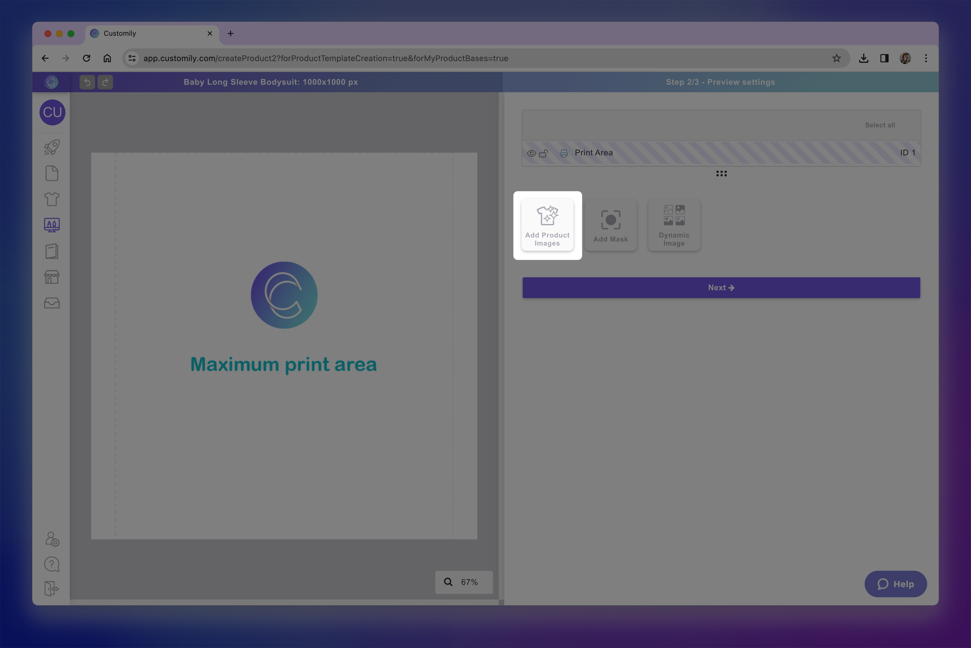add product images.png**
If your product comes in multiple colors or materials, you can upload all the
color variants here. Make sure all images are the same (or very similar), as
the print area will be positioned once and reused across all images.
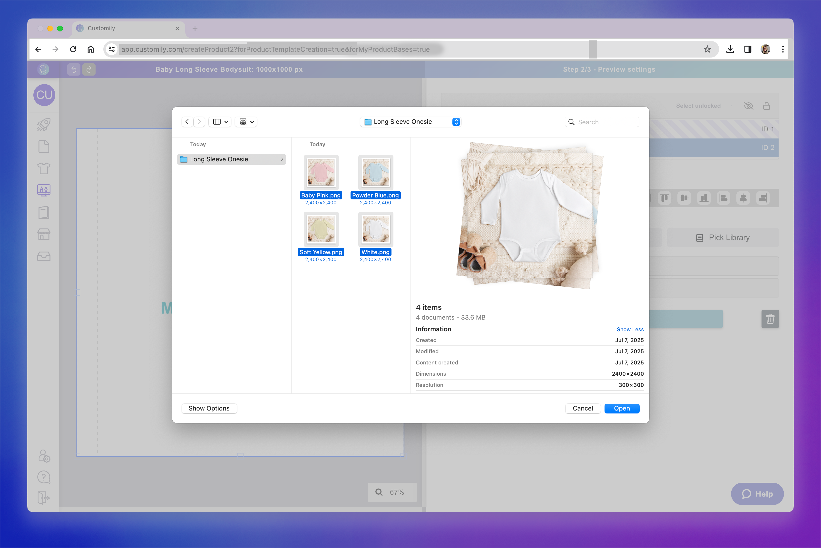Upload images.png**
Pro Tip
**Name your image files with the exact variant names you want (e.g. baby pink, powder blue, white, etc.). Customily will automatically use those names when
creating the product variants.**
- Position the print area
Drag, resize, and rotate the print area so it fits perfectly over the product
image. This ensures the designs will appear exactly where it they will be
printed in real life.
You're working with the same print area you defined earlier — now you're
placing it visually on top of the product photo.
- Optional - Add a mask
Masks let you place a texture or shadow above the design, to make your mockup
look more realistic.
You can use masks to simulate wrinkles, lighting effects, or cutout shapes —
helping the final product feel more polished and accurate. To add a mask,
simply click the Add mask button.
Masks will always sit on top of the print areas, to make sure they go over
whatever design you then place on the product.
Keep in mind
Masks are coordinated with your product images, so if your product has
multiple color images, you will need to add a mask for each image. For
example, if your product comes in 4 colors and you have uploaded 4 product
images in your previous step, you will need to upload 4 masks (even if it's the same mask, upload it 4 times).
- Review and finalize your product base
After configuring the mockup, click Next to go to the final review step. Here,
you’ll see a side-by-side view of:
\- The print file : what will be sent for production
\- The mockup : the live preview shoppers will see in your store
This is your chance to double-check everything before saving.
- Configure product variants
When you click Save , a modal will appear showing the product variants.
If you uploaded multiple background images (e.g. different product colors), a
“color” variant will be created automatically. The variant values will match
the names of the image files you uploaded.
▶ Using a My Product Base
Once you’ve created your own product base, you can use it to publish personalized products
to your store.
This is ideal when you do in-house fulfillment or work with a POD provider
that isn’t integrated with Customily. My Product Bases give you full control
over your product’s print setup, mockup, variants, and file exports — and once
created, they’re reusable, so you can launch new designs in just a few clicks.
Although my Product Bases don't include automatic fulfillment as POD bases do,
they will always include the ready to print file with every order.
When to use a My Product Base
Use My Product Bases when:
- You fulfill orders yourself (in-house printing)
- You work with a POD provider that’s not integrated with Customily
- You want full control over your mockups, print areas, and file exports
- You need to create print files with specific formats or layouts
- You want to reuse the same base across multiple designs or listings
How to Use a My Product Base
Product Bases are used by combining them with a design to create a
personalized product listing. This automatically sets up the product in your
store, complete with its template and customization options.
It’s a fast and reliable way to publish personalized products. And it's very
helpful especially if you want to offer multiple versions of the same product
(like t-shirts for different occasions), or apply the same design to different
products (like mugs, canvases, and hoodies).
To publish a product using a My Product Base:
- Go to the Start Menu and click Publish a New Product from your dashboard.
- Choose My product bases to browse through your products.
- Browse your product bases to find the right product, and click on it to select it.
- Select your preferred variants. Below your selection, you'll see a list of all the variants that will be created on your store.
- Choose the Print Areas where you'd like to apply a design. Depending on how your product base was configured you'll be able to choose one or multiple print areas. You can choose a design for each print area.
- Click \+ Add a design to the print area to select a design
- Choose a design to apply. It could be a Customily pre-made design or one of your own creations.
- After selecting the design, you'll be able to place and scale it within the print area to ensure it fits the product just how you want. The print area is represented by the dashed red line.
- Once you confirm the placement of your design, you can continue creating the product to get it ready for your store!
▶ Adding Multiple Print Areas to your Product Base
Adding multiple print areas to a product base lets you place more than one
design on a single print file. This is useful when you want multiple
customizable sections on a single product page—without needing to generate
separate files.
When to Use Multiple Print Areas
Use multiple print areas when you want to apply different designs to specific
sections of a product, but still generate a single print file for fulfillment.
This is especially helpful for products with distinct zones that need separate
customization setups — even though they share one print file.
Common examples include:
- Mugs : Apply one design to the left side and a different one to the right. Both will be combined into one wraparound print file.
- Flat-pack packaging : For example, a gift box printed on one unfolded sheet. You can assign different designs to each visible panel or flap.
- Wraparound products : Like a tote bag made from a single strip of fabric. You can apply one design to the front and another to the back, all within one print file.
This gives you more flexibility as a merchant when setting up your designs —
especially for products that are printed as a single piece but displayed in
multiple parts.
How It Works
When you add multiple print areas to a page, you’re defining separate zones
within the same print file where different designs can be placed. These areas
act independently, so when you assign a design to each one, Customily will
combine them into one export-ready file that matches your product’s layout.
Here are a few key things to keep in mind:
- Print areas are added to files
Each page represents a separate print file. Any print areas you add to that
page will be exported together into the same file.
- Be mindful of files vs. print areas
Print areas live inside files. So, before adding a new print area, make
sure you’re working on the correct file (e.g., front vs. back of a product).
While it’s rare to have both multiple pages and multiple print areas, it
is supported for complex products like boxes or garments with multiple panels.
- Control mockup visibility
In the mockup step, you’ll be able to place each print area visually on your
product image. If there’s a print area that you don’t want shown in the
storefront preview, simply place it outside the mockup image — it will still
be included in the final file, just not shown to shoppers.
- Assign designs per print area
When publishing a product, you’ll be able to assign a different design to each
print area. These designs work independently from each other — giving you
control over what goes where, even within the same print file.
How to Add Multiple Print Areas
- Go to the Print File step of your product base setup.
- If your product has multiple files, make sure you’re on the correct file (for example, “Front” or “Back”), as each print area is added to the file you’re currently viewing.
- If needed, adjust the print area that comes by default in your product, to size it and position it where you want to go.
- Click the “Add Print Area” button.
- A new print area will appear on the canvas. You can drag , resize , and rotate it to match the correct position on your product layout. Make sure you name your print areas accordingly, so it's easy to recognize them when using your product later.
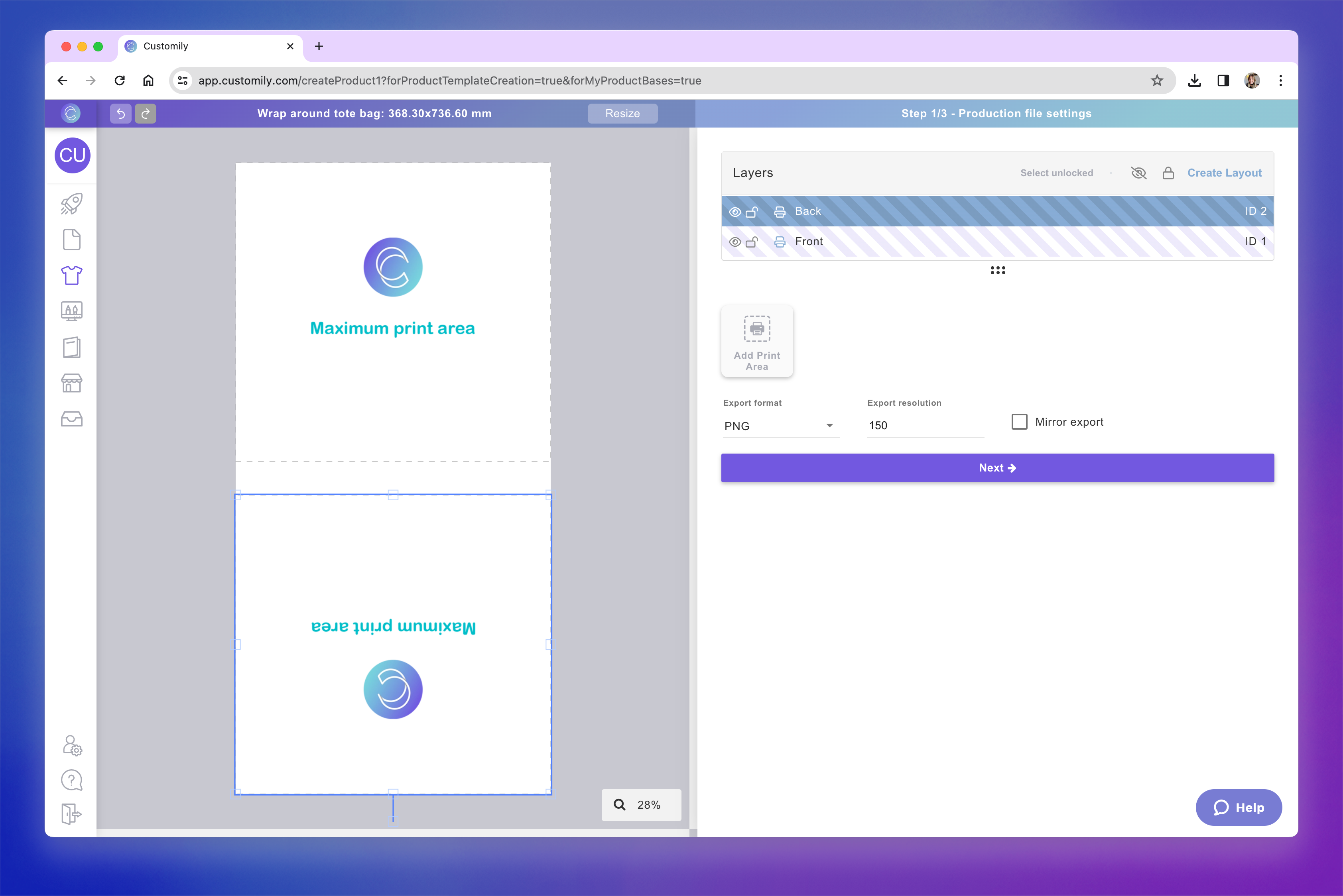second print area.png**
Pro Tip
You can quickly duplicate an existing print area by selecting it and pressing
Ctrl+C / Ctrl+V (or Cmd+C / Cmd+V on Mac). This is especially useful
when you want to add another print area with the same size and shape — perfect
for aligning elements like left and right sides of a mug.
- Repeat the process to add as many print areas as needed. When done, click Next to move on to the mockup setup.
- Position print areas on the mockup
You’ll now see the product mockup where you can place each print area.
Drag, resize, or rotate each print area to match the correct location on the
product image.
If you don’t want a print area to appear on the mockup preview (for example, if it's on the back of a product and the image only shows the front), just
place it outside of the visible image area.
Once added, you’ll be able to assign different designs to each print area when
publishing the product.
▶ Setting up Product Images in your Product Base
Once you’ve configured the print area of your product base, the next step is
to upload product images that will be used to build the mockup. These images
are what shoppers will see when browsing your store — so it’s important they
clearly show the product and match the configuration of your print area.
What Kind of Images Should You Use?
You should upload blank images of your product — meaning they don’t
contain any designs or decorations yet. These images will be used as the
background for your product mockups.
- For simple products (e.g., one color or style), you only need one image.
- If your product comes in multiple colors, materials, or finishes , you can upload one image per variant.
Important
If using multiple images, all images should be the same (or very similar) in
size and layout. The print area is placed once and reused across all images,
so consistency is key.
How Image Names Affect Variants
When you upload multiple product images, **Customily uses the filenames to
generate variant options automatically**. For example, if your images are
named:
Baby Pink.png
Powder Blue.png
White.png
Customily will create a variant named Color with options: Baby Pink,
Powder Blue, and White.
Don’t worry if your image names aren’t perfect — you can always **edit the
variant name and option values** before saving your product base.
Image Upload Order
Customily creates variant options in the order you upload the images. If you
upload multiple images at once, they will usually be added alphabetically.
This order will be reflected in the final product.
How to Upload Images
- In the Mockup step of your product base, click Add Product Images.
- Select one or more blank images of your product.
- After uploading, you’ll see them appear in the mockup preview. Remember to adjust the print area to match your image.
- You can switch between images to check how your print area looks on each one.
That’s it! Once your images are uploaded, you can continue building your
mockup and finalizing your product base.
▶ Using Masks in Your Product Base Mockups
Masks are optional image overlays you can add to your mockup to enhance
realism and depth. They sit on top of the shopper’s design, helping it
blend more naturally with the product image.
What Is a Mask?
A mask is a transparent PNG image placed over the print area on your mockup.
It doesn't affect the print file — it only appears in the product preview your
shoppers see. It’s ideal for:
- Adding shadows or folds to simulate how a design would look on real fabric
- Adding texture or gloss to give the impression of specific materials (e.g. wood grain, metallic shine)
- Hiding parts of the print area to match your product’s shape (like rounded edges)
When to Use a Mask
Use a mask if your product image doesn’t fully represent how the final item
will look once printed. Some common examples:
- Garment details that should sit above the design , like hoodie strings or jacket zippers.
- Cut-out or shaped products , such as heart-shaped ornaments or circle keychains, where the print file is rectangular but the product is not.
- Objects that overlap the print area , like camera cutouts on phone cases that partially cover the design.
- Transparent surfaces , like glass or acrylic that require a see through or gloss effect.
- Adding texture, shadows, or light effects to give your mockup a more realistic, professional look.
How to Add a Mask
- Click the “Add Mask” button in the mockup step of your product base setup. A Mask element will be created, represented with on the layer panel.
- Select the element and Upload your mask image(s) as PNGs with transparency by clicking \+ Add Image Option.
- Choose the PNG you will use as a mask, these will be placed over your product images.
Important
If you have multiple product images, make sure the number of mask images
matches them exactly — even if you're using the same mask image for all,
simply upload copies of the image. Upload the mask images in the **same
order** as your product images to ensure each one is correctly paired.
On the left we can see there are 4 product images, so we add 4 masks (shown on the right) even though in this case they are the same PNG.
- Position and scale the mask to align it perfectly with your product picture. Make sure you don't alter the order of the layers. The Mask element should always remain on top of the Print Area.
Now when you use this product and place a design on it, the mask will always
sit on top of the design — adding depth, shadows, texture or shape. This helps
your product preview look more realistic and closer to what the final printed
item will look like.
▶ What is a Design?
In Customily, a Design is the heart of a personalized product. It’s the
artwork your shoppers will personalize — made up of the visual elements and
personalization features that bring a product to life.
You can think of it as the customizable layout that sits on top of your
product. It includes any text, images, cliparts, or interactive elements that
your shoppers can modify — like names, dates, photos, or custom maps. When a
shopper personalizes a product, they’re interacting with the design.
Each design includes:
- All the artwork elements – Everything visible on the design, whether personalizable or not. This can include:
→ Personalizable elements like editable text, uploaded photos, cliparts, or
dynamic maps.
→ Static elements like decorative text, frames, or background images.
- An automatically generated option set – This is the personalization form shoppers see on your storefront. It contains the inputs they’ll use to personalize the product, such as:
→ Text fields
→ Swatches
→ Dropdowns
→ Image upload buttons, and more.
The option set is linked directly to each personalizable element in the
design, so any changes a shopper makes are reflected instantly in the live
preview.
Where are Designs used?
Designs can be applied to any kind of**product base**, whether
it's a Print-on-Demand (POD) item or one of your own. The same design can be
used across multiple products, and it will automatically adjust to fit the
product’s print area — so you can apply a design to a mug, a t-shirt, or a
blanket without having to recreate it.
Types of Designs
There are three ways to work with designs in Customily:
- Customily Designs
These are ready-made designs created by our team. They’re 100% royalty-free
and ready to sell. Just choose one and apply it to a product — no design
skills required.
Great for getting started fast or finding seasonal inspiration.
- Your Own Designs
You can create a design from scratch using Customily’s Design Studio. Add your
own artwork, set up personalization elements, and customize every detail. This
gives you full creative control and lets you build a completely unique
personalization experience.
Ideal for advanced users or brands with a specific creative vision.
Learn what My Designs are and how to create one.
- Start from a Customily Design and modify it
You can also take any Customily Design and customize it to make it your own.
This will open the design in the Design Studio so you can change the artwork,
add or remove elements, or rearrange the layout.
A perfect shortcut for creating your own twist on a proven design.
Learn how to import a Customily Design to make it your own.
▶ Using a Customily Design
Customily offers hundreds of ready-made designs — covering every occasion,
theme, and recepient you can imagine. These designs are professionally made,
fully customizable, and 100% royalty-free. They’re the fastest way to start
selling personalized products without creating anything from scratch.
Whether you’re just getting started or need to expand your store quickly,
Customily Designs are a great way to launch high-quality personalized products
in minutes.
What’s included in a Customily Design?
When you pick a ready-made Customily Design, you’re not just getting artwork —
you’re getting a complete personalization experience, ready to go.
Each Customily Design includes:
- Pre-arranged artwork: Texts, images, cliparts, and other elements already placed and styled, 100% royalty-free.
- Personalizable elements: Editable text fields, image placeholders, clipart swappers, and more — all linked to input controls.
- A built-in option set: The personalization form shoppers see on your storefront, already connected to each editable element.
This means you can go from product to personalized preview in just a few
clicks — no setup required.
When to use a Customily Design
Use a Customily Design if:
- You want to launch products fast without designing them yourself
- You’re looking for inspiration and want to start from a pre-built concept
- You want access to tried-and-true bestsellers and trending design styles
- You’re new to Customily and want to learn how designs work before creating your own
You can always use a Customily Design as-is — or start from one and modify it
to make your own version.
How to use a Customily Design
Customily Designs are used by combining them with a product base to create a
personalized product listing. This automatically sets up your product with a
complete template, personalization options, and preview — ready to publish.
It’s a quick and easy way to launch personalized products, especially if you
want to reuse the same design across multiple products, or publish several
themed products using the same layout.
To publish a product using a Customily Design:
- Go to the Start Menu and click Publish a New Product from your dashboard.
- Choose your product base. It can be a POD product or one of your own product bases.
- Select your preferred variants. Below your selection, you'll see a list of all the variants that will be created on your store.
- Choose the Print Areas where you'd like to apply a design. Depending on the product you can choose one or multiple print areas. You'll be able to choose a design for each print area.
- Click \+ Add a design to the print area to select a design.
- Click on the Pick from Customily's designs to browse the design gallery.
- Browse through the available designs and select one.
By default, you’ll see the full gallery with the newest designs showing first
— but you can narrow it down using the categories on the left (like Holidays, Wedding, for Mom, for Dad, Maps, Calendars, etc.) or use the search bar at the
top to find something specific.
- Once you select a Design, click Apply Design.
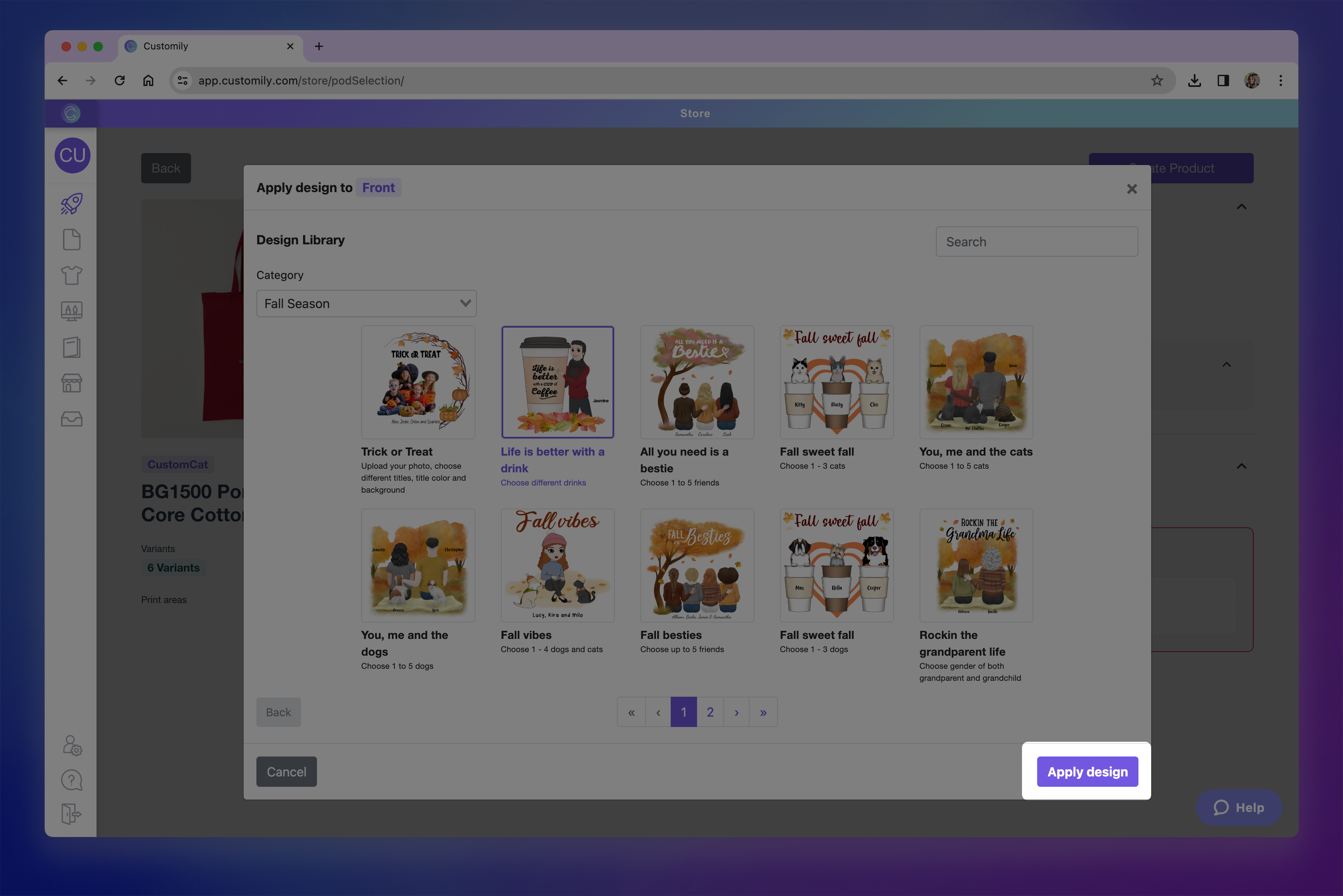apply design.png**
- After selecting the design, you'll be able to place and scale it within the print area to ensure it fits the product just how you want. The print area is represented by the dashed red line.
- Click Confirm once the placement looks right.
If you need to make changes later, you can click Adjust Position to reposition
the design. You can also Remove or Change Design at any time before
publishing.
- Once you confirm the placement of your design, you can continue creating the product to get it ready for your store!
- In the final step, you'll see a live preview of your product with the selected design and its option set already applied.
▶ What are My Designs?
In Customily, My Designs are the personalized artworks you create and
manage to apply to your products. They contain all the visual elements and
personalization features that shoppers will interact with on your store — like
editable text, images, cliparts, and more.
Unlike ready-made designs from Customily’s gallery, **My
Designs** are fully created or customized by you. You can start from scratch
or base them on an existing Customily design and modify them to make them your
own.
You’ll be able to apply your designs to any product you want — whether it’s a
POD product or
one of your own product bases.
Why use My Designs?
Creating your own design gives you complete creative freedom. You can:
- Match your brand's style perfectly
- Offer unique personalization options
- Reuse the same design across different products
- Set up custom option sets based on the elements you include
Every time you create a new design, an option set is automatically
generated for it. This is the form that shoppers will use to personalize your
product — containing things like text inputs, dropdowns, color swatches, and
more. You can edit this option set to fine-tune your personalization
experience.
Where are My Designs stored?
All your designs are saved in the My Designs section of your dashboard.
From there, you can:
- Create a new design
- Edit existing designs
- Clone or delete them
- Rename them or update their thumbnails
▶ How to create a My Design from scratch
Why create a My Design from scratch?
Creating a My Design from scratch gives you complete creative control over
every element in your personalized product, you decide what gets personalized
and how. Unlike ready-made designs, which come prebuilt with specific layouts
and personalization options, a custom design lets you tailor everything — from
the artwork to the shopper’s experience.
You can start simple and build up complexity as you go — from a single
editable name to multi-step personalization experiences with images, maps,
calendars, and more.
How to create a My Design from scratch
- Start a new My Design
Click Create new design from the start menu, or open the my designs panel
from the left-side menu and click the Create Design button on the top left
corner.
- Name your design
A pop-up will ask you to give your design a name. Choose something descriptive
so you can easily identify it later. You can rename it anytime.
- Set your canvas size (optional)
By default, your design canvas is set to 1000 x 1000 mm — a recommended size
that works well across most products.
You can change this by clicking Resize at the top and entering custom
dimensions if needed.
Pro Tip
If you're designing for a specific product, click the Tag icon
 next to
the Resize button. This lets you search for a product and automatically
resizes your canvas to match that product’s print area. If the product has
guidelines (like safe zones or bleed areas), they’ll appear on your canvas too
— making it easier to design with precision.
- Start building your design
Use the tool panel on the right to add personalizable and static elements to
your design.
You can include:
\- Text fields
\- Clipart and image libraries
\- Shopper uploaded images
\- Maps, calendars, moon phases, and more
**Here’s an example of what a design can look like once you've added and
arranged your elements.**

This design includes a text box for shoppers to add their names, a title
reading “The moment we became” , a calendar for selecting a wedding date,
and a dynamic image featuring a floral frame with four different art options.
- Each element you add can be styled, positioned, and configured for personalization using the settings on the right. You can also manage and reorder layers using the layer panel. To learn how to make the most out of our Design Studio, check our guides on how to style and organize your elements here.
Pro Tip
The names you give to your layers will be used to automatically generate the
labels in your option set (the form your shoppers use to personalize). For
example, if you're adding a text field for a shopper to enter a name, name
that layer something clear like “Name” or “Add your name” — it’ll save
you time later!
- Save your design
Once you’re happy with your layout and personalization setup, click Save in
the top-right corner.
Pro Tip
Right below the Save button, you'll find the Download image option. This
lets you download a static image of your design — perfect for creating
promotional graphics or extra mockups for your product gallery. It won’t
affect the functionality of your design, but it’s a handy way to showcase it.
- (Optional) Edit the Option Set
After saving, Customily will automatically create an Option Set — the form
shoppers use to personalize your product. This form is based on the elements
you added to your design and their layer names.
If you want to refine the experience, you can open the Option Set now and
customize it further. You can:
- Change option labels to make option clearer for shoppers
- Change option styles for example from swatch to dropdown
- Customize input behavior like setting character limit, or allowing only numbers or letters in a text input
- Set default selected options , so a choice is pre-selected when the product loads
- Add placeholder text inside inputs to guide shoppers on what to write
- Add help text to give extra context or instructions under each option
- Add conditional logic, so certain options only appear based on previous selections
- Delete options if you want elements to appear on the product but not be editable by the shopper
You can always come back and edit the Option Set later from the My Designs
▶ How to Modify a Customily Design to Create Your Own
Why start from a Customily design
Customily’s ready-made designs are not only ready to use — they’re also fully
editable. That means you can take any design from our gallery and make it your
own.
This is a great option if you:
- Like the layout or concept of a design but want to change the text, images, or styling
- Want to save time while still offering unique products
- Need a faster way to build a large catalog without starting every design from scratch
You can customize anything in the design: add or remove elements, change fonts
or colors, update personalization options, or replace cliparts and images with
your own, and more.
How to create a design starting from a Customily design
- Start a new Design from Customily Design
Click Start from Customily Design from the start menu, or open the my
designs panel from the left-side menu and click the Import from Customily
button on the top left corner.
This will open the full Design Gallery where you can browse or search for a
design to use as your starting point.
- Choose a Customily Design
Browse by category or use the search bar to find something specific.
We have designs grouped by occasions (holidays, weddings), recipients (mom, dad, couples), personalization types (maps, calendars), and more.
- Click on a design to select it.
- Once you select a design, it will be imported into your Design Studio so you can start editing.
Edit the design to make it your own
Once inside the Design Studio, you can:
- Move, resize, or delete any elements
- Add new personalization features like text fields, image uploads, clipart libraries, or interactive elements like maps, moon phases, calendars and more.
- Update fonts, colors, or artwork to match your brand
- Replace images or cliparts with your own assets
Each element that comes with the design, as well as any element you add can be
styled, positioned, and configured for personalization using the settings on
the right. You can also manage and reorder layers using the layer panel. To learn
how to make the most out of our Design Studio, check our guides on how to style and organize your elements here.
In this example, we changed the small heart (Layer: Heart with id 3) for a
larger watercolor heart and moved it behind the hands. We also changed the
title, for a bold quote, and changed the font of the Left and Right name. With
3 slight changes, we created a completely new design.
Pro Tip
The names you give to your layers will be used to automatically generate the
labels in your option set (the form your shoppers use to personalize) — so
it’s helpful to use clear, shopper-friendly names like “Pet Name” or “Select
Character.”
Save your design
Once you’re happy with the edits:
- Click Save to store your new design
Pro Tip
Right below the Save button, you'll find the Download image option. This
lets you download a static image of your design — perfect for creating
promotional graphics or extra mockups for your product gallery. It won’t
affect the functionality of your design, but it’s a handy way to showcase it.
- Imported designs may take a couple minutes to appear on your My Designs panel. Don't worry, this is Customily importing all the assets and options into your account.
In the meantime you can keep working on your account, small notification on
the top right will let you know once the Design is ready to use.
Imported designs will appear at the top of your Designs list, with the word
(cloned) in it's name.
- (Optional) Edit the Option Set
After saving, Customily will automatically create an Option Set — the form
shoppers use to personalize your product. This form is based on the elements
you added to your design and their layer names.
If you want to refine the experience, you can open the Option Set now and
customize it further. You can:
- Change option labels to make option clearer for shoppers
- Change option styles for example from swatch to dropdown
- Customize input behavior like setting character limit, or allowing only numbers or letters in a text input
- Set default selected options , so a choice is pre-selected when the product loads
- Add placeholder text inside inputs to guide shoppers on what to write
- Add help text to give extra context or instructions under each option
- Add conditional logic, so certain options only appear based on previous selections
- Delete options if you want elements to appear on the product but not be editable by the shopper
You can always come back and edit the Option Set later from the My Designs
▶ Using My Designs
Once you’ve created your own designs in Customily — whether from scratch or by
modifying an existing one — you can use them to create and publish
personalized products for your store.
This article walks you through the process of applying a design from **My Designs** to any
product base, including your own product bases or those
Why Use a My Design?
Using your own designs gives you full creative control. You can tailor every
element of the design to match your brand, your product, and your customers.
It’s perfect for:
- Personalization ideas that are unique to your store
- Offering designs that aren’t available in the Customily gallery
- Creating designs for different occasions or audiences using your custom artwork
How to Apply a My Design
My Designs are used by combining them with a product base to create a
personalized product listing. This automatically sets up your product with a
complete template, personalization options, and preview — ready to publish.
It’s the best way to launch personalized products, especially if you want to
reuse the same design across multiple products, or publish several themed
products using the same layout.
To publish a product using a My Design:
- Go to the Start Menu and click Publish a New Product from your dashboard.
- Choose your product base. It can be a POD product or one of your own product bases.
- Select your preferred variants. Below your selection, you'll see a list of all the variants that will be created on your store.
- Choose the Print Areas where you'd like to apply a design. Depending on the product you can choose one or multiple print areas. You'll be able to choose a design for each print area.
- Click \+ Add a design to the print area to select a design.
- Click on the Pick from your designs to browse the design gallery.
- Browse through your designs and select one.
You’ll see your gallery with the newest designs showing first. You can use the
search bar at the top to find something specific.
- Once you select a Design, click Apply Design.
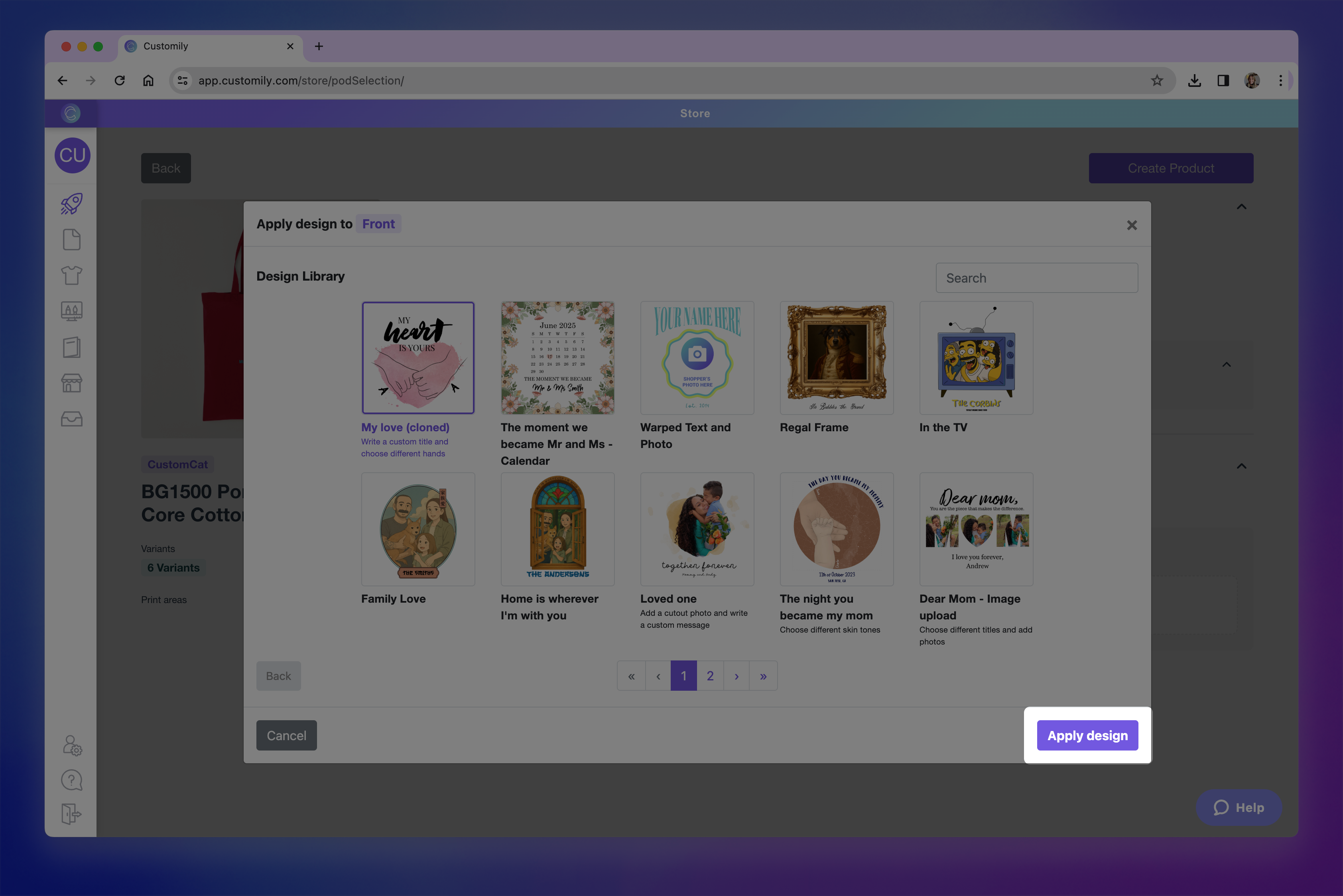Apply design.png**
- After selecting the design, you'll be able to place and scale it within the print area to ensure it fits the product just how you want. The print area is represented by the dashed red line.
- Click Confirm once the placement looks right.
If you need to make changes later, you can click Adjust Position to reposition
the design. You can also Remove or Change Design at any time before
publishing.
- Once you confirm the placement of your design, you can continue creating the product to get it ready for your store!
- In the final step, you'll see a live preview of your product with the selected design and its option set already applied.
▶ How to show the same content across multiple Elements in Customily
Customily allows you to link different design elements so they all display the
same content, whether it's text, images, or other inputs. Just follow these
simple steps:
1Open the Customily App
Log in and access the Customily app from your dashboard.
2Go to the My Designs or Templates Tab
Choose My Designs or Templates , then click to start a new design
ortemplate , or edit an existing one.
3**Add the Elements You Need
**
Keep in mind that for elements to change coordinated, they have to be the same
kind of element (either text, image placeholders, or dynamic elements)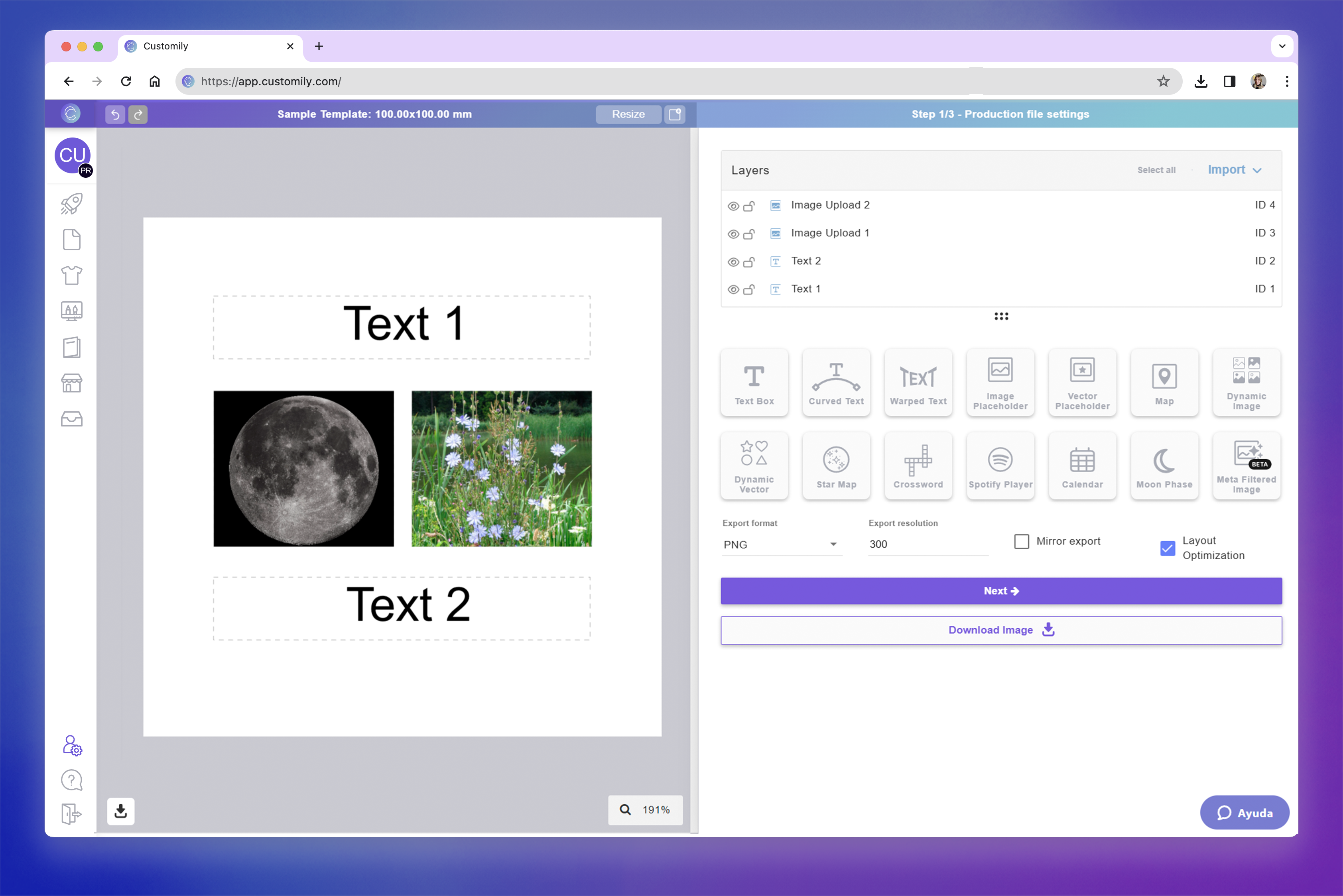screenshots copia 2.png**
4Assign the Same ID to Link Your Elements
To link elements of the same type so they display the same content, simply
give them all the same ID.
This tells Customily to treat them as a single input. When one element is
customized, all other elements with the same ID will automatically update with
the same content.!screenshots copia 1.png
5Save Your Design
▶ QR Code
The QR Code element lets shoppers generate a scannable QR code directly in
your design. They can paste any link—like a website, playlist, contact info,
or personal message—and a QR code will be created automatically.
How It Works
When you add a QR Code to your design:
- Shoppers will be able to enter or paste a link into a designated field.
- A QR code is instantly generated and displayed on the design.
- You control the position and size of the QR Code on the design.
- * *
In this article:
- How to add a QR Code
- Transform the QR code
- How to test how the shopper-generated QR will look
To add a QR Code
You can add QR Codes on Designs and on Templates, by clicking the **QR Code
button**.
Each QR code you add will have a Name that you can edit, and a Unique Id for you to
easily identify it.
Transform the QR Code
Directly on the canvas or by expanding the Transform toolbox, you can
transform the
QR code:
Test how the shopper-generated QR Code will look
At any moment while configuring your QR code, you can test how it will look on
your design, by typing a URL and clicking Generate QR button.
This is just for you to test, whatever QR code you generate won't be saved,
and won't be visible to your customers.
▶ Solid Background Color
The Solid Background element lets you easily add background colors to your
designs. You can keep the color fixed or allow customers to choose from
multiple preset options — including color libraries you’ve created. This is a
great tool for:
- Creating bold, clean backdrops behind your artwork or text
- Offering background color options to your customers
- Designing all-over print products like journals or apparel, where the entire product's color changes based on the shopper’s choice
How It Works
When you add a Dynamic Image to your design:
- The background automatically fills the entire design area and sits behind all other elements by default.
- You can set a fixed color or add multiple color options for shoppers to choose from. Only one background color will be visible at a time—shoppers will see the one that matches their selection.
- You cannot reposition, resize, or change the order of the background; it will always remain in place behind the design and filling the entire area.
- If Movable Image is enabled, shoppers can also reposition or resize the image within the area you define.
- * *
In this article:
- How to add a solid background
- How to set the color of the solid background
- How to add multiple color options to the solid background
- Adjusting the solid background on the preview
To add a solid background
You can add a solid backgrounds on Designs and Templates, by clicking the
Solid Background button. Once you add it, the button will be disabled, as
you can only add one solid background per design or template.
To set the color of the background
- Select the Solid Background element to open its settings.
- Under Fill Color , click the color swatch and choose the color you want and click apply.
To set multiple color options for the background
You can add color option in two ways:
- by manually selecting the color options you'd like to have
- by using a color library (which is the easiest way)
To add colors manually
- Select the Solid Background element.
- Under Fill Color , click +Add color.
- Choose the color you want and click apply.
- Repeat with as many colors as you want.
To add colors using libraries
- Select the Solid Background element.
- Under Fill Color , click Pick Library.
- Choose the color you want to use and click select.
Tip
To see all the image color options the background has, just browse through the
list. You click any of the options at any time to see how they look.
Adjusting the solid background on the preview
In some cases, your preview may differ from your print file — for example, it
might be shown closer or cropped differently than your print file. To ensure
the solid background displays correctly on the preview you can edit it on your
template, for that:
- Open your template.
- Go to the Preview step (step 2).
- Click the Solid Background layer in the preview canvas.
- Use the resize handles to make the background larger if needed, so it covers the full visible area of the product preview.
- You can also adjust the layer order if needed by using the layer panel. You can move the background above or below other elements to get the look you want.
These changes won’t affect your print file — they only apply to how the
product looks in the shopper’s live preview.
▶ Adding AI Filters and Effects to User-Uploaded Images
Give shopper-uploaded photos a creative twist with AI filters and effects.
With the Image Effects toolbox , you can automatically enhance, restyle,
or completely transform uploaded images — from removing backgrounds to turning
portraits into cartoons or 3D art.
Whether you want to clean up a photo or apply a trending AI style, everything
happens automatically when shoppers upload their image.
How It Works
AI filters and effects are applied through the Image Effects toolbox in
your design to user uploaded images on image placeholders.
You can stack multiple filters together, reorder them to control the final
look, and combine free and third-party effects in a single placeholder.
- * *
In this article:
- Available AI Filters and Effects
- Providers and Costs
How to Apply AI Filters and Effects
- Select the image placeholder
- Expand the Image Effects toolbox
- Click Add Image Effect
- Browse or search for an effect
- Click an effect to apply
- The applied effect will be displayed in the effects toolbox. Effects are stackable — you can add several and reorder them at any time.
For example, remove a background first, then apply a cartoon or painting
style.
Tip
You can mix image effects with other placeholder settings such as:
- Pencil Effect + Single Color tracing (for engraving-style designs)
- Watercolor + Masks (to create shaped portraits)
- Face cutouts + Outline strokes (for stickers and cutouts)
For more about these options, see Image Placeholders.
Available AI Filters and Effects
Customily offers a wide variety of image effects — from quick tools to
advanced AI-powered filters. To make it easier to explore them, effects
are organized into three main categories: tools , style modifiers ,
custom prompts. You can also search or filter them by provider
(Customily, Gemini, OpenAI, OpenRouter), and see which ones are free or
require a third-party API connection.
🧰Tools
Practical utilities that prepare or improve shopper-uploaded photos, such as
background removal, face cutout, and more.
- Remove Background
- Blur Background
- Face Cut Out
- Enhance Photo Quality
These are great first-step effects that clean up images that you can leave as
is, or use before applying AI styles.
Providers include:
- Customily (Free built-in)
- Cutout Pro, Remove.bg, OpenAI, Gemini - Nano Banana, OpenRouter (external APIs)
Choosing a provider
Customily AI tools are fast, built-in, and free—perfect for most use cases.
Use third-party services only if you require highly specific background or
cut-out handling. All third-party services require an account with either of
them to be able to use it. For information on their costs visit
🪄Style Modifiers
AI filters that restyle images with artistic or stylized effects.
Includes built-in Customily filters and integrations with Gemini ,
OpenAI , and OpenRouter. Some examples"
- Pencil Drawing
- Watercolor
- Sepia or Invert colors
- Cartoon, Anime, Cyberpunk, Retro, Whimsical, 3D Art
- Renaissance or Pixar-style portraits
Providers include:
- Customily (Free built-in)
- OpenAI, Gemini - Nano Banana, OpenRouter (external APIs)
You can search or browse to discover dozens of options. Many of these work as
pre-made prompts for the most popular filters, letting you quickly apply
trending or artistic looks without writing your own descriptions.
If you want something more specific or unique, you can use Custom Prompts
(explained below) to create your own AI styles.
💬 Custom Prompts
For full creative control, use Custom Prompts to define your own AI
effect.
Just write a short description of the style you want, for example:
- “Vintage cartoon style with soft pastel tones and blurred background.”
You can choose your AI provider (Gemini, OpenAI, or OpenRouter) for
generation.
This feature replaces the older __Meta Filters__ and
provides more flexibility and better control over the results.
Providers and Costs
Customily AI effects are always included and free for all users.
They run directly inside Customily, so you don’t need any setup or external
account to use them.
All other providers — Remove.bg , Cutout Pro, Gemini , OpenAI
, and OpenRouter — require connecting your own API account. These services
have their own usage-based pricing , and you’ll need to link your API key
inside Customily to access their filters. Each effect will display a small 🔑
icon if it requires an external provider.
You can freely mix Customily’s free effects with external AI filters in
the same design.
To link a provider:
- Open Account on the left menu.
- Select Integrations tab.
- Paste your API key for the provider you want to connect (Gemini, OpenAI, or OpenRouter, etc.).
▶ My Designs panel overview
The My Designs panel is where you can view, organize, and manage all the
designs you’ve created in Customily.
You can access it from the left-hand menu of your dashboard. From here, you
can create new designs, edit existing ones, and manage your growing collection
of personalizable artwork.
What you can do in this panel
- Search and browse all the designs you've created
- Create new designs from scratch
- Create a design starting with one from Customily’s gallery
- Edit a design
- Edit the option set of a design
- Rename or change the design's thumbnail
- Clone or delete designs
Designs are shown in order of creation or last edit — the newest or most
recently edited items appear at the top of the list.
Search and Browse
Use the search bar at the top to quickly find any design by name.
You can also scroll through the list to browse all the designs you’ve created
— from newest to oldest.
Each design is displayed as a card with its thumbnail, name, created date,
modified date, and a few quick actions to help you manage it.
Create new designs from scratch
Click Create Design to open a blank canvas in the Design Studio and start
building your design from the ground up.
You’ll be able to add personalizable text, images, cliparts, maps, and more to
create a fully custom experience for your shoppers. Learn how to create a new design from scratch here.
Once saved, your design will be added to this panel for easy access.
Pro Tip
If you're creating a design that's similar to an existing one, consider
cloning an existing design instead and making edits — it can save a lot of
time.
Create a design starting with one from Customily’s gallery
Click Import from Customily to import one of our ready-made designs into
the Design Studio.
imported design will open in the Design Studio, allowing you to edit it
however you like — adding or removing elements, adjusting the layout, or
changing text styles. Learn how to create a new design starting with a Customily design here.
When saved, it becomes your own version and appears in your design list.
Edit a Design
To edit a design, hover over it and click the pencil icon that appears.
From there, you can change anything in the design — move elements around, add
new ones, or remove what you don’t need.
You’ll be asked whether to update the linked option set after saving. If
you've changed any of the personalization elements you'll likely need to
update the option set.
Edit the option set of a design
Click the Edit Options icon to open the option set connected to your
design.
The option set controls the personalization form that shoppers will interact
with in your store. You can rename options, add help text, reorder them, add
conditional logic or even delete options that are no longer needed.
Rename or change the design's thumbnail
To rename a design :
- Hover over the name and click the pencil icon, or
- Double-click the name directly
Type the new name and press Enter to save it.
To change the design's thumbnail :
- Hover over the design image and click on it to upload a new one.
Thumbnails are generated automatically from the design and are purely visual —
they won’t affect the design itself. You can update them if you want to better
recognize or organize your designs.
Clone or delete designs
To clone a design :
- Hover over the base and click the clone icon.
This will create a new design with the word “cloned” added to its name.
Once cloned, the design will automatically open in the editor so you can start
making changes right away.
To delete a design :
- Hover over the design and click the trash icon
Confirm the deletion to permanently remove it from your account.
If you've already published products using this design, they won't be affected
when you delete it. However, deleting a design cannot be undone — make sure
you won’t need it again before removing it.
- Author:EcomGrace
- URL:http://ecomgrace.com/article/2d935142-581f-81a4-97ff-e538b6352488
- Copyright:All articles in this blog, except for special statements, adopt BY-NC-SA agreement. Please indicate the source!