
type
status
date
slug
summary
tags
category
icon
password
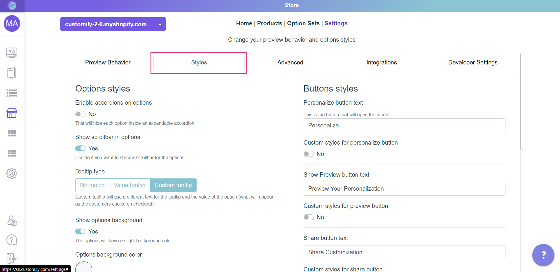
📚 ✅ Customization options
本页汇总了 ✅ Customization options 相关的常见问题(共 38 个)
▶ How to change the "Preview your personalization" button styles
You can change the "Preview your personalization" button style in your store
in an easy and simple way. Just follow the steps below.
Keep in mind
The Preview button is only visible if you use the Show Preview button
preview style or if you have the add 'Show Preview' button option enabled.
Learn how to change preview styles to show the Preview button
here.
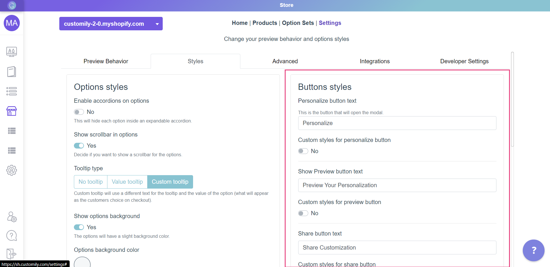
- Open the*[**Store**](https://help.customily.com/en/article/access-your- stores-products-on-customily)**Store****** tab in the left menu.
- Go to 'Settings ' in the top bar menu.
- Go to 'Styles '.

- Go to the part on the right that says "Buttons styles"

- Enable Custom styles for preview button
- Style the button.
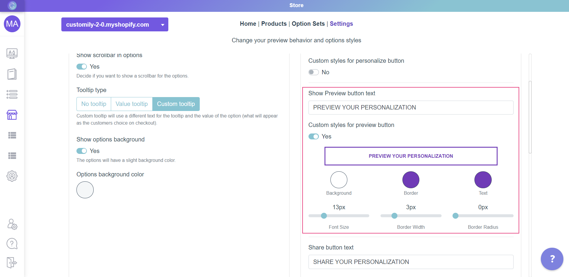
The different styles you can change are:
Background color
Click on the swatch titled Background and choose a color from the picker or
enter the color HEX code.

Border color, width and radius.
To change:
- Border color: Use the Border swatch to choose a color from the picker or to add your own HEX code.
- Border width: Use the range bar titled Border Width to specify a value.
- Border radius : Use the range bar titled Border Radius to specify a value.
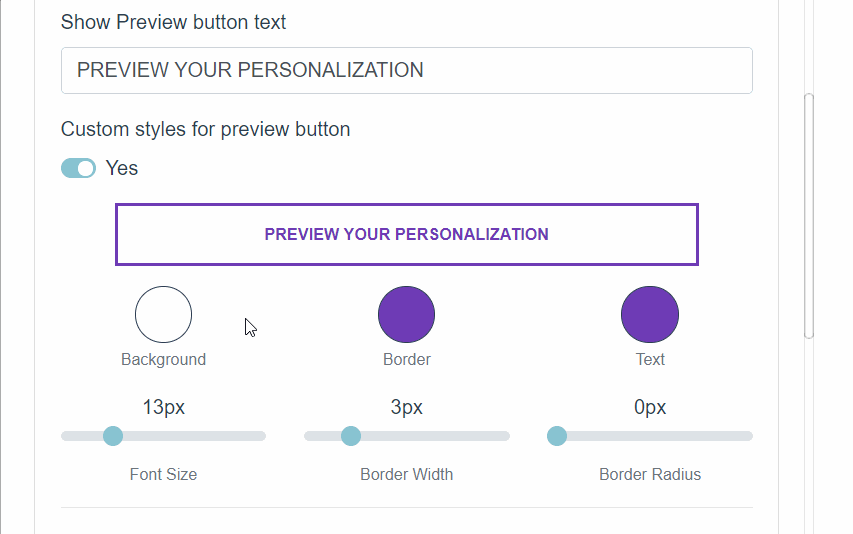
Text color and size
To change:
- Text color: Use the Text swatch to choose a color from the picker or to add your own HEX code.
- Font Size: Use the range bar titled Font Size to specify a value.

- Click Save to save the changes.
▶ How to change the "Add to cart" button styles
You can change the "Add to cart" button style in your store in an easy and
simple way. Just follow the steps below.
Keep in mind
This **will only change the "Add to cart" button on the products that have
Customily**. If you have products that are not personalized and are not using
Customily, the Add to cart button on them will be the default of your store.
If you want to change the Add to cart button style for all your products,
whether they have Customily or not, you should change them through your
Shopify theme.
- Open the*[**Store**](https://help.customily.com/en/article/access-your- stores-products-on-customily)**Store****** tab in the left menu.
- Go to 'Settings ' in the top bar menu.
- Go to 'Styles '.

- Go to the part on the right that says "Buttons styles"

- Enable Custom styles for add to cart button
- Style the button.
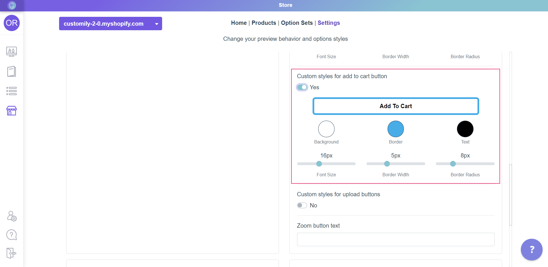
The different styles you can change are:
Background color
Click on the swatch titled Background and choose a color from the picker or
enter the color HEX code.
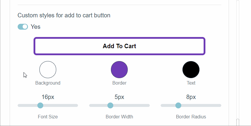
Border color, width and radius.
To change:
- Border color: Use the Border swatch to choose a color from the picker or to add your own HEX code.
- Border width: Use the range bar titled Border Width to specify a value.
- Border radius : Use the range bar titled Border Radius to specify a value.

Text color and size
To change:
- Text color: Use the Text swatch to choose a color from the picker or to add your own HEX code.
- Font Size: Use the range bar titled Font Size to specify a value.
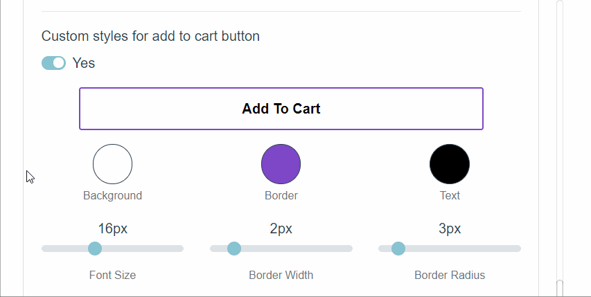
- Click Save to save the changes.
▶ How to change the "Share" button styles
You can change the "Share" button style in your store in an easy and simple
way. Just follow the steps below.
Keep in mind
The Share button is only visible if you allow personalization sharing. Learn
how to enable this option to show the share button
here.
- Open the*[**Store**](https://help.customily.com/en/article/access-your- stores-products-on-customily)**Store****** tab in the left menu.
- Go to 'Settings ' in the top bar menu.
- Go to 'Styles '.
- Go to the part on the right that says "Buttons styles"

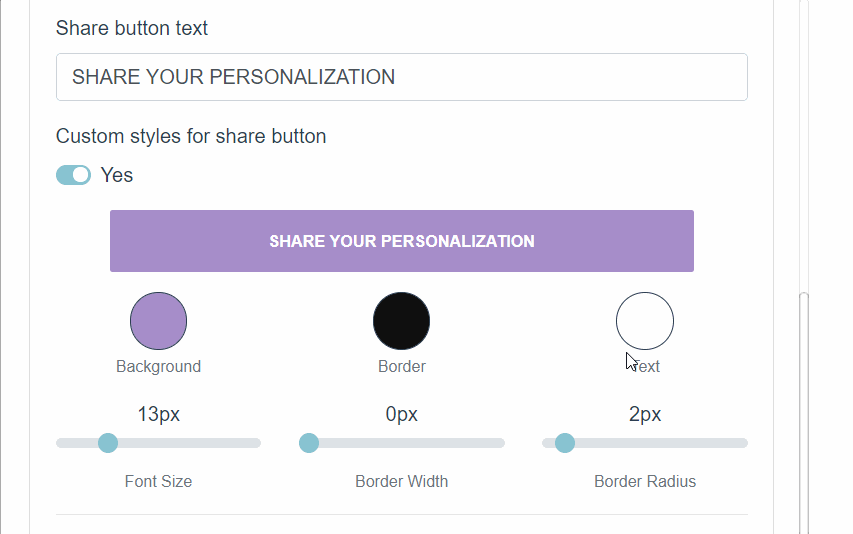
- Enable Custom styles for share button
- Style the button.
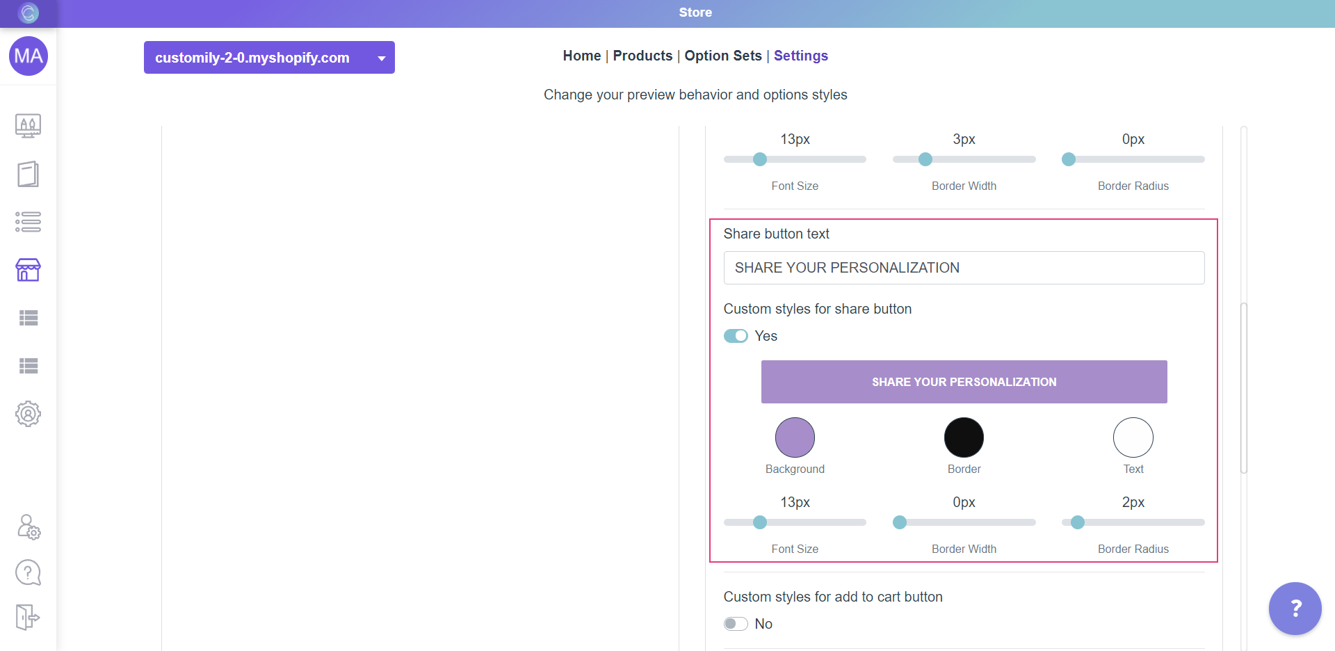
The different styles you can change are:
Background color
Click on the swatch titled Background and choose a color from the picker or
enter the color HEX code.
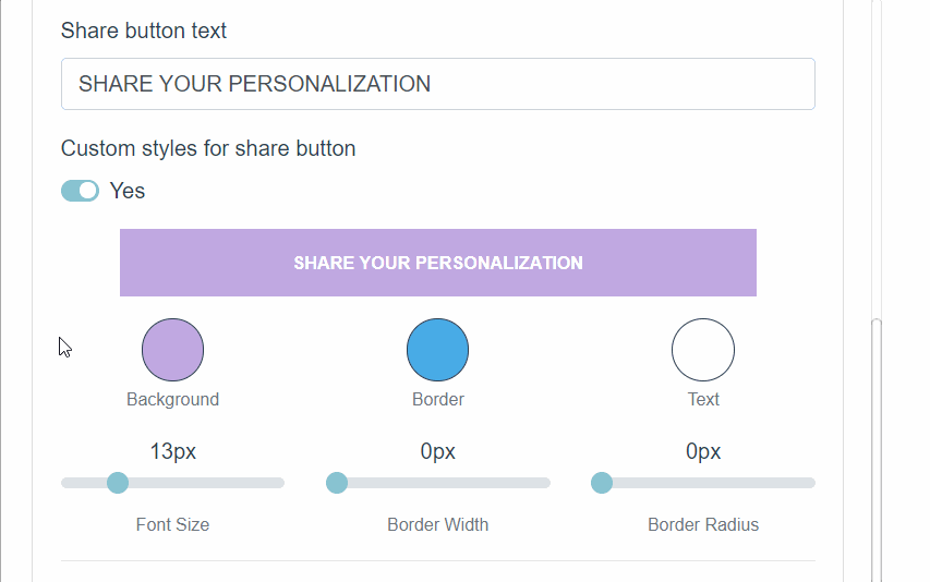
Border color, width and radius.
To change:
- Border color: Use the Border swatch to choose a color from the picker or to add your own HEX code.
- Border width: Use the range bar titled Border Width to specify a value.
- Border radius : Use the range bar titled Border Radius to specify a value.
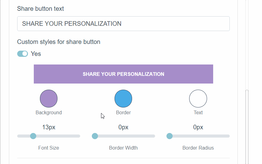
Text color and size
To change:
- Text color: Use the Text swatch to choose a color from the picker or to add your own HEX code.
- Font Size: Use the range bar titled Font Size to specify a value.
- Click Save to save the changes.
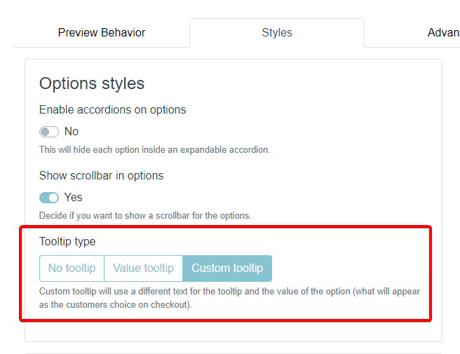
▶ Tooltip type
Tooltips are a blob of text that appear when you hover over swatch options.
They are a great way to help your customer visualize easier and faster their
options.
What text can I use on the tooltips?
By default, tooltips use the value of the option. The value of the option,
is what appears as the customers choice in the cart.
However, you can choose to use a different text for the tooltip if you want.
This is helpful if you want to give extra information on the tooltip, and not
just show the options name.
You can change this setting by selecting the tooltip type. There are 3 tooltip
styles available:
No tooltip
Disables the tooltips everywhere on your store.
Custom tooltip
The value and tooltip of the option can be different from each other.
Value Tooltip
Values and tooltips are the same thing. This is the default setting.
To select the tooltip type
- Open **store**
- On the top menu go to Settings
- Select the Stylestab.
- Choose your tooltip type
Keep in mind
If you had your tooltips set as "Custom tooltip" and you want to change to
"Value tooltip" you will be asked if you want to use the text on the value or
the on on the tooltip as the text that will be used for
both.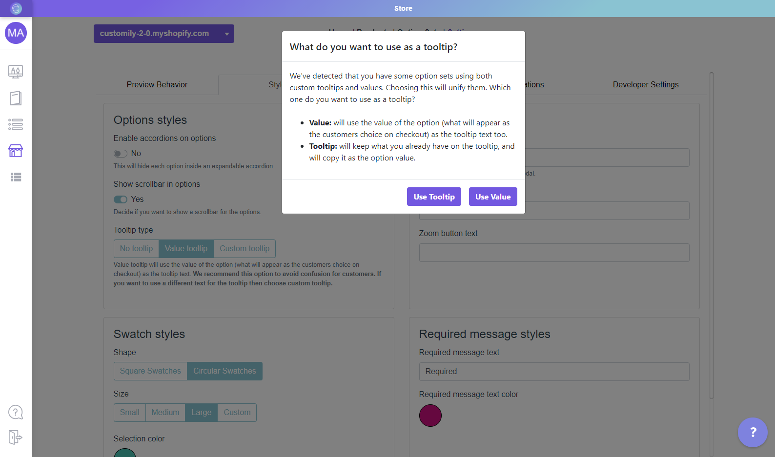
▶ How to change the "Personalize" button styles
You can change the "Personalize" button style in your store in an easy and
simple way. Just follow the steps below.
Keep in mind
The personalize button is only visible if you use the modal preview style.
Learn how to change preview styles to show the personalize button
here.
- Open the*[**Store**](https://help.customily.com/en/article/access-your- stores-products-on-customily)**Store****** tab in the left menu.
- Go to 'Settings ' in the top bar menu.
- Go to 'Styles '.

- Go to the part on the right that says "Buttons styles"
- Enable Custom styles for personalize button
- Style the button.
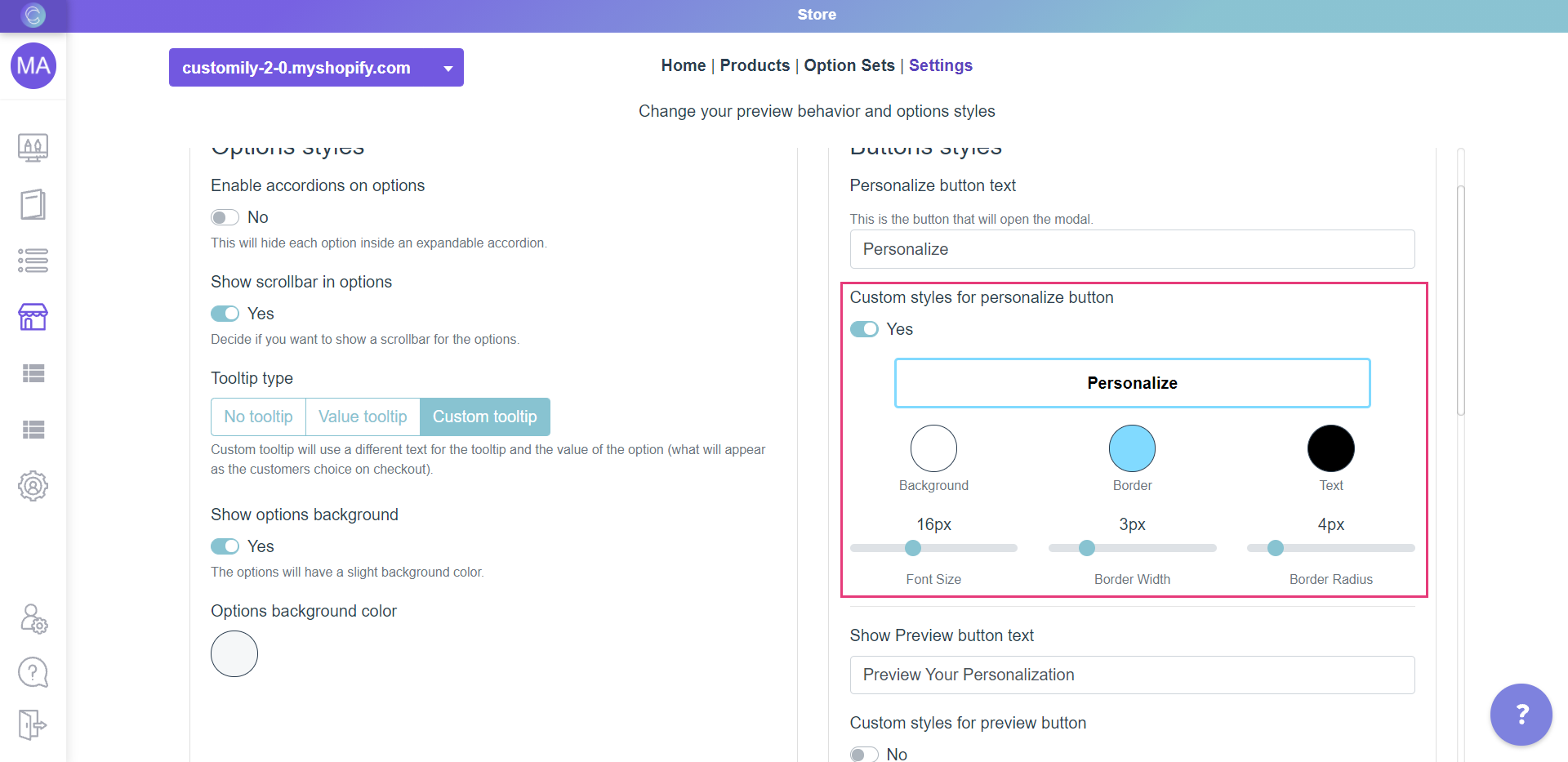
The different styles you can change are:
Background color
Click on the swatch titled Background and choose a color from the picker or
enter the color HEX code.

Border color, width and radius.
To change:
- Border color: Use the Border swatch to choose a color from the picker or to add your own HEX code.
- Border width: Use the range bar titled Border Width to specify a value.
- Border radius : Use the range bar titled Border Radius to specify a value.
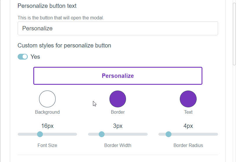
Text color and size
To change:
- Text color: Use the Text swatch to choose a color from the picker or to add your own HEX code.
- Font Size: Use the range bar titled Font Size to specify a value.

- Click Save to save the changes.
▶ Swatch styles settings
Personalize how your swatch buttons will look like on your store front end.
To change your Customily swatch styles
- Open **store**.
- On the top menu go to Settings.
- Open the Styles tab
- Under Swatch Styles you can choose to personalize shape, size and selection color.
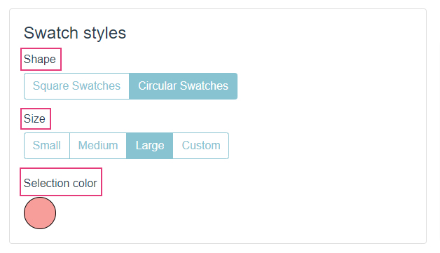
Style | What changes
---|---
Shape | Changes the shape for your swatches buttons.
Size | Changes the size of your swatches buttons. Choose 'Custom' to assign size in pixels.
Selection Color | Changes the color for the border when the option is selected. You can choose from the color picker or enter any HEX code of your preference.
Note
If you want to change your swatches even more, you can always change them through CSS.
▶ Change options styles
The way Customily Options are displayed depends on the type of option if it's
a text field, a swatch, a dropdown, etc.
Styles are usually picked up from your theme automatically, however, if you
want to change styles you can do so through the settings
To change Customily Options styles
- Open **store**
- On the top menu go to Settings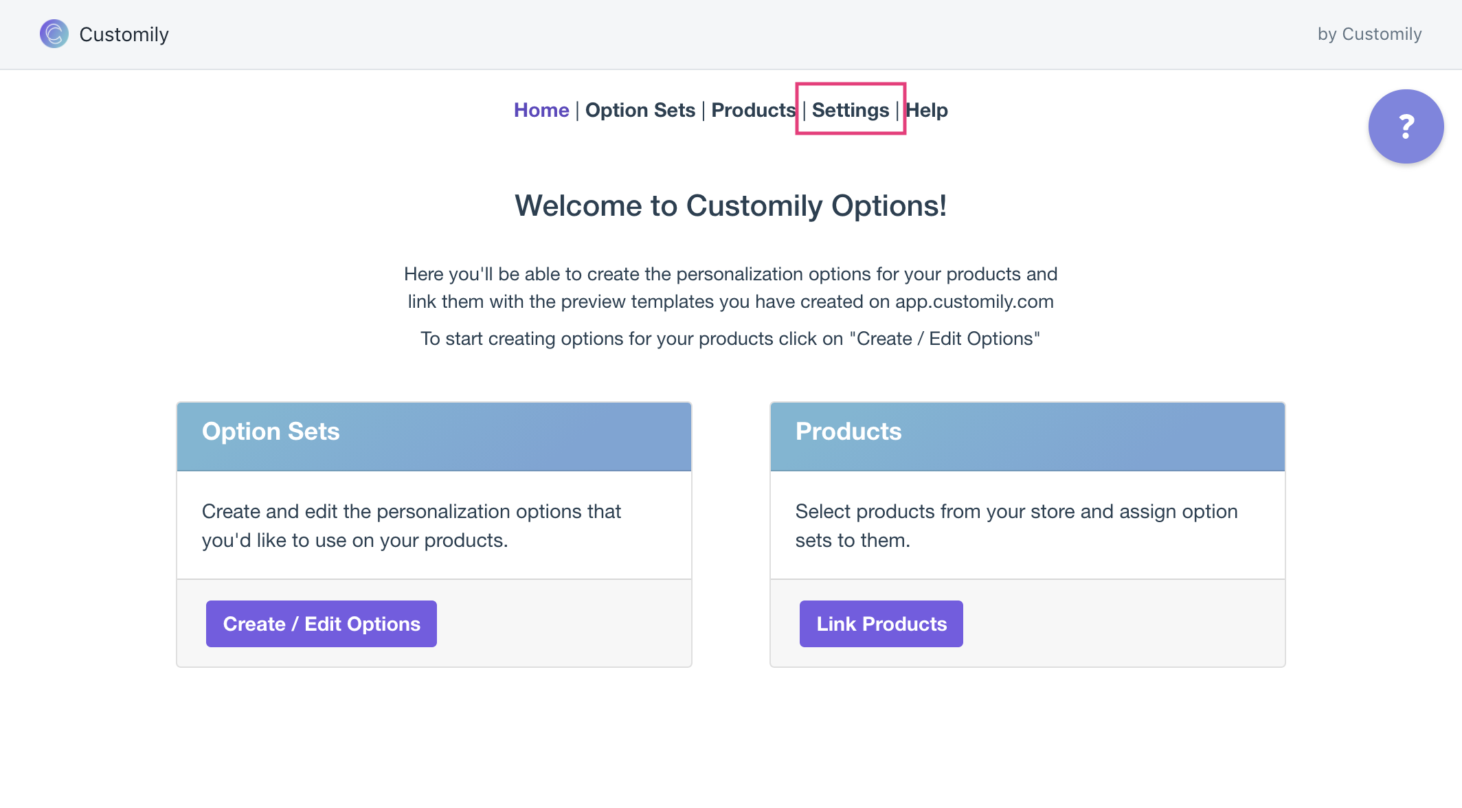
- Open the styles tab and change the styles settings as you please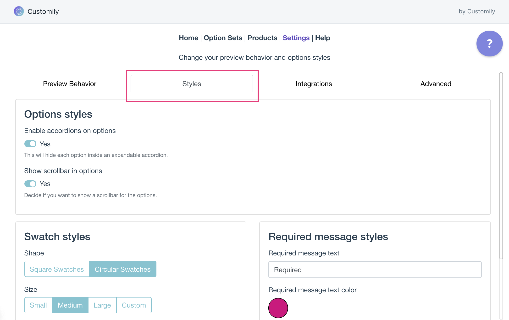
Styles you can change through settings
These are the styles you can change through settings
Style | What changes
---|---
Enable accordions on options | It will hide each option inside an expandable accordion
Show scrollbar in options | Shows or hides the scrollbar when options are too long. This is only visible on the Modal preview style
Swatch styles | Change the size and shape of the swatches, and the color of the selected swatch.
Required message styles | Change the wording and the color of the required message. This message is shown when a required option is left unselected.
▶ What is an Option Set?
In Customily, an Option Set is the group of personalization fields your
shoppers interact with on your product page. It’s the form that lets them
customize your product — made up of text inputs, swatches, dropdowns,
calendars, image uploads, and more.
Option sets are what connect your design with your storefront. Without an
option set, your shoppers wouldn’t have a way to personalize the elements in
your design.
When a shopper types in a name, uploads a photo, or picks a date, they’re
using the Option Set.
What’s Included in an Option Set
Each option set includes a list of input fields, also called options. Each
of these options is connected to a specific element in your design — such as a
text box, image placeholder, or dynamic image — and controls how that element
gets personalized.
For example:
- A text input may be linked to a name or message in your design.
- A swatch may change the color of a text or a font.
- A dropdown may let shoppers choose between multiple clipart styles.
- A calendar input may let them select a meaningful date.
You can customize how these options look and behave in your store, to match
your product and offer the best buying experience.
Where Do Option Sets Come From?
Option sets are generated automatically when you:
- **Create a new design** in the Design Studio.
- Link a template with a product manually.
You can also create option sets manually from scratch , without using a
design or template— but this is recommended only for advanced users with
complex personalization workflows.
Learn more about how Option Sets are created here.
No matter how an option set was created, you can always edit it later.
You’ll be able to change option labels, rearrange their order, delete or clone
inputs, and even adjust how each option looks and behaves on your storefront.
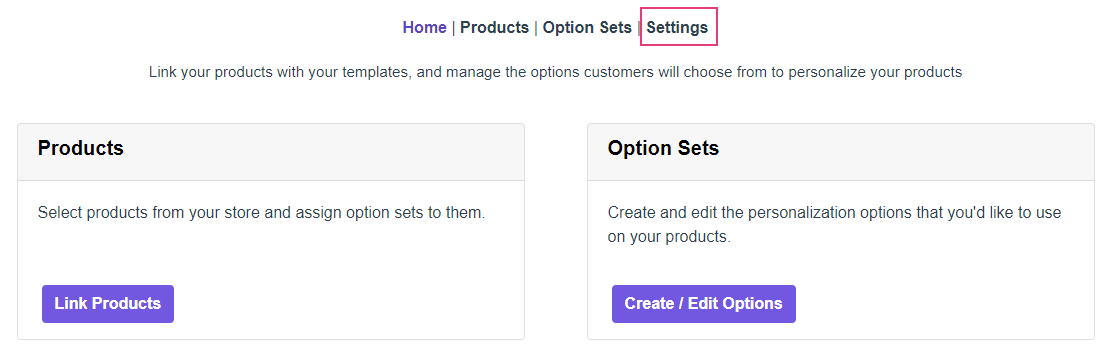
▶ Where to Find and Manage Your Option Sets
Once you understand what an option set is, the next step is knowing where to
find them and how to manage them. Whether your option sets were created
automatically or manually, you can view, edit, and organize them all from the
same place.
Accessing Your Option Sets
To view your option sets:
- Go to your Start section in Customily, click Option sets on the top navigation bar.
Head to your Store section, and click Create/Edit Options to open your
option sets.
- This will open the Option set panel where you'll see the full list of option sets in your account.
- From the Option Sets panel, you can manage all your sets:
Hover over any option set to:
- Open and Edit it to customize the options
- Clone an existing set to reuse it
- Check its history to see when it was created or last updated
- Delete it
Pro Tip
Use the Search bar at the top to quickly find a specific set.
▶ How Option Sets Are Created
Option sets can be created in three different ways in Customily. Two are
automatic and happen while you're working on your designs or templates. The
third is manual and recommended only for advanced users.
- Automatically when creating a Design
- Automatically when linking a Template to a Product
- Manually, from scratch.
Creating an option set automatically when creating a Design
When you create a design using the Design Studio, Customily automatically
generates an option set based on the personalization elements in your design.
Each element that shoppers can personalize — like a text box or dynamic image
— will generate a corresponding option (like a text input or swatch) in the
option set. You can later customize these options as needed.
This is the most common way option sets are created. You can learn more about how automatic option sets are created from designs here.
Creating an option set automatically when linking a Template to a Product
When you manually link a template to a product, you’ll be asked to select an
option set. At that point, you can either:
- Choose an existing option set, or
- Create a new one from the template
If you choose to create a new option set, Customily will automatically
generate it based on the elements in the template — similar to when an option
set is created from a design. Each element that shoppers can personalize on
your template — like a text box or dynamic image — will generate a
corresponding option (like a text input or swatch) in the option set. You can
later customize these options as needed.
This is useful when you're creating products manually instead of publishing
them directly from the Start Menu.
This gives you flexibility to reuse an option set or generate a fresh one
tailored to the template you're linking.
Creating an option set manually
You can also create option sets manually, without using a design or a
template. This gives you full control over every option and how it behaves —
but you’ll need to manually link each option to a design element.
This method is best for merchants with complex personalization needs who are
familiar with how option sets work.
What Happens Automatically vs Manually
When you create an Option Set automatically Customily:
- Detects the design elements
- Adds the best Option for each one
- Assigns the proper Function
You can review and tweak these settings — for example, swapping a swatch for a
dropdown, or changing a label.
When you create an Option Set manually , you’ll need to:
- Add each Option yourself
- Choose the correct Option Type
- Assign the proper Function
This gives you full control and is ideal for advanced customizations.
▶ How to create an Option Set manually
While most merchants use option sets created automatically from a design or
template, there are cases where creating an option set from scratch is the
best way to go. This method is recommended for advanced users who want
complete control over the personalization experience.
Why create an option set manually?
Manual creation gives you full flexibility to:
- Build an option set without needing a design first
- Reuse the same set across multiple products and designs
- Create complex or conditional flows tailored to your product
- Customize each option’s logic, style, and layout from the ground up
How to create an option set manually
- Open your Option Sets panel and Click + New Option Set
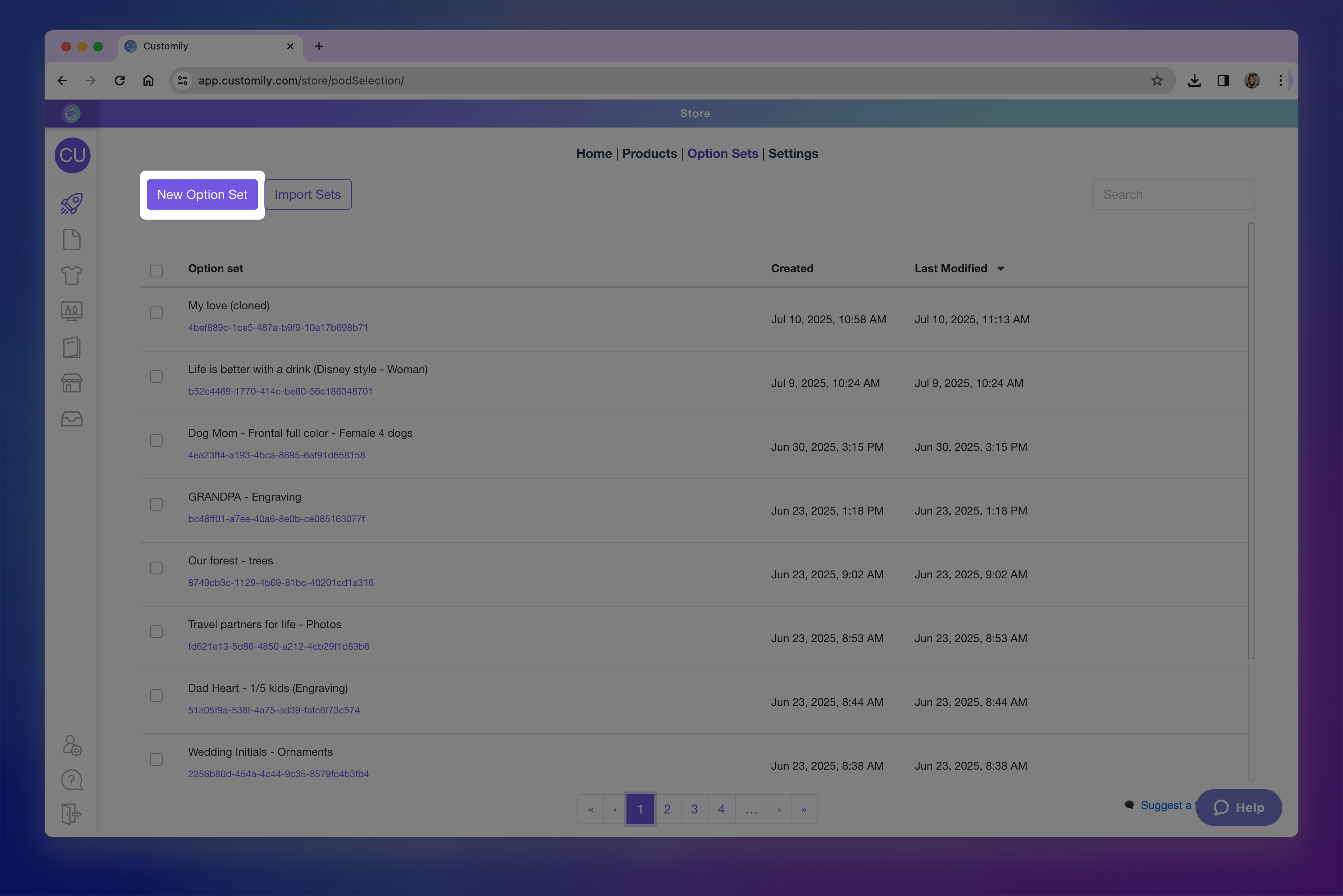new option set.png**
- Give the option set a name, this is visible only to you, not the shoppers.
- Add your option
Click +Add Option to add your first option manually.
If you click the toggle icon, you may also see options to **Create from a
template element or Import from another set** — but for this walkthrough,
we’ll focus on building manually.
- Click on the newly added option to expand it and access its settings. This is where you'll configure the behavior and appearance of the option.
- Choose the type of option
By default, the option is set to a text input. You can change this to any
other input type — such as dropdown, swatch, image upload, or date picker —
using the Option type dropdown.
Here’s a quick overview of the available types:
→ Text inputs (single-line and multi-line): Let shoppers enter custom text, such as names or
messages.
→ Dropdowns:
Show a list of values for the shopper to choose from (like font options or styles).
→ Dropdown with swatch: Combines dropdown functionality with visual
swatches for each value.
→ Swatches (colors, images): Display visual choices like colors or images as
clickable options.
→ Text Swatches: Display text-based options as clickable buttons.
→ Image uploads: Let shoppers upload their own images to be added
into your design.
→ Vector uploads: Allow uploading vector files when high-resolution
artwork is needed.
→ Color picker:
Gives shoppers a color selector to choose any custom color (instead of pre-set swatches).
→ Checkbox: Use
for toggling on/off elements or including optional personalization.
→ Maps: Add a
searchable location input that generates a stylized map in your design.
→ Star Maps:
Add a searchable location and date input that generates a custom star
constellation map.
→ Date Picker (calendar): Let shoppers select a specific date using a
calendar widget.
→ QR Code: Let
shoppers add a URL to automatically generate a QR code.
Want to learn more about what each option type can do? Check the articles
linked above to explore how to best configure each one.
- Define the option label
This is the name that will appear to shoppers above the option on your
storefront (e.g. “Enter your name” or “Choose a color”).
It’s also the name you’ll see listed in the option set panel, so it’s helpful
to keep it clear and descriptive.
- Format the option's settings
Each option type has its own formatting settings. For example, text inputs can
have character limits or placeholder text, while swatches can be styled with
custom thumbnails, color pickers, and more.
Explore the linked articles in step 5 to learn what formatting options are
available for each input type and how to configure them.
- Assign the option's function
Functions define what the option actually controls in the design — this is
what tells Customily what the option will change. For example like changing a
text color, switching an image, or updating a map.
When you create option sets automatically (through a design or template),
these functions are applied for you. But when building a set manually,
assigning a function is a key step.
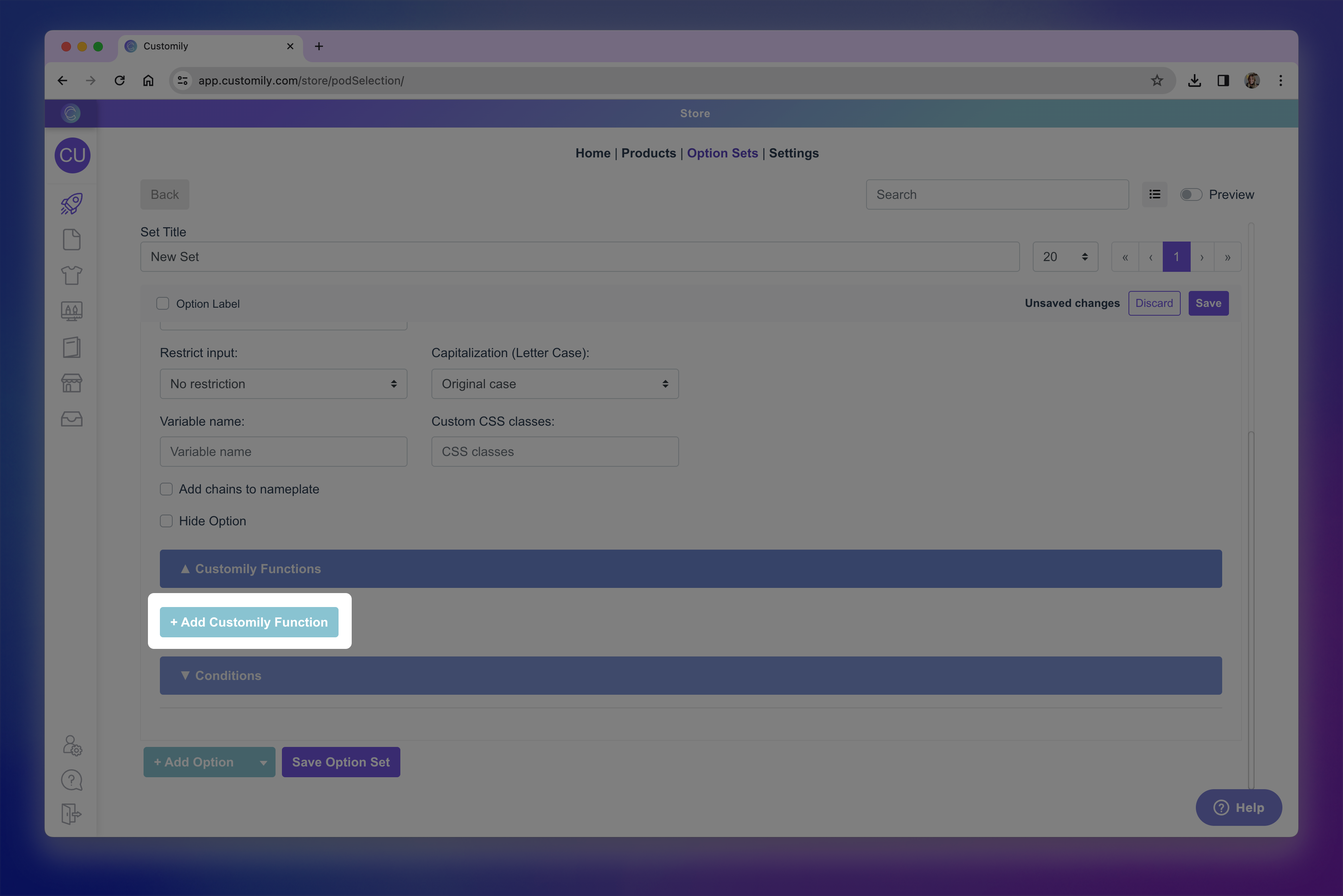
Click the Functions tab inside the option to, and click **+Add Customily
Function** to assign one.
Available functions vary depending on the type of option you are using
Here are some of the most common functions:
→ Text – Replaces the content of a text box.
→ Text color – Changes the color of a text element.
→ Font type – Changes the font style used.
→ Dynamic image – Switches between multiple images inside a dynamic image
element.
→ Image upload – Applies shopper uploaded image into image placeholder.
→ Change template – Replaces the entire design template with another one.
→ Add Shopify product – Adds a Shopify product as part of the personalization
(bundling).
Want to learn more about all available functions and how they work? Check
**Understand Functions in Option Sets** for a full list of functions and how they interact
with your options.
- Link the Option to a Design Element
After selecting the function, you need to connect it to the specific element
in your design it should control — this is done by assigning the **Element
ID**.
You can:
→ Type the ID manually if you know it
→ Or click the **Search
▶ How to Create an Option Set Automatically
The easiest way to create option sets in Customily is by letting the app do it
for you! There are two ways option sets can be created automatically — no
manual setup required:
- When you create a My Design
- When you link a product to a template and choose to generate the set from it
Let’s break down both methods:
Automatic Option Sets for My Designs
Whenever you create a new My Design , Customily will automatically
generate an option set for it based on the personalization elements you used
in the design.
You don’t have to do anything — the option set is created for you in the
background, and is ready to use when you connect this design to a product.
You can always edit these auto-generated sets if you want to customize the
options, labels, logic or order.
Create Options Automatically when linking a Product to a Template
When adding personalization manually to an existing listing from your store in
the Store section, you’ll be asked to select a template and an option set.
After you select the template, you’ll have two choices:
- Use an existing option set
- Create a new one from the template
If you choose to Create Option set from Template , Customily will:
- Scan your template’s personalization elements
- Automatically generate the right options and link them to the appropriate template layers
This method saves you tons of setup time. And, same as with the option sets
generated from designs, you can always edit these auto-generated sets if you
want to customize the options, labels, logic or order. Learn how to edit option sets here.
What’s included in an automatic option set?
Automatically generated sets include:
- All the personalization options needed to match your template or design
- Pre-assigned functions, linked to the correct elements
- Pre-filled values for swatches, dropdowns, or other selectable inputs
Everything is ready to go — but fully editable afterward.
Can I edit an automatic option set?
Yes! After it's created, your option set works just like any other in your
account.
You can:
- Edit existing options
- Add or remove options
- Change labels, types, functions, and values
- Apply conditional logic
- Reorder options
Want to learn more? See how to edit an option set →
▶ Text input
Text Inputs let shoppers type in their own personalized content, like names,
messages, quotes, or whatever text you can think of. You can use them to
collect anything from short names to long dedications.
You can configure how the text input behaves, and decide how that input will
be used to personalize.
- * *
In this article:
- Settings you can configure on a Text Input
- How Text Inputs can be used to personalize
Settings you can configure on a Text Input
When you select Text Input as the option type, you’ll be able to configure
how the input behaves and appears in your store.
To configure these, expand the option in your Option Set and scroll
through the available settings.
Text inputs come with a wide range of settings. Click any item below to jump
directly to it:
🛠 Basic Settings
- Label
- Required
- Help Text
- Placeholder
- Initial Value
- Max Length
- Make it Text Area
- Restrict Input
- Capitalization
⚙️ Advanced Settings
- Variable Name
- Custom CSS Class
- Add Chains to Nameplate
- Hide Option
Label
Text that appears above the input field on your product page (e.g., “Enter your name”)
Required
Make this field mandatory by enabling this toggle. If it's required, shoppers
won't be able to complete their purchase without filling it out. An * next to
the option label will indicate it is required on the storefront.
Help Text
Add a short description below the input to guide your shoppers (e.g. “Enter a name or short message”).
Placeholder
A sample text that appears in the input field before shoppers type. This
disappears when they start writing.
Initial Value
Pre-fill the input with a specific value that will show in the preview right
away (unlike a placeholder, this text is submitted unless edited).
Max Length
Set a limit on how many characters shoppers can type.
Make it textarea
Turn the input into a multi-line field. When enabled, you can set:
- Max number of lines
- Max characters per line
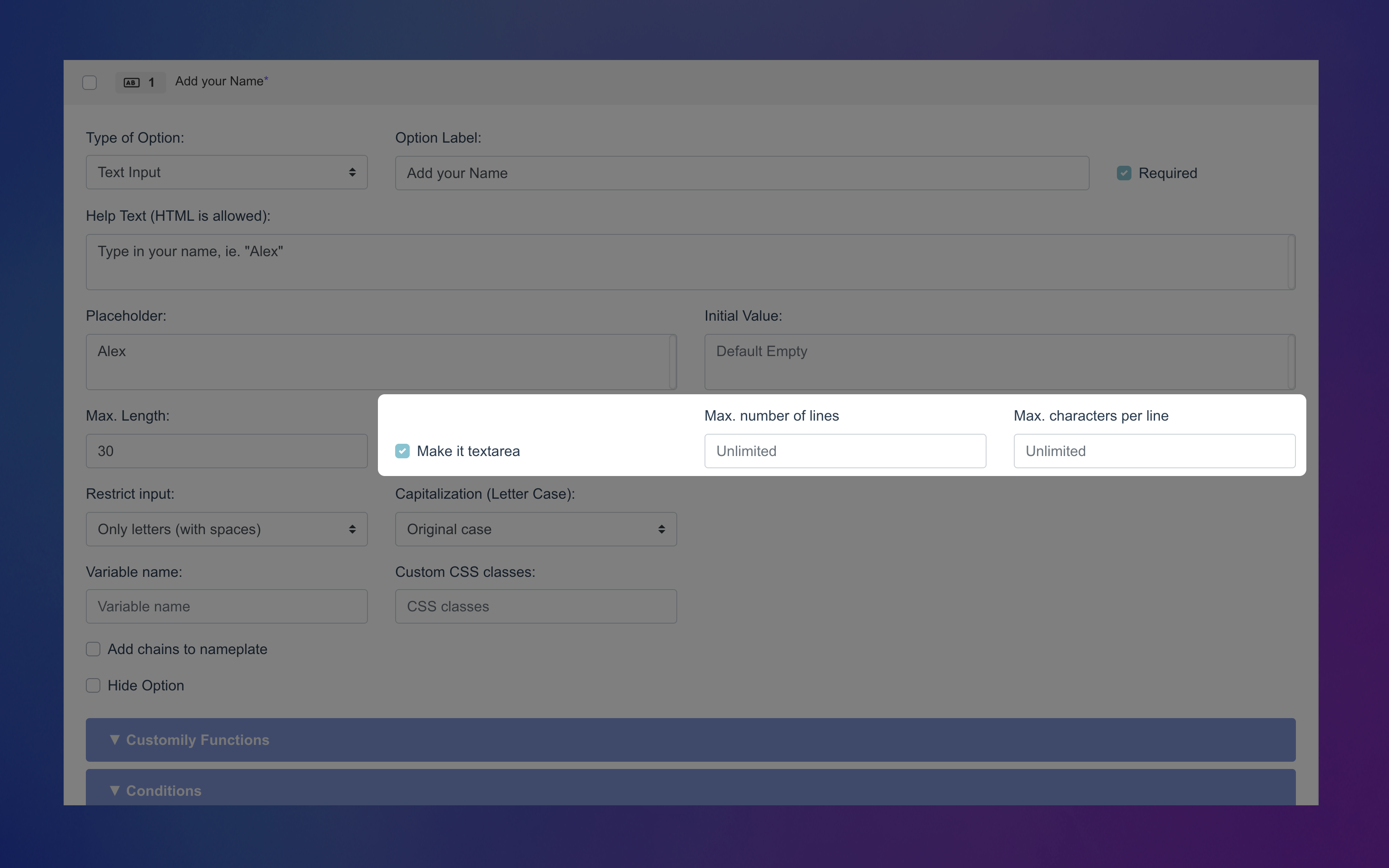Text input text area.png**
Restrict Input
Control what shoppers can enter:
- No restriction
- Only numbers (no spaces)
- Only numbers (with spaces)
- Only letters (no spaces)
- Only letters (with spaces)
- Custom restriction (use a regex pattern to filter specific content — e.g. block curse words)
Capitalization
Automatically format the input as:
- All UPPERCASE
- all lowercase
- Capitalize Each Word
- Original case (default)
Variable Name (Advanced)
Assign a hidden variable to this option (not visible to shoppers). This allows
you to pre-fill it via a URL, useful for marketing campaigns or sharing pre- configured links.
Custom CSS Class (Advanced)
Add a custom class name to target and style this option through CSS in your
store’s developer settings.
Add chains to nameplate (Advanced)
Adds curly brackets
{} before and after the input text. Only used forproducts with fonts made for engraving nameplates (where the chain character is mapped to
{}).Hide Option(Advanced)
Hide this option completely from shoppers — helpful when you want to include
fixed text in the preview without letting customers change it.
How Text Inputs Can Be Used to Personalize
Text inputs let shoppers type their own text — but what that text does
depends on the function you assign to the option.
You can learn more about functions and how they work here.
To assign a function to a Text Input, expand the Function tab of your
option and choose how it should interact with your template.
Text Inputs can power a variety of personalization types by assigning
functions to them. Here are the functions that work with text inputs,
▶ Dropdown
Dropdowns let shoppers select from a list of predefined values — like choosing
a font style, quote, or size. They’re perfect for offering multiple choices in
a compact format.
You can configure how the dropdown behaves, and decide how that input will be
used to personalize.
- * *
In this article:
- Settings you can configure on a Dropdown
- How Dropdowns can be used to personalize
- How to configure Dropdown Values
Settings you can configure on a Dropdown
When you select Dropdown as the option type, you’ll be able to configure
how the selector behaves and appears in your store.
To configure these, expand the option in your Option Set and scroll
through the available settings.
Click any item below to jump directly to it:
🛠 Basic Settings
- Label
- Required
- Help Text
- Placeholder
⚙️ Advanced Settings
- Variable Name
- Custom CSS Class
- Hide Option
Label
Text that appears above the dropdown selector on your product page (e.g., “Choose a quote”)
Required
Make this field mandatory by enabling this toggle. If it's required, shoppers
won't be able to complete their purchase without selecting it. An * next to
the option label will indicate it is required on the storefront.
Help Text
Add a short description below the selector to guide your shoppers.
Placeholder
Text that appears in the dropdown before any selection is made. This can
prompt shoppers to make a choice, like Select a style.
Variable Name (Advanced)
Assign a hidden variable to this option (not visible to shoppers). This allows
you to pre-fill it via a URL, useful for marketing campaigns or sharing pre- configured links.
Custom CSS Class (Advanced)
Add a custom class name to target and style this option through CSS in your
store’s developer settings.
Hide Option(Advanced)
Hides the option completely from shoppers. This is useful when you want to
control personalization behavior in the background without shopper input.
How Dropdowns Can Be Used to Personalize
Dropdowns let shoppers select from a list — but what that selection does
depends on the function you assign to the option.
To assign a function, expand the Function tab of your option and choose
how it should interact with your template.
Dropdowns can power a variety of personalization types by assigning
functions to them. Here are the functions that work with dropdowns, click
on each one to learn how they can personalize your product:
- Text
- Text Color
- Text Outline Color
- Font Type
- Dynamic Image
- Dynamic Vector
- Image color
- Dynamic Vector color
- Change template
- Add Shopify Product
- Layout visibility
Text
Changes the content of a text element in your template, with the pre- defined value on the dropdown. Perfect for lists of pre-defined options like
cities, months, quotes, and more.
Text Fill and Outline Color
Updates the fill color or the outline color of a text element that has
different color options.
Font Type
Changes the font of a text element that has different font options.
Dynamic Image / Dynamic Vector
Changes a preset image or vector in your design based on the selection
(e.g., switching hairstyles, clothes, etc.).
Image Color / Dynamic Vector Color
Changes the color of an Image upload if it is set to Single Color mode and has color options, or of a
different color options.
Change Template
Loads a completely different template when the shopper selects a specific
value (useful for switching product styles or sizes).
Add Shopify Product
Adds an extra Shopify product when a certain value is selected (ideal for upsells or bundles).
Layout Visibility
▶ Dropdown Swatch
Dropdowns with swatches(also known as Dropdown Swatch) let shoppers select
from a list of predefined values — just like regular dropdowns — but with the
added benefit of showing a visual swatch next to each option. It’s perfect
when you want to offer choices like fonts, styles, or colors and make it
easier for shoppers to see what each one looks like before selecting, but
still keeping it compact.
You can configure how the dropdown with swatches behaves, and decide how that
input will be used to personalize.
- * *
In this article:
Settings you can configure on a Dropdown Swatch
When you select Dropdown Swatch as the option type, you’ll be able to
configure how the selector behaves and appears in your store.
To configure these, expand the option in your Option Set and scroll
through the available settings.
Click any item below to jump directly to it:
🛠 Basic Settings
- Label
⚙️ Advanced Settings
Label
Text that appears above the dropdown selector on your product page (e.g., “Choose a quote”)
Required
Make this field mandatory by enabling this toggle. If it's required, shoppers
won't be able to complete their purchase without selecting it. An * next to
the option label will indicate it is required on the storefront.
Help Text
Add a short description below the selector to guide your shoppers.
Placeholder
Text that appears in the dropdown before any selection is made. This can
prompt shoppers to make a choice, like Select a style.
Variable Name (Advanced)
Assign a hidden variable to this option (not visible to shoppers). This allows
you to pre-fill it via a URL, useful for marketing campaigns or sharing pre- configured links.
Custom CSS Class (Advanced)
Add a custom class name to target and style this option through CSS in your
store’s developer settings.
Hide Option(Advanced)
Hides the option completely from shoppers. This is useful when you want to
control personalization behavior in the background without shopper input.
How Dropdown Swatches Can Be Used to Personalize
Just like regular dropdowns, Dropdowns with swatches let shoppers select from
a list — but with the added benefit of visual cues for each option. What that
selection does depends on the function you assign to the option.
You can learn more about functions and how they work here.
To assign a function to a Dropdown, expand the Function tab of your option
and choose how it should interact with your template.
Dropdowns with swatch can power a variety of personalization types by
assigning functions to them. Here are the functions that work with
dropdowns, click on each one to learn how they can personalize your product:
Text
Changes the content of a text element in your template, with the pre- defined value on the dropdown swatch. Perfect for lists of pre-defined options
like cities, months, quotes, and more.
Text Fill and Outline Color
Updates the fill color or the outline color of a text element that has
different color options.
Font Type
Changes the font of a text element that has different font options.
Dynamic Image / Dynamic Vector
Changes a preset image or vector in your design based on the selection
(e.g., switching hairstyles, clothes, etc.).
Image Color / Dynamic Vector Color
Changes the color of an Image upload if it is set to Single Color mode and has color options, or of a
different color options.
Change Template
Loads a completely different template when the shopper selects a specific
▶ Swatch
Swatches let shoppers choose from a set of predefined options shown
visually — like colors, images, or clipart. All available choices are
displayed at once, making it quicker and more intuitive for shoppers to pick
what they want. You can define each swatch using either a color or an image,
depending on what fits your product best.
You can configure how the swatch behaves, and decide how that input will be
used to personalize.
- * *
In this article:
- Settings you can configure on a Swatch
- How Swatches can be used to personalize
- How to configure Swatch Values
Settings you can configure on a Swatch
When you selectSwatch as the option type, you’ll be able to configure how
the selector behaves and appears in your store.
To configure these, expand the option in your Option Set and scroll
through the available settings.
Click any item below to jump directly to it:
🛠 Basic Settings
- Label
- Required
- Help Text
⚙️ Advanced Settings
Label
Text that appears above the swatch selector on your product page (e.g., “Choose a color”)
Required
Make this field mandatory by enabling this toggle. If it's required, shoppers
won't be able to complete their purchase without selecting it. An * next to
the option label will indicate it is required on the storefront.
Help Text
Add a short description below the swatches to guide your shoppers.
Variable Name (Advanced)
Assign a hidden variable to this option (not visible to shoppers). This allows
you to pre-fill it via a URL, useful for marketing campaigns or sharing pre- configured links.
Custom CSS Class (Advanced)
Add a custom class name to target and style this option through CSS in your
store’s developer settings.
Hide Option(Advanced)
Hides the option completely from shoppers. This is useful when you want to
control personalization behavior in the background without shopper input.
How Swatches Can Be Used to Personalize
Swatches let shoppers make a visual choice — but what that selection does
depends on the function you assign to the option.
You can learn more about functions and how they work here.
To assign a function to a Swatch, expand the Function tab of your option
and choose how it should interact with your template.
Swatches can power a variety of personalization types by assigning
functions to them. Here are the functions that work with swatches, click
on each one to learn how they can personalize your product:
- Map Style
- Star Map Style
Text
Changes the content of a text element in your template based on the value
selected in the swatch. While it's less common to use swatches for text input,
it can work for short, predefined choices — like initials, numbers, or short
words — especially when paired with a visual reference.
Text Fill and Outline Color
Updates the fill color or the outline color of a text element that has
different color options.
Font Type
Changes the font of a text element that has different font options.
Dynamic Image / Dynamic Vector
Changes a preset image or vector in your design based on the selection
(e.g., switching hairstyles, clothes, etc.).
Image Color / Dynamic Vector Color
Changes the color of an Image upload if it is set to Single Color mode and has color options, or of a
different color options.
Map Style
Changes the visual style for a map element — like street, vintage, or
dark. Each swatch represents one of Customily’s predefined map styles, and
the selected style updates the map’s appearance automatically.
▶ Text Swatch
Text swatches let shoppers choose from a set of predefined options
displayed as clickable buttons. Unlike regular swatches, these don’t use
images or colors, they use text; and unlike dropdowns, all options are visible
at once, making selection quicker and more intuitive. They’re great for short
text choices like sizes, initials, or style names.
You can configure how the text swatch behaves, and decide how that input will
be used to personalize.
- * *
In this article:
Settings you can configure on a Text swatch
When you selectText swatch as the option type, you’ll be able to configure
how the selector behaves and appears in your store.
To configure these, expand the option in your Option Set and scroll
through the available settings.
Text swatches come with a wide range of settings. Click any item below to jump
directly to it:
🛠 Basic Settings
⚙️ Advanced Settings
Label
Text that appears above the text swatch selector on your product page (e.g., “Choose number of pets”)
Required
Make this field mandatory by enabling this toggle. If it's required, shoppers
won't be able to complete their purchase without selecting it. An * next to
the option label will indicate it is required on the storefront.
Help Text
Add a short description below the swatches to guide your shoppers.
Variable Name (Advanced)
Assign a hidden variable to this option (not visible to shoppers). This allows
you to pre-fill it via a URL, useful for marketing campaigns or sharing pre- configured links.
Custom CSS Class (Advanced)
Add a custom class name to target and style this option through CSS in your
store’s developer settings.
Hide Option(Advanced)
Hides the option completely from shoppers. This is useful when you want to
control personalization behavior in the background without shopper input.
How Text Swatches Can Be Used to Personalize
Text swatches let shoppers make a visual choice — but what that selection
does depends on the function you assign to the option.
You can learn more about functions and how they work here.
To assign a function to a Text swatch, expand the Function tab of your
option and choose how it should interact with your template.
Text swatches can power a variety of personalization types by assigning
functions to them. Here are the functions that work with swatches, click
on each one to learn how they can personalize your product:
- Map Style
- Star Map Style
Text
Changes the content of a text element in your template, with the pre- defined value on the text swatch. Perfect for lists of pre-defined short
options like initials, months, numbers, and more.
Text Fill and Outline Color
Updates thefill color or the outline color of a text element that has
different color options.
Font Type
Changes the font of a text element that has different font options.
Dynamic Image / Dynamic Vector
Changes a preset image or vector in your design based on the selection
(e.g., switching hairstyles, clothes, etc.). While this works with Text
Swatches, it’s not the most intuitive option for shoppers, since there’s no
visual preview — consider using image-based swatches instead when showing
visual differences matters.
Image Color / Dynamic Vector Color
Changes the color of an Image upload if it is set to Single Color mode and has color options, or of a
different color options.
Map Style
Changes the visual style for a map element — like street, vintage, or
dark. Each swatch represents one of Customily’s predefined map styles, and
▶ Image Upload
Image Upload lets shoppers upload their own images — whether it's a pet
photo, a logo, a drawing, or anything else they want to add to the design.
They’ll see a button that opens a file picker, and once an image is uploaded,
it will appear directly in your product preview.
You can configure how the image upload looks and behaves, and decide how it
will be used to personalize.
- * *
In this article:
- Settings you can configure on an Image Upload
Settings you can configure on an Image Upload
When you select Image Upload as the option type, you’ll be able to
configure how the upload button behaves and appears in your store.
To configure these, expand the option in your Option Set and scroll
through the available settings.
Click any item below to jump directly to it:
🛠 Basic Settings
- Label
- Required
- Help Text
- Initial Image
- Button Text
- Minimum image size
⚙️ Advanced Settings
- Custom CSS Class
- Hide Option
Label
Text that appears above the upload image button on your product page (e.g., “Add your photo”).
Required
Make this field mandatory by enabling this toggle. If it's required, shoppers
won't be able to complete their purchase without uploading an image. An * next
to the option label will indicate it is required on the storefront.
Help Text
Add a short description below the upload button to guide your shoppers. Great
to give helpful tips so shoppers know what kind of image works best or what to
expect, specially if the image will have some filters applied (e.g.,"Upload a clear, front-facing photo for best results.", or "Recommended size: 1000×1000px.").
Initial Image
Pre-fill the image placeholder with a specific photo that will show in the
preview right away. Great to upload something that says "your image goes here"
or an example picture.
Button Text
Customize the label on the upload button shown to shoppers. You can use
something simple like “Upload” or “Browse,” or tailor it to match your product
— for example, “Add Your Pet’s Photo” or “Upload Your Artwork.”
Minimum image size
Set a minimum required width and height (in pixels) for uploaded images. This
ensures shoppers only upload high-enough resolution images for your design. If
the uploaded image is too small, they’ll see an error and won’t be able to
proceed until they upload a larger one.
Custom CSS Class (Advanced)
Add a custom class name to target and style this option through CSS in your
store’s developer settings.
Hide Option(Advanced)
Hide this option completely from shoppers — helpful when you want to include
fixed image in the preview without letting customers change it.
How Image Uploads are used to Personalize
Image Uploads let shoppers upload their own images — that image is placed into
the design thanks to the function assigned to the image upload option.
You can learn more about functions and how they work here.
Unlike other option types, you don’t need to assign a function manually.
The Image Upload option comes with the Image Upload function already
defined — it just needs to be linked to a compatible element in your design.
Image Uploads work with the following elements:
- Image Placeholder – Displays the uploaded image directly in your design.
- Meta Filtered Image – Applies an AI-generated filter to the shopper’s image before displaying it.
Just connect the upload option to the right element in your template, and
Customily takes care of the rest!
▶ Vector Upload
Vector Upload lets shoppers upload high resolution vector files — whether
it's a logo, a monogram, a line-art illustration or anything else they want to
add to the design. They’ll see a button that opens a file picker, and once a
vector is uploaded, it will appear directly in your product preview.
You can configure how the vector upload looks and behaves, and decide how it
will be used to personalize.
- * *
In this article:
- Settings you can configure on an Vector Upload
- How Vector uploads are used to personalize
Settings you can configure on an Vector Upload
When you select Vector Upload as the option type, you’ll be able to
configure how the upload button behaves and appears in your store.
To configure these, expand the option in your Option Set and scroll
through the available settings.
Click any item below to jump directly to it:
🛠 Basic Settings
- Label
- Required
- Help Text
- Button Text
⚙️ Advanced Settings
- Custom CSS Class
- Hide Option
Label
Text that appears above the upload vector button on your product page (e.g., “Add your logo”)
Required
Make this field mandatory by enabling this toggle. If it's required, shoppers
won't be able to complete their purchase without uploading an image. An * next
to the option label will indicate it is required on the storefront.
Help Text
Add a short description below the upload button to guide your shoppers. Great
to give helpful tips so shoppers know what kind of vector works best or what
to expect (e.g.,"Upload SVG, PDF or EPS files")
Button Text
Customize the label on the upload button shown to shoppers. You can use
something simple like “Upload” or “Browse,” or tailor it to match your product
— for example, “Add Your Logo” or “Upload Your Artwork.”
Custom CSS Class (Advanced)
Add a custom class name to target and style this option through CSS in your
store’s developer settings.
Hide Option(Advanced)
Hide this option completely from shoppers — helpful when you want to include
fixed image in the preview without letting customers change it.
How Vector Uploads are used to Personalize
Vector Uploads let shoppers upload their own vector files — that vector is
placed into the design thanks to the function assigned to the vector upload
option.
You can learn more about functions and how they work here.
Unlike other option types, **you don’t need to assign a function manually to
the vector upload. The option comes with the Vector Upload** function
already defined — it just needs to be linked to a compatible element in your
design.
Image Uploads work with the element:
- Vector Placeholder – Displays the uploaded image directly in your design.
Just connect the upload option to the right element in your template, and
Customily takes care of the rest!
▶ Color Picker
Color Pickers let shoppers choose any color they want — no need to limit
them to predefined swatches. They’ll see a color picker on your storefront,
allowing them to select custom shades with full flexibility.
You can configure how the color picker option looks and behaves, and decide
how it will be used to personalize. However, the **color picker interface
itself can’t be changed**. Shoppers will always see:
- A color spectrum selector
- Sliders for adjusting color (hue and opacity)
- A field to enter HEX , RGBA , or HSLA values directly
- * *
In this article:
- How Color Pickers can be used to personalize
Settings you can configure on a Color Picker
When you select Color Picker as the option type, you’ll be able to
configure how the picker behaves and appears in your store.
To configure these, expand the option in your Option Set and scroll
through the available settings.
Click any item below to jump directly to it:
🛠 Basic Settings
⚙️ Advanced Settings
- Variable Name
Label
Text that appears above the color picker on your product page (e.g., “Choose text color”)
Required
Make this field mandatory by enabling this toggle. If it's required, shoppers
won't be able to complete their purchase without uploading an image. An * next
to the option label will indicate it is required on the storefront.
Help Text
Add a short description below the color picker to guide your shoppers. Great
to give helpful tips so shoppers know what colors work best.
Default Color
Select the color that will show in the preview right away. You can use it to
match your design style or suggest a good starting point for shoppers.
Variable Name (Advanced)
Assign a hidden variable to this option (not visible to shoppers). This allows
you to pre-fill it via a URL, useful for marketing campaigns or sharing pre- configured links.
!picker variable.png**Custom
CSS Class** (Advanced)
Add a custom class name to target and style this option through CSS in your
store’s developer settings.
Hide Option(Advanced)
Hide this option completely from shoppers — helpful when you want to include
fixed image in the preview without letting customers change it.
How Color Pickers Can Be Used to Personalize
Color pickers let shoppers choose any particular color they want — but **where
that color is applied to** depends on the function you assign to the option.
You can learn more about functions and how they work here.
To assign a function to a Color Picker, expand the Function tab of your
option and choose how it should interact with your template.
To personalize your product with a Color Picker, you’ll need to assign a
function that controls the color of an element in your design. Here are
the functions that work with Color Pickers, click on each one to learn how
they can personalize your product:
- Text Color
- Text Outline Color
- Image Color
- Dynamic Vector Color
Text Fill and Outline Color
Updates thefill color or the outline color of a text element.
Image Color / Dynamic Vector Color
Changes the color of an Image upload if it is set to Single Color mode, or of a Dynamic Vector in Single Color mode.
▶ Checkbox
Checkboxes let shoppers turn something on or off in your design. They're
perfect for optional features, like adding an accessory, toggling a design
detail, or including an extra product in the order.
When a shopper checks the box, a specific personalization is applied. When
it’s left unchecked, that change won’t happen — giving you full control over
what’s added and when.
Another very common use of a checkbox is **to reveal other options in the
product** , without applying any change to the design itself. For example, if
you're designing custom stationery you could have a checkbox to:
“Add return address to the envelopes?”
If checked, a group of fields appears for the shopper to enter their address.
If not, those fields stay hidden.
This setup is handled using Conditions, which lets you show or hide additional
options based on the checkbox’s value.
All of this can be configured when you determine how the checkbox looks and
behaves, and decide how it will be used to personalize.
- * *
In this article:
Settings you can configure on a Checkbox
When you select Checkbox as the option type, you’ll be able to configure
how the option behaves and appears in your store.
To configure these, expand the option in your Option Set and scroll
through the available settings.
Click any item below to jump directly to it:
🛠 Basic Settings
- Label
- Required
- Help Text
- Start Selected
⚙️ Advanced Settings
- Variable Name
- Custom CSS Class
- Hide Option
Label
Text that appears next to the checkbox your product page (e.g., “Add frame”)
Required
Make the checkbox mandatory for shoppers to proceed. This is most useful when
you want them to confirm something before adding the product to the cart — for
example, verifying that their personalization is correct or acknowledging a
disclaimer.
An * next to the option label will indicate it is required on the storefront.
Help Text
Appears below the checkbox label to give shoppers extra guidance or context.
This is especially helpful if the label is short and you want to provide
details without cluttering the checkbox itself.
For example:
- Label: “I confirm that the name and date are correct.”
Help Text: “Please review your personalization carefully — changes can’t
be made after purchase.”
- Label: “Optional gift wrap (+$5)”
Help Text: “Your gift will be wrapped in festive paper and include a blank
card.”
Start Selected (checked by default)
If enabled, the checkbox will be pre-checked when shoppers first see the
product.
This is useful if you want a default selection (for example, including an optional feature by default) but still allow shoppers to uncheck it if they
don’t want it.
Variable Name (Advanced)
Assign a hidden variable to this option (not visible to shoppers). This allows
you to pre-fill it via a URL, useful for marketing campaigns or sharing pre- configured links.
Custom CSS Class (Advanced)
Add a custom class name to target and style this option through CSS in your
store’s developer settings.
Hide Option(Advanced)
Hide this option completely from shoppers — helpful when you want to include
fixed image in the preview without letting customers change it.
How Checkboxes Can Be Used to Personalize
Checkboxes are great for simple, yes/no choices. A shopper either selects it
or leaves it unchecked — and that single choice can trigger personalization in
your design.
What the checkbox actually does depends on the function you assign to it.
For example, a checkbox can toggle a design element on or off, switch a
layout, or add an extra product to the cart.
You can learn more about functions and how they work here.
To assign a function to a Checkbox, expand the Function tab of your option
and choose how it should interact with your template.
In many cases, checkboxes don’t use a function directly. Instead, they’re
often used to hide or show additional options — for example, revealing a
set of text fields only if the shopper wants to add a custom message — using
conditions.
When you do assign a function, it will define how the checkbox interacts with
an element in your design. Here are the functions that work with Checkboxes,
click on each one to learn how they can personalize your product:
▶ Map Search
Map lets shoppers search for a specific location by typing an address or
place name. As they type, a popup map (powered by Mapbox) appears with live
suggestions and a visual preview, making it easy to pinpoint the right
location.
You can configure how the image upload looks and behaves, and decide how it
will be used to personalize.
- * *
In this article:
- Settings you can configure on a Map Search
Settings you can configure on a a Map Search
When you select Map as the option type, you’ll be able to configure how
the search field behaves and appears in your store.
To configure these, expand the option in your Option Set and scroll
through the available settings.
Click any item below to jump directly to it:
🛠 Basic Settings
- Label
- Required
- Help Text
- Placeholder
⚙️ Advanced Settings
- Custom CSS Class
- Hide Option
Label
Text that appears above the search input on your product page (e.g., "Enter a special location" or "Search for your city").
Required
Make this field mandatory by enabling this toggle. If it's required, shoppers
won't be able to complete their purchase without selecting a location. An *
next to the option label will indicate it is required on the storefront.
Help Text
Add a short description below the input to guide your shoppers.
Placeholder
A sample text that appears in the input field before shoppers type. This
disappears when they start writing. For example: “Search for a place…”
Custom CSS Class (Advanced)
Add a custom class name to target and style this option through CSS in your
store’s developer settings.
Hide Option(Advanced)
Hide this option completely from shoppers — helpful when you want to include
fixed map in the preview without letting customers change it.
How Map Search is used to Personalize
The Map option lets shoppers select a specific location — and that location is
displayed in your design thanks to the function already assigned to the map
option.
You can learn more about functions and how they work here.
Unlike other option types, you don’t need to assign a function manually.
The Map option comes with the Map Search function pre-defined — you just
need to link it to a compatible element in your design.
Map Search works with the following element:
- Map Element – Displays a street map based on the shopper’s selected location.
Just connect the map option to the right element in your template, and
Customily takes care of the rest!
▶ Star Map Search
Star Map lets shoppers search for a specific location by typing an address
or place name, and select a date by typing or choosing from the calendar. As
they type the location, live suggestions appear directly in the input field.
Once a location is selected, the star map updates automatically in the product
preview.
The date picker is pre-filled with today’s date , but shoppers can change
it by clicking and selecting a different one. Once a date is selected, the
star map updates to reflect the stars on that specific day.
When you add a Star Map option to your option set, it creates **one field in
the backend , but shoppers will see two inputs on the product page** — one
for the location and one for the date.
You can configure how the star map search looks and behaves, and decide how it
will be used to personalize.
- * *
In this article:
Settings you can configure on a a Star Map Search
When you select Star Map as the option type, a search field for location
and a date picker for the date will appear on your store. These options work
together, and can't be separated.
To configure these, expand the option in your Option Set and scroll
through the available settings.
Click any item below to jump directly to it:
🛠 Basic Settings
⚙️ Advanced Settings
Label
Text that appears above the search input on your product page (e.g., "Enter a special location" or "Search for your city"). The date picker always
appears below it with the default label “Pick a date.”
Required
Make the location field mandatory by enabling this toggle. If it's required,
shoppers won't be able to complete their purchase without selecting a
location. An * next to the option label will indicate it is required on the
storefront.
Help Text
Add a short description below to guide your shoppers. The help text will
appear below the date picker option.
Custom CSS Class (Advanced)
Add a custom class name to target and style these two options through CSS in
your store’s developer settings.
Hide Option(Advanced)
Hide both options completely from shoppers — helpful when you want to include
fixed map in the preview without letting customers change it.
How Star Map Search is used to Personalize
The Star Map option lets shoppers select a specific location and date — and
the stars for that location and moment are displayed in your design thanks to
the function already assigned to the star map option.
You can learn more about functions and how they work here.
Unlike other option types, you don’t need to assign a function manually.
The Star Map option comes with the Star Map Search function pre-defined —
you just need to link it to a compatible element in your design.
Star Map Search works with the following element:
- Star Map Element – Displays a star map based on the shopper’s selected location.
Just connect the star map option to the right element in your template, and
Customily takes care of the rest!
▶ Date Picker
Date Picker adds a calendar field to your product, allowing shoppers to
either type in a date or select one directly from a visual calendar. You can
connect a Date Picker to different elements in your design, depending on what
you want to show. For example, display the selected date as text, mark it on a
calendar, or reveal the moon phase for that night.
You can configure how the date picker behaves, and decide how that input will
be used to personalize.
- * *
In this article:
Settings you can configure on a Date Picker
When you select Date Picker as the option type, you’ll be able to
configure how the date selector behaves and appears in your store.
To configure these, expand the option in your Option Set and scroll
through the available settings.
Text inputs come with a wide range of settings. Click any item below to jump
directly to it:
🛠 Basic Settings
⚙️ Advanced Settings
Label
Text that appears above the date picker field on your product page (e.g., “Choose a date”)
Required
Make this field mandatory by enabling this toggle. If it's required, shoppers
won't be able to complete their purchase without selecting a date. An * next
to the option label will indicate it is required on the storefront.
Help Text
Add a short description below the picker to guide your shoppers. For example:
“Select a meaningful date — you can type it or choose from the calendar.”
How Date Pickers Can Be Used to Personalize
Date Pickers let shoppers choose a specific date — but what that date does
depends on the function you assign to the option.
You can learn more about functions and how they work here.
To assign a function to a Date Picker, expand the Function tab of your
option and choose how it should interact with your template.
Date Pickers can power a variety of personalization types by assigning
functions to them. Here are the functions that work with text inputs,
click on each one to learn how they can personalize your product:
Text
Displays the shopper’s date on a text element in your template.
Calendar
Displays the shopper’s date on a calendar element in your template.
Moon Phase Calendar
Displays the moon phase for the specific date the shopper selected on a **Moon
Phase element** in your template.
▶ What are Option Types?
Option Types determine __how your personalization options appear to
shoppers__. They control the form of input — whether it’s a text field, a
dropdown, a color swatch, an upload button, or something else. In essence,
option types define the interface the shopper uses to provide input for
personalization.
Each option type is different and is best suited for specific personalization
needs. For instance:
- Text Inputs are great for short messages or names,
- Swatches are ideal for visual selections like colors or clipart,
- Image Uploads let shoppers add their own photos or logos.
Option Types vs. Option Sets
An Option Set is the group of personalization fields connected to a
product.
Each individual option in the set has an Option Type , which
determines how it appears to the shopper — as a field, dropdown, swatch,
checkbox, etc.
Option Types You Can Use
Click any option type below to learn how it works and how to configure it:
A simple text field where shoppers can type custom content — like a name,
quote, or message. You can limit characters, add placeholders, and even use
multi-line inputs.
A compact list of predefined options. Shoppers click to expand and choose one.
Great for long lists like sizes, fonts, or styles.
Combines a dropdown list with visual previews next to each item. Useful when
shoppers need both a label and an image to decide (e.g., font previews, clipart styles).
Displays all options visually at once — using colors or images. Ideal for
color selections, clipart sets, or anything visual.
Similar to swatches, but uses text buttons instead of images or colors. Great
for quick selections like sizes or styles.
Adds an upload button so shoppers can upload their own image (like a photo or logo). The image is placed in your design automatically.
Lets shoppers upload vector files (like .svg) when high-resolution or scalable
artwork is needed.
Adds a color selection tool so shoppers can pick any custom color (not just predefined swatches).
A simple toggle — yes or no. Useful for optional add-ons, confirming
personalization, or triggering changes.
Adds a location search field with a popup map for selecting addresses or
places. Works only with map elements.
Adds a location and date picker to generate an accurate star map. Designed to
work specifically with Star Map elements.
Adds a calendar-style input so shoppers can select a specific date. Can be
used to display the date, highlight it on a calendar, or show a moon phase.
A special text input where shoppers can paste a link , which is converted
into a QR code in the design. Only valid URLs are supported.
Choosing the Right Option Type
When you create an Option Set automatically (for example, from a Customily Design), Customily will create the option with the best Option Type for each
element in your design.
But you're always in control — if you'd rather use a **dropdown instead of a
swatch , or switch from text input to checkbox** , you can easily make
that change by editing the option set.
When you build an option set manually (or if you're adding an extra option manually) you’ll choose which Option Type to use. Ask yourself:
- What kind of input do I need from the shopper?
- Should it be visual, text-based, or something interactive like a map?
- Do I want all choices visible, or only one at a time?
There’s no single “best” option — choose the one that makes the experience
easiest and clearest for your shoppers.
▶ Understanding How Option Sets Work
You already know that an **Option Set** is a group of personalization fields shoppers
interact with — but what actually makes those fields work?
In this article, we'll break down the parts behind the scenes that bring
personalization to life — and how they all connect.
The Building Blocks of an Option Set
Each personalization field inside your Option Set is called an Option —
and each Option has two critical properties:
1. Option Type
This defines how shoppers interact with the option — for example, a text
input, dropdown, color swatch, or upload button.
2. Function
This defines what the option actually does in your design. For example:
- Change a color
- Replace an image
- Update a font
- Show the stars for a specific date and location
It’s the function that links the option to the element in your template it
should affect — like a text box, image placeholder, or color layer.
Learn more about Functions →
How Everything Connects
To personalize a product, each option in your Option Set connects a shopper’s
input to something in your design. Here’s how it all comes together:
- One Option Set → contains multiple Options
- Each Option → has an Option Type (what shoppers see)
- Each Option → is assigned a Function (what it changes)
- Each Function → connects to an Element in your Design Template (like a text box or image placeholder)
Together, this setup makes sure that when a shopper interacts with your
product page — like typing a name, choosing a color, or uploading an image —
the product preview updates in real time to reflect that personalization.
In most cases, you won’t have to connect any of this yourself. Customily
handles it automatically when creating option sets.
But understanding how everything works is helpful — especially if you want to
edit options, customize behaviors, or build an Option Set manually later on.
▶ Understanding Functions in Option Sets
Functions are what connect your options to your product’s design. They are
what make your personalization options actually work. They tell Customily
**what**what__each option is supposed to do — whether it should change the
text, switch the background image, change a color, or change a font.
Without a function, an option won’t impact the product preview or print file —
it will simply appear as a field on your store.
How Functions Work
Each function is assigned to an individual option and defines how that option
will interact with your design. For example, a function can change the text of
a warped text, switch a font, or replace an image.
If you're creating your Option Set automatically
(like when creating a my design), all the necessary functions will be assigned
for you. You don’t need to configure anything — the personalization will just
work.
However, if you’re editing or creating an Option Set manually, you’ll need to
assign the right function to each option yourself. You can learn how to do
that here: Assigning Functions to Your Options.
In many cases, an option can have more than one function. This is useful when
a single shopper selection needs to affect multiple design elements — for
example, using a swatch to change the color of several text elements at once.
We cover how to do that step-by-step here: Using One Option to Control
Multiple Elements.
It’s also important to note that **not all functions work with all option
types**. Some option types — like dropdowns or swatches — support multiple
functions. Others — like Image Upload or Star Map — are limited to one
specific function. When assigning functions, Customily will only show you
compatible combinations to avoid confusion.
Available Functions
Functions define what each option does in your design. Here’s a complete list
of the current Customily functions, organized by category:
✏️ Text & Style Functions
- Text : Replaces the content of a text element.
- Text Color : Changes the fill color of a text element.
- Text Outline Color : Changes the outline (stroke) color of a text element.
- Font Type : Changes the font used in a text element.
🖼️ Image & Vector Functions
- Image Upload : Displays an image uploaded by the shopper in an image placeholder.
- Vector Upload : Displays a vector file uploaded by the shopper in a vector placeholder.
- Dynamic Image : Displays a pre-set image from the Dynamic Image element based on the shopper’s selection.
- Dynamic Vector : Displays a pre-set vector from the Dynamic Vector element based on the shopper’s selection.
- Image Color : Changes the color fill of an image placeholder.
- Dynamic Vector Color : Changes the color fill of a dynamic vector.
🤖 AI & Interactive Functions
- Prompt : Generates an AI-created image based on a shopper’s text prompt.
- Crossword : Displays a personalized crossword puzzle based on shopper input.
- Spotify Player : Loads the song information (such as track title, artist, and album art) based on the shoppers chosen song.
- QR Code : Generates a scannable QR code using a URL provided by the shopper.
- Calendar : Displays a selected date inside a calendar design.
- Moon Phase Calendar : Shows the moon phase based on the selected date.
🗺️ Location & Map Functions
- Map Search : Generates a map based on a typed location (city, country, or address).
- Map Style : Changes the map’s visual theme (e.g., minimalist, vintage).
- Star Map Search : Generates a star map based on a typed location and date.
- Star Map Style : Changes the star map’s visual theme (e.g., dark, navy).
- Star Map Display : Toggles optional visual layers on the star map (e.g., grid lines, constellations).
🔗 Utility & Add-ons
- Change Template : Switches to a different design template based on the option selected.
- Layout Visibility : Shows or hides a layout section in your design.
- Add Shopify Product : Adds an additional Shopify product to the cart when the option is selected (great for bundles or upsells).
▶ Assigning Functions to Your Options
If you're editing or creating an Option Set manually, once you've added your
options, you'll need to assign a function to each one in order for it to
affect your design.
Functions tell Customily what to do with the shopper’s input — like change
a text, switch an image, or display a QR code. If you skip this step, the
option will still appear on your product page, but it won’t do anything in the
live preview.
When are Functions assigned?
- Automatically:
When Option Sets are created automatically (like when creating a design or creating them from a template), Customily will assign the correct function to each option based
on your template. In most cases, you won’t need to change anything.
- Manually:
If you’re creating your Option Set from scratch — or
editing an existing one — you’ll need to manually assign a function to each
option. This gives you full control over how each input affects your design.
How to assign a Function
- Open the Option Set you want to edit.
- Find the option you want to work with and click to expand it.
- Scroll down and find the Customily Functions section. Click to open it.
- Click \+ Add Customily Function
Add Customily function.png**
- Choose the appropriate function based on what you want the shopper’s input to change.
- Select the template element it should affect. If you know the ID of the element you can type it, but it's easiest to use the magnifying glass to identify the element.
If the option set is linked to a template (for example if the set was created automatically and you're editing it) you'll see elements available on it to
select one. If not, first select the template and then find the element you
want to affect.
Only compatible elements will be shown to prevent mismatches. Choose your
element and click select.
Tip
Most functions are linked to a design element — like a text box, image
placeholder, or dynamic image — so they can control how that element behaves.
However, some functions don’t connect to specific elements:
Layout Visibility : You’ll assign a layout to each value inside the
option. Only one layout is shown at a time, based on the shopper’s selection.
Change Template: You’ll assign a template to each value inside the option.
Only one template will load at a time, based on the shopper's selection.
Add Shopify Product: For dropdowns or swatches, you’ll assign a product to
each value. For text fields or checkboxes, you’ll define the product directly
inside the function’s settings.
These options won’t show any element connections, but they still require
proper configuration to work as expected.
- A single option can power multiple changes in your design — just assign more than one function! For example:
One dropdown can change the font type of several text boxes at once.
One color swatch can control the text color and the vector color of
different elements.
This gives you the flexibility to create powerful personalization with fewer
shopper inputs — making the experience simpler and more intuitive. To add
another function simply click again \+ Add Customily Function and
configure it.
Need help choosing the right function?
Check out Understanding Functions in Option Sets for a full
list of available functions and what each one does.
▶ How to Make an Option Required
By default, options in your personalization form are optional — shoppers can
skip them and proceed to checkout. But in many cases, you’ll want to **make
sure shoppers complete a specific option** before they place an order (like entering a name or uploading a photo).
You can do that by making the option required inside the option settings.
Make an Option Required (Individually)
- Go to your Option Sets panel and select the set you want to edit.
- Click on the Option you want to make required to expand its settings.
- Find the checkbox labeled “Required” on the top right corner and check it.

- Save your changes.
A * will be added next to the option to indicate it's required. Once enabled,
shoppers won’t be able to add the product to the cart until they complete that
option.
Using Conditional Logic?
You can make conditioned options required, but be careful:
If the option is hidden and doesn't have a value selected by default ,
it will block shoppers from adding the product to the cart.
To avoid this, make sure the option has a default selected value , so it’s
technically completed even if the shopper doesn’t see it.
Make Multiple Options Required at Once
To save time, you can mark several options as required (or optional) in bulk:
- From the Option Set editor , select multiple options using the checkboxes next to each option name.
- In the top bar, click Make Required* (or Make Optional).
- Save your changes.
▶ How to Pre-fill or Pre-select an Option by Default
If you want to guide your shoppers or streamline their personalization
journey, you can pre-fill or pre-select an option so it already has a value
when the page loads. This can save time, reduce confusion, and ensure required
options don’t block the cart if left empty.
You can do this for:
- Text inputs , by pre-filling the field with a default message.
- Image uploads , by loading a default image automatically.
- Dropdowns, swatches, or checkboxes , by selecting one of the values by default.
To Pre-fill Text Inputs
- Open your Option Set and locate the text input option.
- Under Initial Value , type the text you want to display by default, for example: "Dad", "Your Name Here", or "I love you!".
This text will appear written on the input and will show on the preview
automatically when they start to personalize. They can still edit or replace
the text.
- Save your changes.
To Pre-fill Image Uploads
- Open your Option Set and find the image upload option.
- Under Initial Image , click Browse to upload the image you want to load by default.
This image will show up in the preview automatically when they start to
personalize. They can replace it by uploading their own image.
- Save your changes.
To Pre-select Options (Dropdowns, Swatches, etc.)
This applies to any option that has predefined values to choose from —
like dropdowns
dropdown swatches, text swatches, and more. You can choose one of the values to be
pre-selected by default , so shoppers see it already selected when the
product page loads.
- Open your Option Set and find the option you'd like to edit.
- Scroll to the swatch values and click the value you want to select to expand it.
- Check the Selected checkbox to mark the value as selected by default.
- Save your changes.
▶ How to Add Help Text or Placeholder Text
Adding help text or a placeholder is a great way to guide shoppers and
make personalization easier.
- Help text : Help text appears below the option label and is available for every type of option. Use it to explain what the option does, give examples, or add extra instructions.
- Placeholder text : Appears inside text input fields before shoppers type anything, or on dropdown selectors before they pick something. Use it to suggest what kind of text they can enter (e.g., “Enter your name here”) or to prompt an action (e.g., "Select a hair color").
Adding Help Text
- Go to your Option Sets panel and select the set you want to edit.
- Click on the Option you want to edit to expand its settings.
- Locate the Help Text field and type your text. Keep it short and clear.
Tip
Help text supports HTML styling , so you can make words bold , change
colors, add clickable links, and more — all directly in the Help Text field
using inline HTML. !help text with html.png
- Save your changes.
Adding Placeholder Text
- Go to your Option Sets panel and select the set you want to edit.
- Click on the Option you want to edit to expand its settings.
- Locate thePlaceholder field and type your text. Keep it short, clear, and action-oriented.
Keep in mind
Placeholder text only appears when no value has been entered or selected, and
it will never appear on the product preview. Once the shopper starts typing or
picks a value, the placeholder disappears automatically.
If you want text to appear on the preview by default, use an Initial Value
(for text inputs) or Selected Value (for dropdowns/swatches) instead — see
▶ How to Limit Characters in a Text Field (and also restrict inputs)
If you want to control what shoppers can type into a text input or textarea,
you can limit the number of characters they can enter or restrict the type of
characters allowed (letters, numbers, spaces, etc.). This helps ensure the
personalization fits your design and avoids unexpected formatting.
You can:
- Limit the maximum number of characters shoppers can enter.
- Limit the number of lines and characters per line (for textareas).
- Restrict input type to only allow specific kinds of characters.
Limit the Maximum Number of Characters
- Go to your Option Sets panel and select the set you want to edit.
- Click on the Text InputOption you want to edit to expand its settings.
- In the Max Length field, enter the number of characters you want to allow. Keep in mind Max Length counts spaces as characters.
- Save your changes.
When setting a Max Length , a counter will appear next to the option's
label, showing how many characters have been typed and what the maximum
allowed is.
Limit the number of lines and characters per line (for Text Area only)
- Go to your Option Sets panel and select the set you want to edit.
- Click on the Text InputOption you want to edit to expand its settings.
- Make sure the input is marked as a Textarea
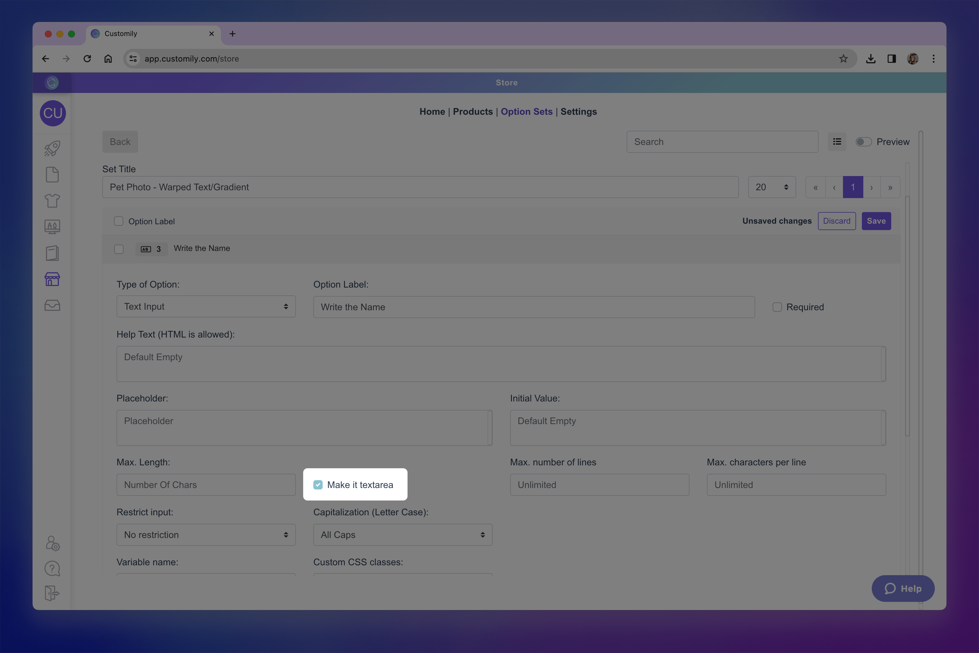make textarea.png**
- Set Max Number of Lines to limit maximum number of lines allowed. And Max. Characters Per Line to cap the length of each line. You can use one or both settings.
- Save your changes
Tip
You can also use Max Length together with Max Lines and
Characters Per Line. This creates multiple limits at once (useful for strict layouts), but it can feel restrictive—use thoughtfully.
Restrict Input Type (Letters, Numbers, Custom Rules)
- Go to your Option Sets panel and select the set you want to edit.
- Click on the Text InputOption you want to edit to expand its settings.
- Find Restrict Input and choose a rule:
→ No restriction (default)
→ Only numbers (with spaces)
→ Only numbers (NO spaces)
→ Only letters (with spaces)
→ Only letters (NO spaces)
→ Custom (restrics specific words with Regex expression)
- Save your changes
Tip
If you're restricting the input, explain it in the **Help Text** so
shoppers know exactly what to type. For example: “Only letters allowed” or
“Numbers only.” Without guidance, it can be frustrating for shoppers if their
input doesn’t appear and they don’t understand why.
How to restrict specific words with Custom Regex Expressions
Custom regex (regular expressions) let you create your own advanced rules for
what shoppers can and cannot type. They’re useful for things like:
- Blocking specific words or phrases.
- Enforcing a format
- Combining multiple rules into one.
- Under Restrict Input , select Custom
- Enter the words you'd like to restrict using ( ) and separating each word with a | . For example
(fudge|shoot|dang)
This would block shoppers from typing the words fudge, shoot and dang.
- Save your changes
Tip
Most merchants use presets for common restrictions, but Custom Regex is
perfect for advanced scenarios — like requiring certain words, disallowing
specific characters or symbols, or enforcing a specific format. If you’re not
familiar with regex, you can use an online regex generator or ask ChatGPT to
write one for you. Always test to make sure valid inputs are accepted and only
unwanted ones are blocked.
▶ How to Add a Minimum Required Size for Images Uploaded by Shoppers
If your design requires a high-quality print, you can set a minimum width and
height (in pixels) for any image shoppers upload. This ensures the image won’t
appear blurry or pixelated when printed.
If a shopper tries to upload an image smaller than the minimum size you set,
they’ll see an error message prompting them to upload a larger file.
Adding a minimum required size for image uploads
- Go to your Option Sets panel and select the set you want to edit.
- Click on the Image UploadOption you want to edit to expand its settings.
- Find the “Minimum image size” section and enter the minimum width and height in pixels.
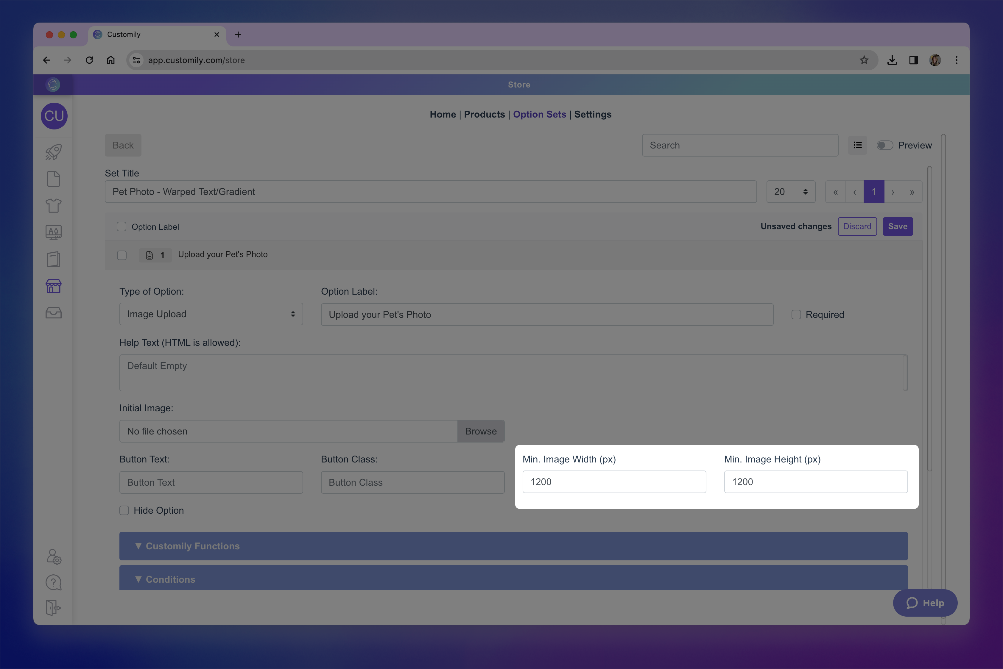min image width and height.png**
- Save your changes.
How to Know What Minimum Size to Use
For most print products, aim for at least 150 DPI (dots per inch) to
ensure good print quality. You can calculate the minimum pixel dimensions like
this:
Photo Print Width in inches × DPI = pixel width
Photo Print Height in inches × DPI = pixel height
Example:
- An 8×10 inch print at 150 DPI would need at least 1200×1500 px.
Here’s a quick reference guide:
Photo Print Size (inches) | MinPixels @150 DPI | Min Pixels @300 DPI
---|---|---
5x7 | 750x1050 | 1500x2100
8x10 | 1200x1500 | 2400x3000
12x16 | 1800x2400 | 3600x4800
16x20 | 2400x3000 | 4800x6000
20x24 | 3000x3600 | 6000x7200
Keep in Mind
Setting very high pixel requirements may cause shoppers’ uploads to be
rejected, especially if they’re uploading from mobile devices.
▶ Using Conditional Logic to Show and Hide Options
Conditional Logic controls when an option is visible to shoppers based on
the value(s) selected in another option, for example, showing a color selector
only after a shopper chooses a style. This makes the personalization
experience cleaner and more intuitive, by only presenting relevant options.
Conditional Logic can be:
- Automatically created when your Option Set is generated from a design or template that uses layouts or libraries with categories, or
- Added manually to customize behavior where needed
This article will guide you through both methods and help you build smarter,
user-friendly workflows.
How Conditional Logic Works When Created Automatically
When you create an Option Set automatically from a design or template,
Customily adds Conditional Logic in the background for certain elements — so
you don’t have to set it up manually.
This happens in cases where:
- Layouts are used (e.g., switching between different scene compositions based on shopper choices)
- Libraries with categories are applied to an element (e.g., a hairstyle library organized by “Blonde,” “Brunette,” and “Redhead” categories)
This automated setup makes personalization smoother for shoppers and saves you
from creating multiple manual conditions yourself. You can still edit or add
conditions later if needed.
When using Layouts
If your design includes multiple layouts, Customily will:
- Create an option for selecting the layout.
- Use that selection to control which other options are shown.
Example:
You have a design with three layouts:
- 1 dog
- 2 dogs
- 3 dogs
The first option in your Option Set will let the shopper choose their layout.
If they select 2 dogs , they will only see the options to choose Dog 1 and
enter Dog 1’s name and the options to choose Dog 2 and enter Dog 2’s name.
All other options that don’t belong to the chosen layout remain hidden. This
way, each shopper only sees the inputs relevant to their selection.
When using Libraries with Categories
If your design uses a library that is organized into categories
Customily will:
- Create a main option to select the category.
- Use that selection to show only the option for the chosen category.
Example:
You have a Hairstyles library with three categories:
- Blonde
- Brunette
- Redhead
The main option lets the shopper choose a Hair Color (category). If they
select Blonde , only the Blonde Hairstyles option is shown. The
Brunette Hairstyles and Redhead Hairstyles options remain hidden.
Creating Conditions Manually
Sometimes you’ll want to create a condition yourself, to control exactly when
an option appears for the shopper. To add a condition:
- Go to your Option Sets panel and select the set you want to edit.
- Click on the*Option you want to condition** to expand its settings.
- Expand the conditions section
- Click Add Condition to add a new condition.
- Choose theAction , to decide wether the option should Show or Hide when the condition is met.
- Choose the Trigger Option , this is the other option in your Option Set that will act as the "trigger".
- Define the Condition , it can be:
→ When certain value(s) are selected \- for dropdowns, swatches, etc.
→ When a checkbox is checked/unchecked
→ When a text input equals a specific value \- for example if a shopper
types "Yes".
→ When a text input has at least X characters
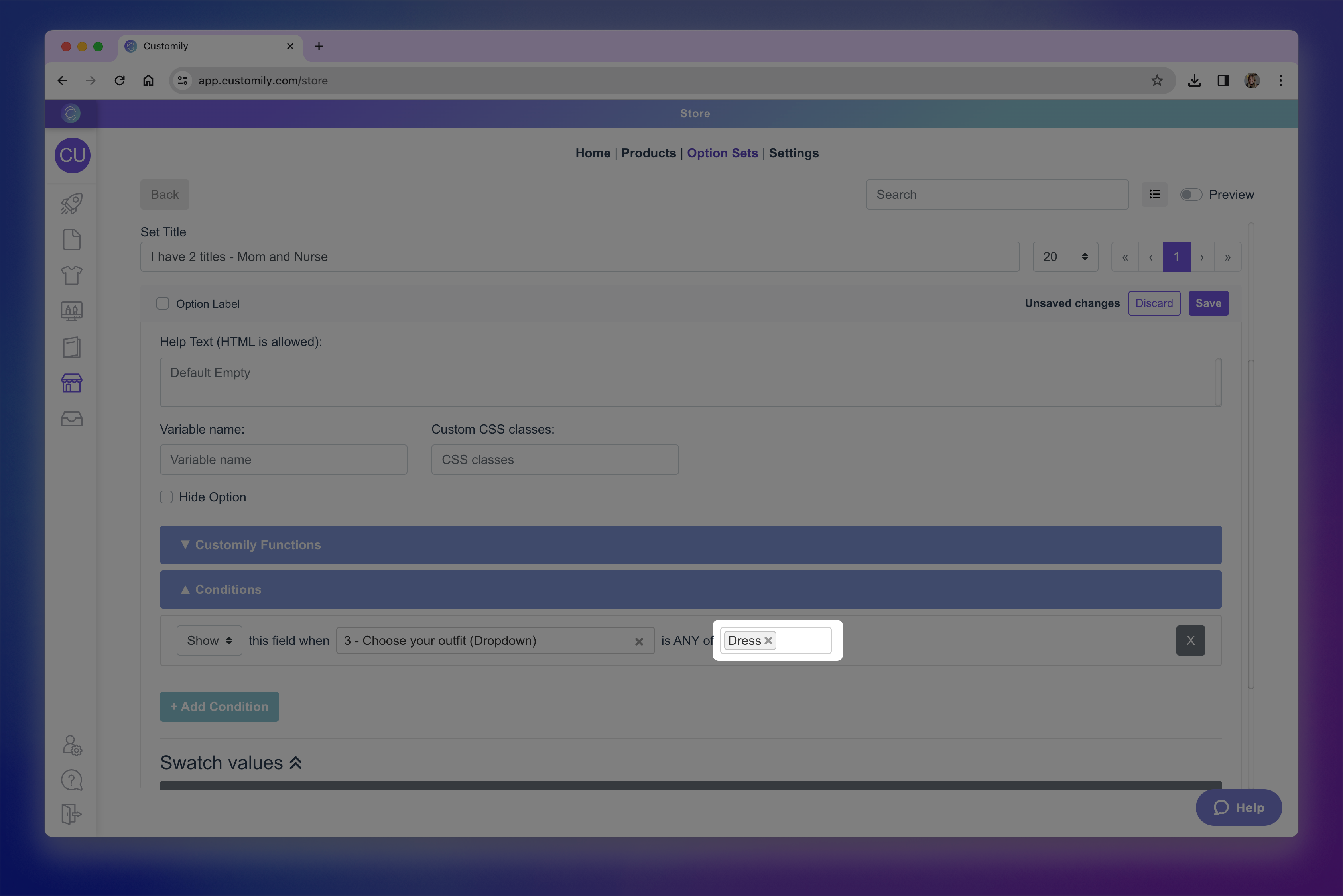set condition.png**
You can add as many conditions as you need. When multiple conditions are
present, you can decide if they should be metall together (AND) or if
any of them (OR) should trigger the action.
- Save your changes.
Bulk Adding Conditions
When you need to apply the same condition to multiple options, you can save
time by using the Bulk Actions menu.
- In your Option Set, use the checkboxes to select all the options you want to apply the condition to.
- In the top bar, click Set Logic.
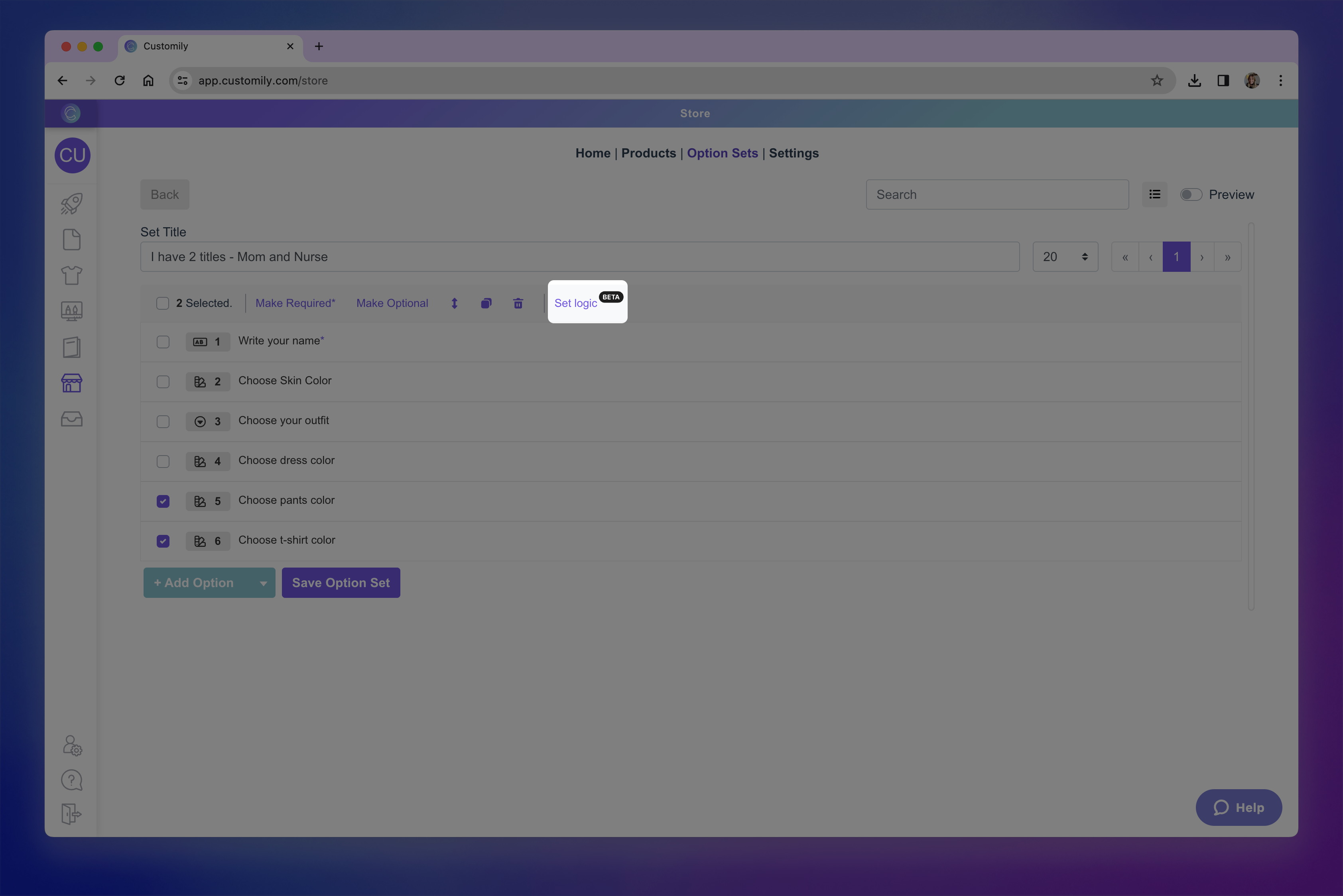Set Logic.png**
- Just like when adding a condition individually, you’ll:
→ Choose whether the selected options should Show or Hide when the
condition is met.
→ Pick thetrigger option.
→ Define the condition’s value or rule.
→ You can still add multiple conditions if needed, and choose whether they
should follow AND or OR logic.
- Click Apply to set te logic and then Save your changes.
Tip
If you want to test how your conditions work , enable the **Option Set
Preview** and try changing the options directly in the preview. This lets you
see the results of your conditions in real time, so you can confirm everything
works as intended before publishing.
▶ Understanding the Difference Between Product Variants and Customily Option Sets
When setting up products in your store, it’s important to understand the
difference between product variants created in your eCommerce platform
(like Shopify, WooCommerce, Etsy, Shoplazza, etc.) and Option Sets created
in Customily. While both let you offer multiple choices to shoppers, they work
differently and have different purposes.
What Are Product Variants?
Product variants are defined directly in your eCommerce platform. They
represent different versions of the same product — for example, a T-shirt
available in multiple sizes or colors.
With variants, you can:
- Assign different prices for each variant.
- Set a unique SKU (stock-keeping unit).
- Track inventory for each variant individually.
- Use platform features like showing “X colors available” in category pages.
- Leverage SEO benefits for variant-specific URLs (in platforms that support it).
On most eCommerce platforms, variant selection is displayed to shoppers as
dropdown menus by default , unless your store’s theme or an app
customizes them into other formats like swatches or buttons.
There are limitations to variants, where each platform has its own
restrictions — such as how many options you can add and how many variant
combinations are allowed. For example, Shopify allows a maximum of 3 options
and 100 combinations per product.
What Are Customily Option Sets?
Option Sets are created entirely within Customily and are not tied to your
eCommerce platform’s inventory or pricing system. They’re used to add
personalization options to your products, such as:
- Choosing a hair style in an illustration.
- Entering a name or custom text.
- Selecting background patterns.
Option Sets:
- Do not affect stock, SKU, or price directly.
- Have no limits on the number of options or combinations you can create.
- Work seamlessly with personalization previews, functions, and conditional logic.
While standard variants are limited by your platform, **Customily gives you
access to a wide range of[**option types** for
personalization — from swatches and image uploads to color pickers, text
inputs, calendars, and more — allowing you to go far beyond what’s possible
with native variants.
Using Variants and Option Sets Together
Both variants (created on your eCommerce platform) and **Customily Option
Sets** are powerful tools for giving shoppers choices — but they serve
different purposes. Using them strategically will help you manage your catalog
efficiently and deliver the best personalization experience.
When to Use Variants
Create variants for attributes that:
- Affect the overall product (size, material, shape, base color, etc.).
- Need to be tracked for inventory.
- Require different SKUs or pricing.
- Play a role in SEO (e.g., you want each color or style to have its own product page).
- Should be visible in category pages or product listings (e.g., “Available in 5 colors”).
Most eCommerce platforms have some limitations for variants — such as the
number of options or combinations you can create — so keep that in mind when
planning your catalog.
Tip
You can add Customily functionality to variants by assigning
functions to
them — for example, changing the preview image when a shopper selects a
garment color variant. This is especially useful when you want:
- The control and catalog benefits of variants (inventory, SEO, product organization).
- The dynamic preview updates provided by Customily.
Example: A t-shirt’s size and color are variants, but the color variant is
linked to a Customily function that changes the t-shirt color in the live
preview.
When publishing a product using a **Product Base** and a design in
Customily, variants are defined within the product base. This means:
- Any variant options you select in the product base will automatically be created as variants for your product.
- This follows our best practice: use variants for broad product attributes (size, shape, material, base color) and Customily options for personalized details.
When to Use Customily Option Sets
Use Customily options for attributes that:
- Are personal to each shopper (e.g., name, custom text, uploaded image).
- Don’t need inventory tracking.
- Don’t require different SKUs or pricing.
- Control purely visual or decorative personalization on the preview (e.g., background pattern, font choice, design element).
Customily options have no limit to the number of choices you can add, so
they’re ideal for personalization beyond your platform’s variant limits.
▶ How to Add Functions to Product Variants
Sometimes the changes in your preview should be triggered by the **product’s
variants** (such as Shopify’s size or color options) rather than by a
Customily option.
For example:
You sell a hoodie in 5 base colors. Each color is already set up as a variant
in Shopify. When the shopper switches from “Black” to “Blue,” you want the
preview to show the blue hoodie automatically.
In cases like this, you can assign a Customily function directly to the
variant. This way, your product’s built-in variant controls the preview
change, keeping the personalization form clean and easy to use.
If you’re not sure whether to use variants or Customily options for a
particular product choice, see Understanding the difference between variants and Customily options for guidance.
Common Use Cases
- Changing the garment color in the preview
When the variant represents the color of your garment, you can use the
Change Dynamic Image function to swap the garment image in the preview.
You’d select the element that holds your garment image, then assign the
correct image option for each variant.
- Switching templates based on size
When the variant is size and the print file or preview needs to adjust (for example, you sell posters and need larger/smaller print files), you can use
the Change Template function and assign a different template to each
variant.
Tip
If your product was created automatically using a **product base and a
design** , variant functions are configured for you. You don’t need to
manually assign them.
Assigning Functions to Variants
- Go to your Products section in Customily.

- Find the product you want to edit and click to open it.
- Make sure the product is already connected to a template (and an option set if needed).
- Expand the Product Variants section to see their settings.
- Under the Assign Customily Functions to Product Variants section, find the variant you want to configure and click it to expand it.
- Click Customily function to expand it.
- Click +Add Customily Function
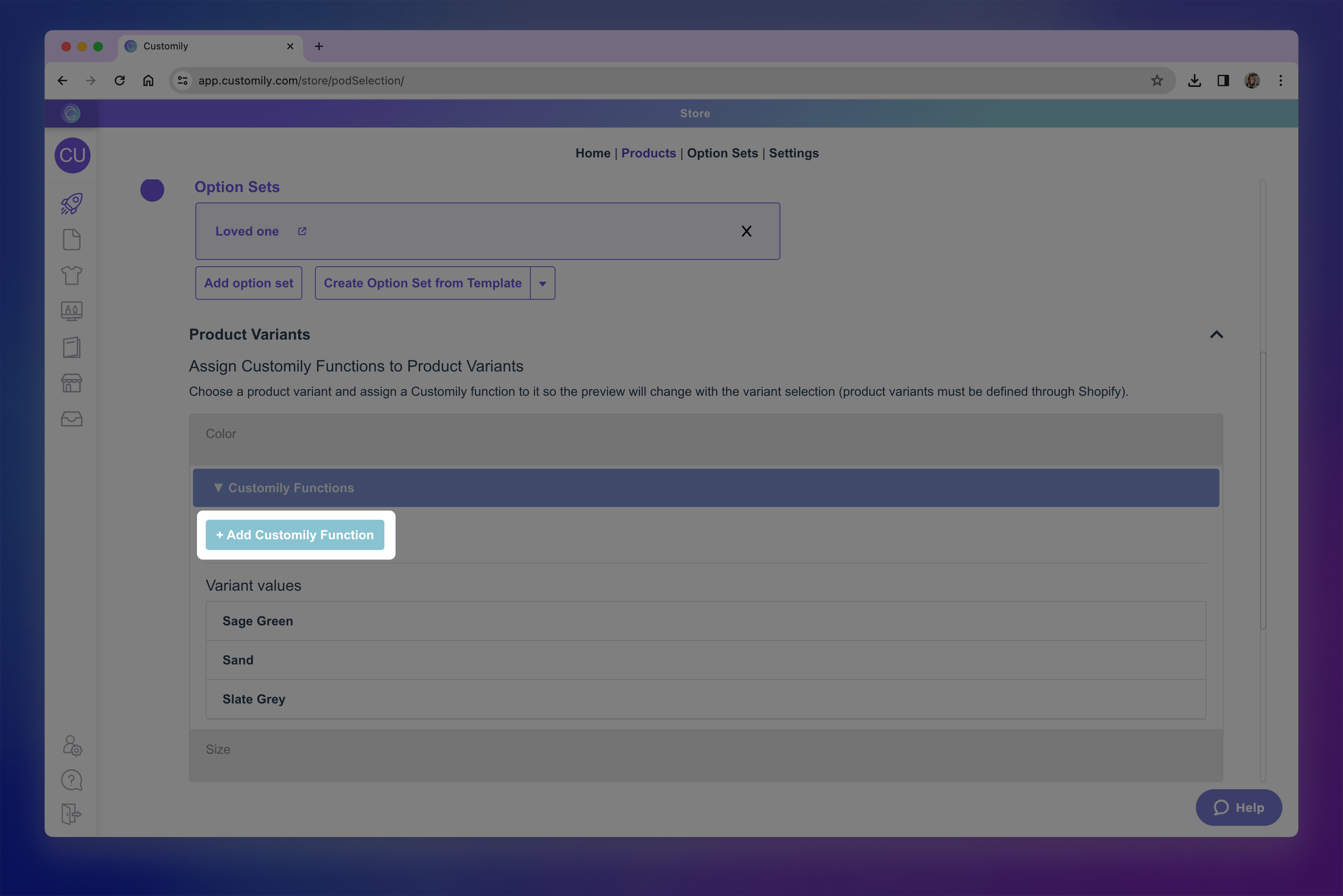Add customily function.png**
- Configure the function just like you would for a Customily option — selecting the correct function type, and element.
Need help setting up the function?
See Understanding Functions in Option Sets for a detailed explanation of how each function
works and how to configure it.
- Go to Variant values , and make sure you assign the correct values for each variant. This could be image position, color position, template id, depending on the function you selected.!variant values.png
- Save your changes.
Each variant can have as many functions as you need. This is especially useful
when you want to change multiple things on the preview at once. A classic
example is when changing a garment color also requires changing the text color
in your design — for instance, showing black text on a white T-shirt, but
switching to white text when the T-shirt color is dark navy.
▶ How to use Conditions with Product Variants
In some cases, the options you show shoppers should depend on which variant
they’ve selected. Instead of showing all personalization options for all
variants, you can **set conditions so shoppers only see what’s relevant to the
variant they chose**.
For example:
If your product has a “Short Sleeve” and a “Long Sleeve” variant, you might
only want sleeve length personalization options to appear for the Long Sleeve
variant.
Variant conditions let you **control exactly what personalization options
shoppers see based on the variant they choose** — making the buying experience
more relevant, faster, and easier.
Common use cases
- Showing or hiding a single option when a variant is selected.
Sometimes a variant only affects one part of your personalization flow. In
that case, you can set a condition so a specific option only appears when the
right variant is selected.
For example, if your product has a variant for personalization finish —
such as Metallic , Glitter , or Vinyl — you can condition the
color options so shoppers only see the colors available for the finish they
choose. All other options will remain the same.
- Showing or hiding entire option sets
In other cases, the variant might change the personalization entirely, and the
shopper should see a different set of options from start to finish.
For example, if your product offers Embroidery or Foil Stamp as a
variant, you could create one option set for embroidery (monogram + thread color) and another for foil stamping (full name + foil effect). Each set would
only appear when its matching variant is selected.
How to condition Entire Option Sets
- Go to the Products section in your Customily app.
- Find and open your product.
- Make sure the product is already connected to a template and one or more option sets if needed.
- Expand the Product Variants section.
- Under the Assign Conditions to Product Variants section, find the option set you want to condition and click it to expand it.
- In the Variant Conditions for Set area, click +Add Condition.
- Configure the condition by choosing theAction , to decide wether the option should Show or Hide when the condition is met, and the Variant selection that will act as the trigger.
You can add as many conditions as you need. When multiple conditions are
present, you can decide if they should be met all together (AND) or if
any of them (OR) should trigger the action.
- Save your changes.
How to condition a specific Option
Repeat steps 1–5 from the previous section to reach the **Assign
Conditions to Product Variants** section, find the option set you want to work
with and click it to expand it.
- Under Variation Conditions for Option , find the option you want to condition and click it to expand it.
- Click +Add Condition.
- Configure the condition by choosing theAction , to decide wether the option should Show or Hide when the condition is met, and the Variant selection that will act as the trigger.
You can add as many conditions as you need. When multiple conditions are
present, you can decide if they should be met all together (AND) or if
any of them (OR) should trigger the action.
- Repeat with any other option that needs to be conditioned.
- Save changes.
▶ How to Edit an Option Set
You can edit any option set in your account, whether it was created
automatically from a design or template, or manually from scratch. Editing
allows you to customize the shopper experience on your product page — from the
labels and styles of each option, to advanced logic and behavior.
- Open the Option Set you want to edit
From the Option Sets panel, hover over the one you want to update and click
it, or click the pencil icon on the right.
- Once inside the option set, you'll see a list of all the options it includes.
→ If your set has many options, they’ll be paginated — you can choose to view
10, 20, or 40 options per page (default is 20).
→ If your options use conditional logic, try switching to Group View to
see them nested beneath their parent option. This makes complex sets easier to
read.
→ Use the search bar to quickly find a specific option by name.
- Expand an Option to view and edit its settings
Hover and click the highlighted option to expand it and access all editable
fields.
Each option has its own settings depending on the input type. Want to know
everything you can edit? Jump to What you can edit below.
- Reorder, Clone or Delete Options
You can:
→ Drag and drop to rearrange options on the current page.
→ Use the Reorder button to move options across different pages of the
set.
→ Clone a specific option with the clone button
→ Delete an option using the Trash button
- Use bulk actions if needed
Select multiple options using the checkboxes to:
→ Move
→ Clone
→ Delete
→ Mark as required or optional
→ Add conditional logic
- Create new options if needed
Click \+ Add Option at the bottom of the page to add a new personalization
field. There are three ways to add a new option:
→ Create from scratch
Add a complete new option manually. You’ll choose an input type, define its
label and configure all its settings.
→ Create from a template element
Click the toggle icon next to + Add Option and select **\+ Create Option from
Template element**.
This allows you to pick a personalization element from a template (like a text box or dynamic image). An option will be created automatically, already linked
to that element.
→ Import from another set
Click the toggle icon again and choose \+ Import from another Option Set.
This lets you copy an existing option from any other option set in your
account, keeping its full configuration.
Newly added options will be added at the end of the option set.
Pro Tip
You can use the Preview toggle at any time to see how your options will
appear to shoppers while you're editing. !Previw options.png
This live preview reflects all the settings you've configured — like input
types, default values, and conditional logic — so it's great for double- checking how your personalization flow works.
in mind this preview is a simplified version of your storefront. It won’t
reflect your store’s actual styling, but it gives you a quick way to test
behavior and layout.
What Can You Edit on Each Option?
The settings available for each option depend on the option type you’re
using.
For example, text inputs can have character limits or placeholder text
, while swatches can be styled with custom thumbnails , color pickers
, and more.
To learn what’s available for each option type and how to configure them,
check out the articles below:
- Text inputs (single-line and multi-line): Let shoppers enter custom text, such as names or messages.
- Dropdowns: Show a list of values for the shopper to choose from (like font options or styles).
- Dropdown with swatch: Combines dropdown functionality with visual swatches for each value.
- Swatches (colors, images): Display visual choices like colors or images as clickable options.
- Text Swatches: Display text-based options as clickable buttons.
- Image uploads: Let shoppers upload their own images to be added into your design.
- Vector uploads: Allow uploading vector files when high-resolution artwork is needed.
- Color picker: Gives shoppers a color selector to choose any custom color (instead of pre-set swatches).
- Checkbox: Use for toggling on/off elements or including optional personalization.
- Maps: Add a searchable location input that generates a stylized map in your design.
- Star Maps: Add a searchable location and date input that generates a custom star constellation map.
- Date Picker (calendar): Let shoppers select a specific date using a calendar widget.
These articles explain how to customize labels, styles, conditions, functions,
and more — depending on the type of personalization you're offering.
- Author:EcomGrace
- URL:http://ecomgrace.com/article/2d935142-581f-8114-92c2-d4c91f74fa1c
- Copyright:All articles in this blog, except for special statements, adopt BY-NC-SA agreement. Please indicate the source!